
Last updated 16 November 2026
“I keep changing my sales page and checkout, to optimise it for more sales, and I can’t tell if any of it made a difference.”
If that sounds like you after a quiet sales month or a launch that came in under target, you probably have plenty of ideas. What’s missing is the numbers that show which ones work.
Around 70% of people who reach a checkout leave without buying (Baymard, 2026).
Some of that is normal. 42% are just browsing and not ready to buy (Baymard, 2026). But if you keep in touch with them, many will come back when you’ve helped them better understand your offering, and when they’re ready.

The part you can fix sits somewhere specific in your funnel: a step people skip, a field that errors on a phone, a page that looks fine on your laptop and broken on theirs. A week of guessing costs a week of sales. Leave it a month and you’ve paid for a month of traffic into the same leak. .
Below are 24 tips for measuring and testing a funnel that ends in a ThriveCart checkout, each with how to do it with ThriveCart. They come from research by Baymard, CXL, Klaviyo, Shopify, HubSpot, PinnacleCart and ThriveCart itself.
And we add to this page as we find more.
In this guide
- Find where buyers drop off
- Decide what to test
- Run tests you can trust
- Keep improving after the test
Find where buyers drop off
Start by counting. ThriveCart shows you sales, and your website analytics shows you visits and clicks. Put the two side by side and the leak usually shows itself.
Two kinds of ThriveCart seller. If your Buy button goes straight to ThriveCart, your funnel runs sales page, Buy click, checkout, sale, and you only know who left the checkout if they typed their name and email into it. If you capture name and email before the cart (for example, a short opt-in popup on the Buy button), you have one more step to measure and the email of everyone who clicked Buy, so you can follow up with all of them. The step to watch closely is then the checkout itself, where buyers are asked to type those same details again.
Every tip below works either way.
Tip 1: Track your funnel one step at a time
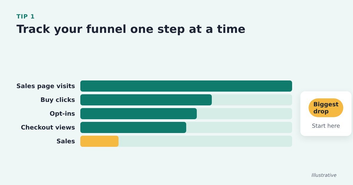
One conversion rate tells you sales are low. Numbers for each step tell you where.
Do it with ThriveCart: for the same week, count sales page visits, Buy button clicks, opt-ins (if you use one), checkout views and ThriveCart sales. The biggest drop between two steps is where you start.
Source: PinnacleCart, ways to increase add-to-cart rate
Tip 2: Find the checkout errors that happen most and fix those first
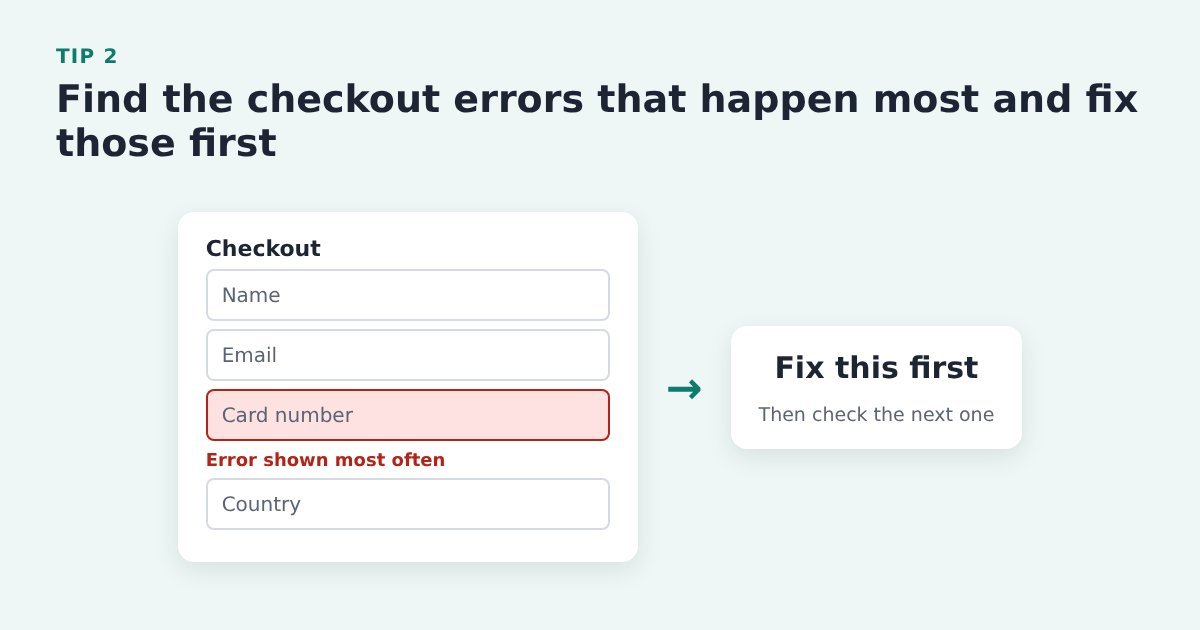
A field that keeps throwing an error is a leak you can often fix in an afternoon.
Do it with ThriveCart: connect your analytics in the tracking settings of your ThriveCart product and watch which step of the checkout loses most buyers. Then fill the checkout in yourself, on a phone and on a desktop computer, to see the error messages your buyers see.
Source: Baymard Institute, current state of checkout UX
Tip 3: Check conversion by device and browser, not just the average
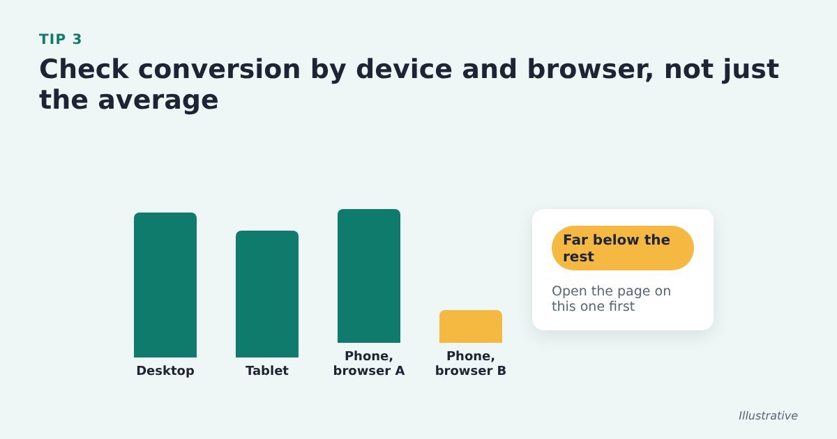
A healthy average can hide a page that’s broken on one kind of phone.
Do it with ThriveCart: split the sales page by device and browser in your website analytics, and check which of those splits ThriveCart’s own reports show. If one converts far below the rest, open the page on that device first.
Source: CXL, conversion research
Tip 4: Check your visitors’ real screen sizes before deciding what goes above the fold
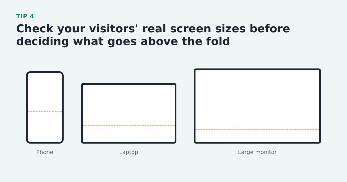
The fold sits in a different place on a phone, a laptop and a big monitor.
Do it with ThriveCart: look up the screen sizes for your sales page in your website analytics and design for the ones your visitors actually use. This one is about the sales page: the ThriveCart checkout isn’t where it applies.
Source: CXL, mastering above the fold
Tip 5: Watch recordings and heatmaps before you redesign

You see where visitors really look and where they stop, instead of guessing.
Do it with ThriveCart: add a heatmap or session recording tool to the sales page and check how many visitors scroll as far as the Buy button. Then test a layout change rather than rebuilding on a hunch.
Options on WordPress include;
Opti-Behavior, Microsoft Clarity, Hotjar, Crazy Egg, Mouseflow, Lucky Orange, Aurora Heatmap.
As far as we are aware, its not yet possible to add heatmaps or mouse trackers to your ThriveCart checkout. Here’s hoping its in the development pipeline.
Source: CXL, visual hierarchy for UX and conversions
Tip 6: Let your customers’ emails tell you what to test next
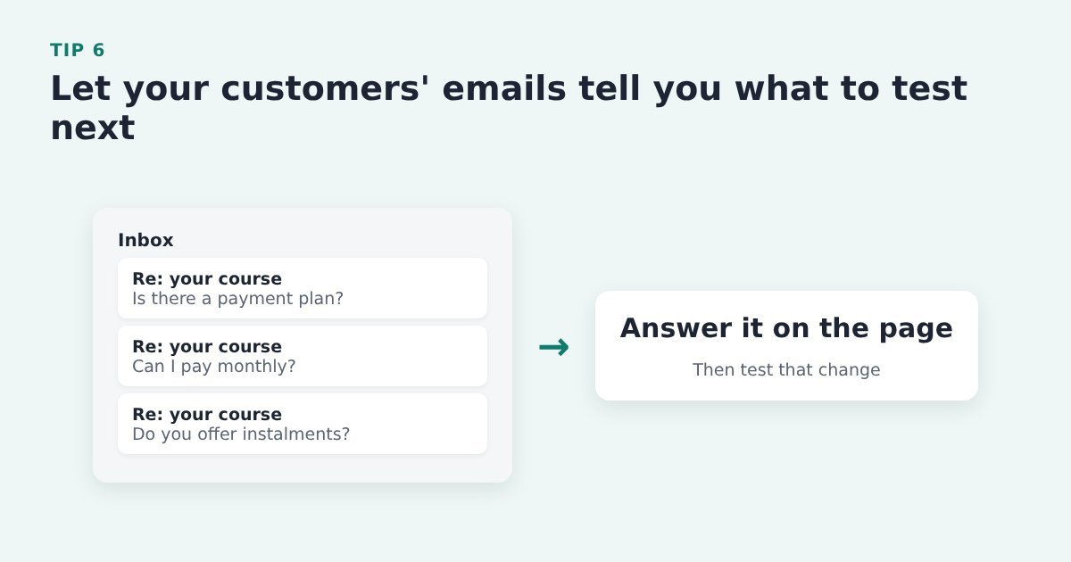
The question people keep asking points straight at the weakest part of the page.
Do it with ThriveCart: keep a list of the questions buyers and nearly-buyers email you. Answer the common ones on the sales page or the ThriveCart checkout, and test that change first.
Source: PinnacleCart, ways to increase add-to-cart rate
Tip 7: Compare your recovery email click rates with a benchmark

Click rates for each email show you which message to work on first.
Do it with ThriveCart: ThriveCart passes abandoners to your email tool, and your email tool sends and reports. Open the reports for the tag or list ThriveCart adds abandoners to, read the open rate and click rate for each email and work on the weakest one. This covers the abandoners whose email you have: those who typed it into the checkout, or everyone who clicked Buy if you capture name and email before the cart. For the sequence itself, see our 5-step process to better sales conversion.
Evidence: Shopify, citing Klaviyo benchmark data, puts the average abandoned cart email click rate at 6%, and 11.3% for the top 10% of Klaviyo’s ecommerce customers. Shopify, abandoned cart emails: best practices and examples
Decide what to test
Once you know where buyers drop off, choose what to change. The best tests come from evidence, and they change something the visitor will notice.
Tip 8: Fix the checkout basics before you buy new tools
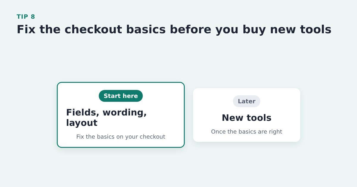
Most checkout gains come from layout, form fields and wording, not new technology.
Do it with ThriveCart: go through your ThriveCart checkout for fields you don’t need, unclear wording and clutter before you pay for another app. Our ThriveCart checkout guide has 27 tips for that.
Evidence: Baymard estimates large sites could raise conversion by 35.26% through better checkout design alone. Baymard Institute, checkout UX benchmark
Tip 9: Start every test with a hypothesis
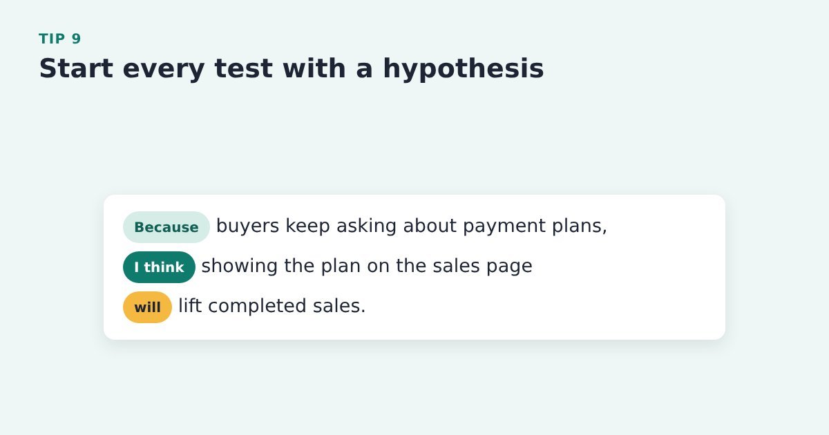
A random change teaches you very little, even when it wins.
Do it with ThriveCart: write one line before you touch the page: because of this evidence, I think this change will do this. Take the evidence from your ThriveCart sales figures and customer emails, then make the change in your page builder or checkout settings.
Then start testing it.
Source: CXL, 12 A/B testing mistakes I see all the time
Tip 10: Test the offer, copy and layout, not the button colour

There is no best button colour. The tests worth your traffic change what the visitor understands.
Do it with ThriveCart: pick changes to the headline, the offer or the order of the page – they matter far more. Make them in your page builder, then compare orders in your ThriveCart sales figures. Our sales page copy tips have ideas to test.
Source: CXL, 12 A/B testing mistakes I see all the time
Tip 11: If your page gets few sales, test big changes
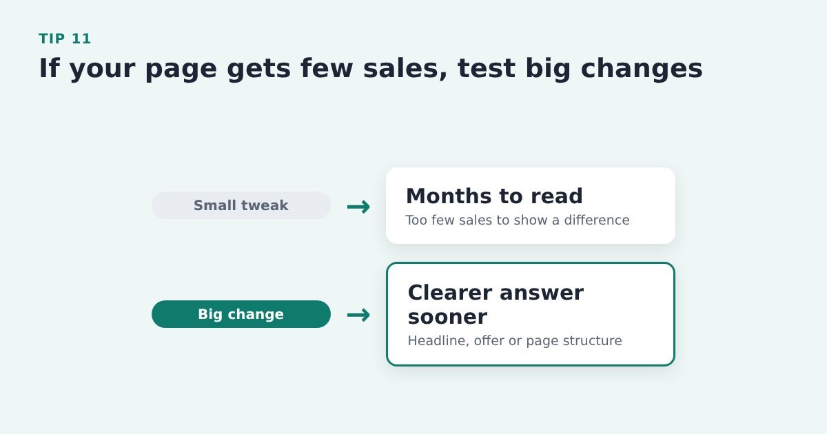
Small tweaks need a lot of sales to show a result, so on a quiet page they can take months.
Do it with ThriveCart: change the headline, the offer or the page structure rather than a single word, then compare ThriveCart orders for each version.
Source: CXL, 12 A/B testing mistakes I see all the time
Tip 12: Test where your Buy button sits
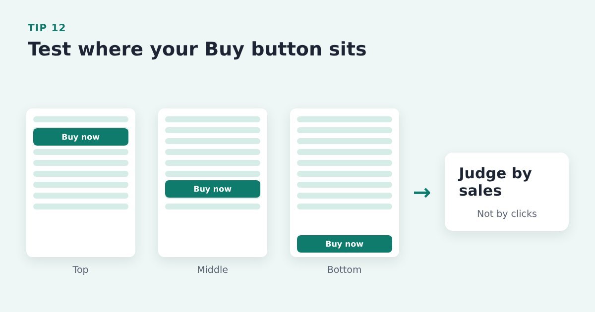
Above the fold isn’t automatically best, and clicks alone can mislead you. If its too early on the page, more people might click it, but they’re not yet ready to buy so click back. Which messes with your stats.
Do it with ThriveCart: try the button in different places on the sales page with your page builder or a testing tool, and judge each version by completed ThriveCart sales, not clicks.
Source: CXL, mastering above the fold
Tip 13: Compare a one-page checkout with a multi-step one
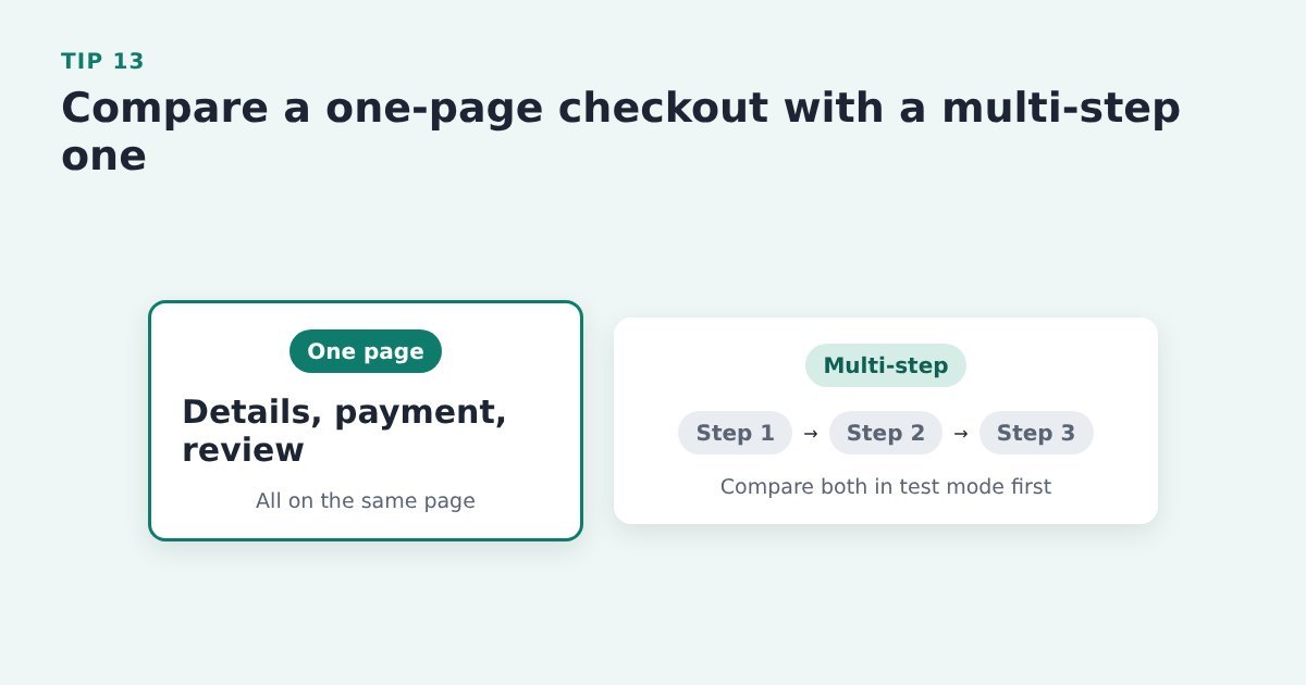
Layout choices change results, so compare them with real buyers instead of guessing.
Do it with ThriveCart: Have a look through the checkout templates ThriveCart offers and try them in test mode before you change anything on the live checkout. If you go one-page, keep the review on that same page.
In general, multi-step checkouts are better for higher priced items. But if you’ve got the name and email before the car, which is a wise move, you may find conversion are better with a one-page checkout.
Source: Wingify (VWO), optimising your checkout page
Run tests you can trust
A test is only useful if you can trust its result. These following tips stop you picking a ‘winner’ that was never really there.
Tip 14: Change one thing at a time

If you change the headline and the button together, you won’t know which one did the work.
Do it with ThriveCart: test one change on your sales page or ThriveCart checkout, such as the button wording, and compare sales over the same period.
Source: Aftersell, cart optimisation strategies
Tip 15: Don’t run two tests on the same page at once
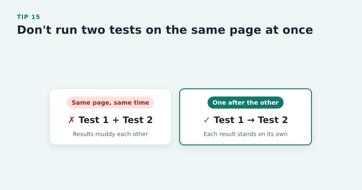
Two tests on the same traffic can muddy each other’s results.
Do it with ThriveCart: finish one test before you start the next on the same page, and keep a simple list of what’s running where.
Source: CXL, 12 A/B testing mistakes I see all the time
Tip 16: Run each test in full seven-day blocks

Conversion changes from one day of the week to another.
Do it with ThriveCart: start and stop each test on the same weekday and run it for at least two full weeks. Make the change in your page builder or testing tool, then compare orders in your ThriveCart sales figures.
Evidence: In an example in the article, CXL found Thursdays made twice as much money as Saturdays and Sundays. CXL, 12 A/B testing mistakes I see all the time
Tip 17: Don’t call a test early

An early lead often disappears once more buyers come through.
Do it with ThriveCart: let the test run until it reaches the marks shown, before you pick a winner. A page with few sales won’t get there quickly, which is another reason to test big changes (tip 11).
Evidence: CXL recommends at least 95% significance, 350 to 400 conversions per variation and 2 to 4 weeks of testing. CXL, 12 A/B testing mistakes I see all the time
Tip 18: Check your tracking, and note anything unusual, before you trust a result
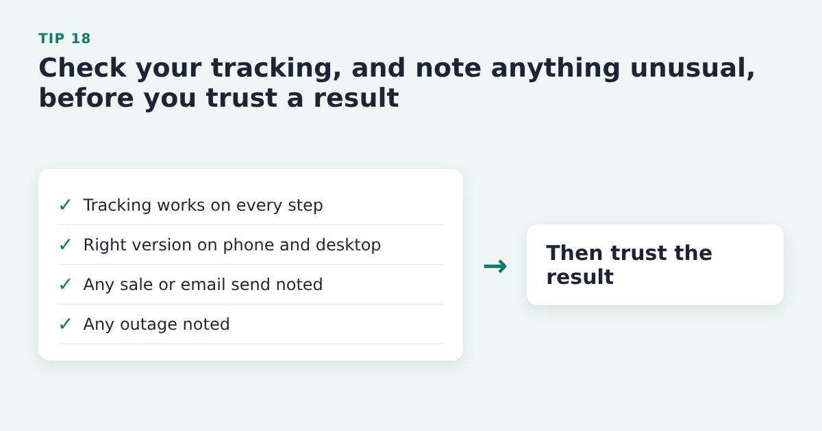
A broken tag or a surprise promotion can make a loser look like a winner. Or vice-versa.
Do it with ThriveCart: use ThriveCart’s test mode to run through the checkout, check your page builder or testing tool shows the right version on phone and desktop, and write down any sale, email send or outage during the test.
Source: CXL, 12 A/B testing mistakes I see all the time
Tip 19: Break your results down by segment
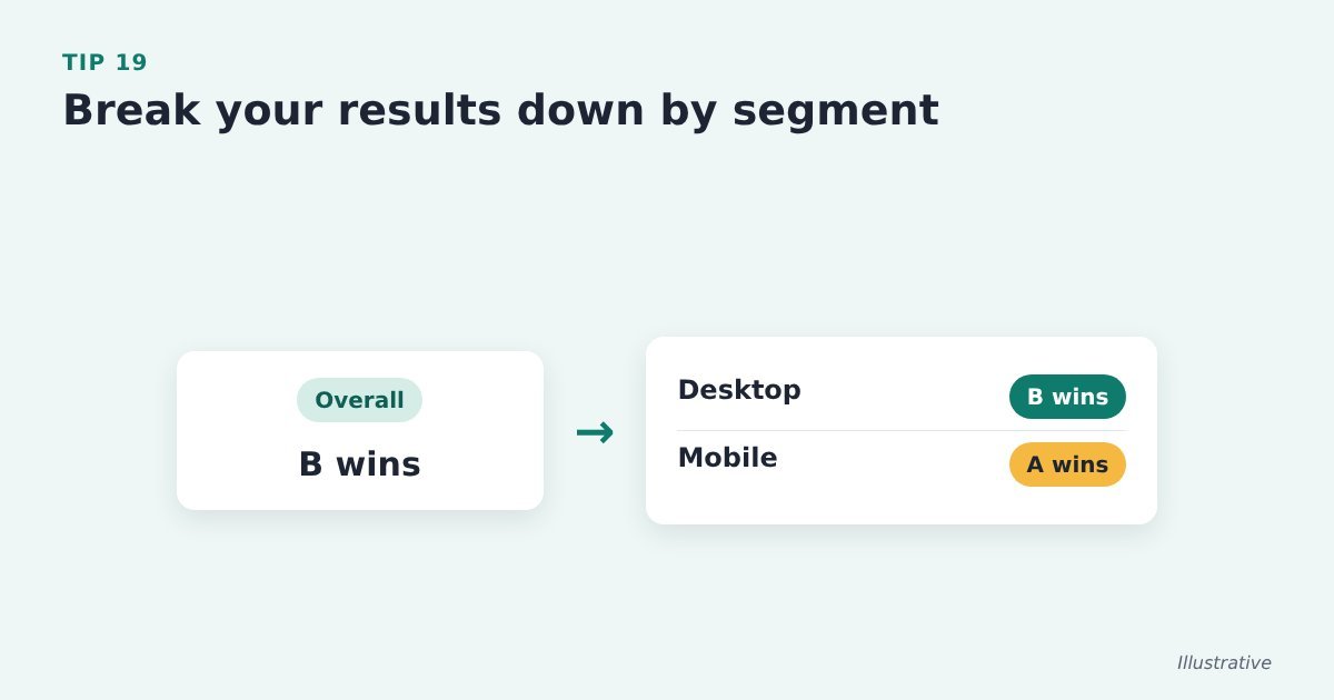
Averages hide differences: a version can win on desktop and lose on mobile.
Do it with ThriveCart: send your test data to your analytics tool and compare device, traffic source and new versus returning visitors alongside ThriveCart’s sales figures. Check which tracking your page builder or testing tool supports.
Source: CXL, 12 A/B testing mistakes I see all the time
Tip 20: Watch average order value as well as conversion rate
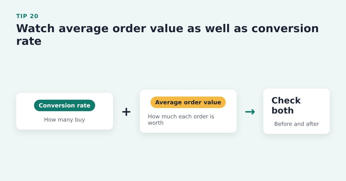
A change that brings more orders but smaller ones may not be a win.
Do it with ThriveCart: compare orders and revenue in your ThriveCart sales figures before and after the change, not just the number of sales.
Source: ThriveCart, 10 tips for maximising your conversions
Keep improving after the test
These tips keep the gains coming once your first test is done, and make sure the buyers you win get a good start.
Tip 21: Don’t give up after a failed test
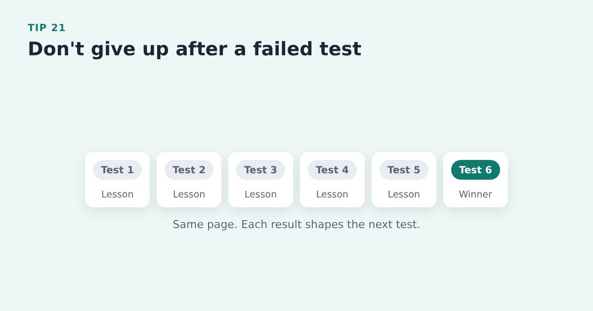
A losing test still tells you something about your buyers.
Do it with ThriveCart: write down what you learned, use it for your next hypothesis and test again on the same page.
Evidence: CXL describes a case study that needed six tests on the same page to reach a satisfactory lift. CXL, 12 A/B testing mistakes I see all the time
Tip 22: Keep banking the small wins
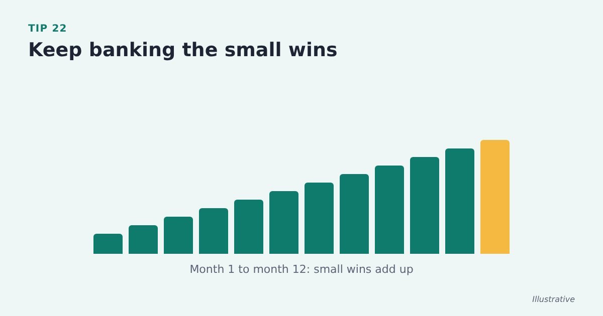
Gains of a few per cent add up over a year.
A 1% relative improvement in sales conversion each week compounds to a 67.8% improvement over 52 weeks.
Keep tweaking!
Do it with ThriveCart: roll each winner out on the live page, note it in your test log and move on to the next test.
Evidence: CXL works out that a 5% improvement each month gives about an 80% lift over 12 months. CXL, 12 A/B testing mistakes I see all the time
Tip 23: Write your welcome emails with as much care as your abandon sequence

New subscribers are at their most interested just after they opt in.
Do it with ThriveCart: give new opt-ins a welcome series in your email tool, written as carefully as your abandoned cart emails.
Evidence: Klaviyo’s 2026 data puts the average welcome series click rate at 6.5%. Klaviyo, 2026 abandoned cart benchmarks
Tip 24: Use your thank-you page

Just after paying, a buyer wants to know what happens next. A dead end wastes that moment.
Do it with ThriveCart: set a custom success URL on the ThriveCart product that points to a page confirming their access, explaining the next step and offering one related next step. Maybe an upsell or related product. Maybe an invited into your inner-sanctum of higher-level customers.
Source: HubSpot, landing page best practices
Fix the leak before your next launch
Once you’ve tracked each step, one gap often stands out: people who wanted the product enough to click Buy, then stopped at the checkout. If you have a launch coming up or a new product going live, that’s the step to fix before the traffic arrives.
A short opt-in on the Buy button gives you the name and email of everyone who clicks it. Cart Conversion Boost is the free WordPress plugin that carries those details from your opt-in form into the ThriveCart checkout, so it opens already filled in and buyers don’t type them twice. It works with Thrive Architect, Kit, Elementor, MailerLite and a growing list of other tools. The full 5-step process is free to read.
Sources: Baymard Institute, cart abandonment rate; PinnacleCart, ways to increase add-to-cart rate; Baymard Institute, current state of checkout UX; CXL, conversion research; CXL, mastering above the fold; CXL, visual hierarchy for UX and conversions; Shopify, abandoned cart emails: best practices and examples; Baymard Institute, checkout UX benchmark; CXL, 12 A/B testing mistakes I see all the time; Wingify (VWO), optimising your checkout page; Aftersell, cart optimisation strategies; ThriveCart, 10 tips for maximising your conversions; Klaviyo, 2026 abandoned cart benchmarks; HubSpot, landing page best practices.
Leave a Reply