
Last updated 9 November 2026
“Urgh!! Plenty of people read my sales page. Hardly any of them click the button.”
If that sounds familiar, the problem is usually the page, not the traffic (assuming your traffic matches your products).
Visitors skim, can’t quite tell what you sell, there’s just not enough intrigue or fascinating or interest – or they aren’t sure what the button will do, and they leave before your ThriveCart checkout ever loads.
Leave it for a week and that’s a week of clicks you paid for that never reach the checkout. Leave it for a month, or a whole launch, and it turns into the quiet sales month you can’t quite explain. It matters most when you’re about to spend: a launch coming up, a new product going live, or ad costs that keep creeping up.
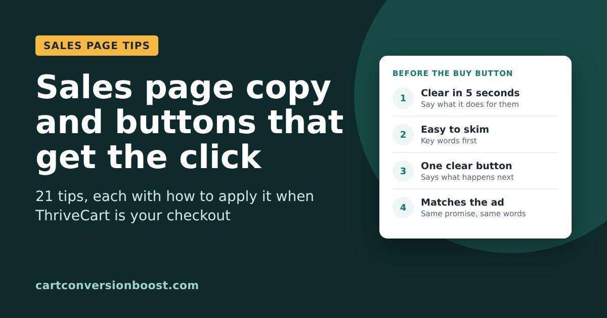
Below are 21 tips for sales page copy and call to action buttons, each with how to do it if you sell with ThriveCart. They’re pulled from research by Nielsen Norman Group, HubSpot, Unbounce, SamCart and others.
And we add to this page as we find more.
In this guide
- Make it clear in five seconds
- Write for people who skim
- Buttons that get the click
- Match the page to the visitor
Make it clear in five seconds
Before anyone reads your copy closely, they decide whether it’s for them. These six tips make that decision easy.
Tip 1: Check a newcomer can tell what you sell in five seconds
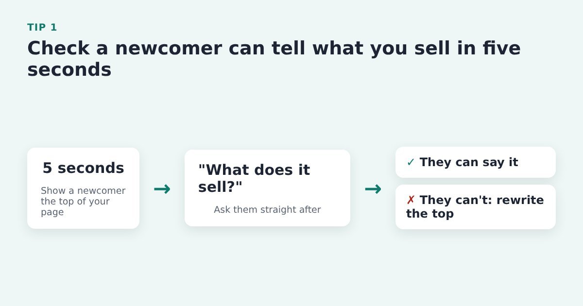
Visitors skim the top of a page and decide quickly whether to stay. If they can’t say what you sell, they won’t scroll down to the button.
Do it with ThriveCart: show the top of your sales page (everything above the first Buy button) to someone who doesn’t know the product for five seconds, then ask what you sell. If they can’t say, rewrite the top before you change anything else.
Source: HubSpot, landing page best practices
Tip 2: Open with the one thing you want visitors to remember
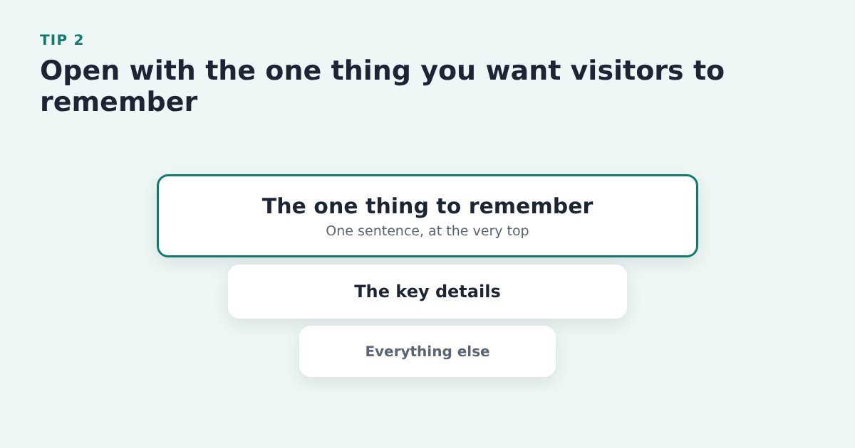
Plenty of visitors only read the first lines, so the most important message has to come first. The detail can follow underneath.
Do it with ThriveCart: write that one sentence at the top of your sales page in your page builder (Thrive Architect, Elementor or similar), not in ThriveCart. The sales page is where people decide; the checkout is where they pay.
Source: Nielsen Norman Group, inverted pyramid
Tip 3: Say what the product does for the buyer, not what it is
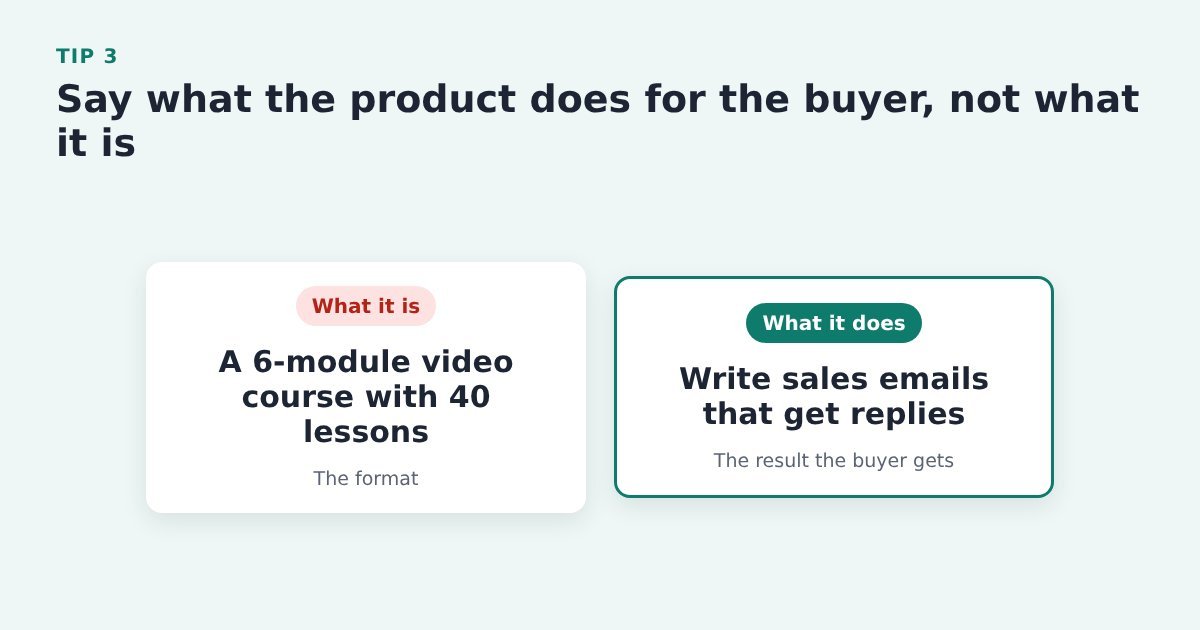
People buy the result. “Six modules and 40 lessons” describes the box; the outcome tells them why it matters to them.
Do it with ThriveCart: rewrite the headline and first paragraph of the sales page that leads to your ThriveCart checkout around the result the buyer gets, and move the format (modules, videos, downloads) further down.
Source: PinnacleCart, ways to increase add-to-cart rate
Tip 4: Make your tagline too specific to fit anyone else
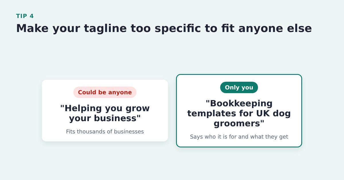
A tagline that could describe thousands of other businesses tells the visitor nothing about why you’re the right choice.
Do it with ThriveCart: in your page builder, rewrite the line under your headline so it names who the product is for and what they get. Nothing needs to change in ThriveCart.
Source: Nielsen Norman Group, summaries that build trust
Tip 5: Spell out the specific gains next to the Buy button
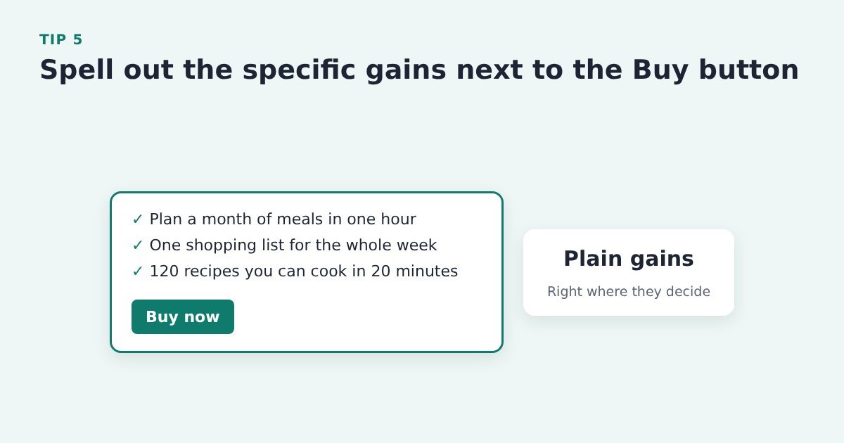
The button is where people make the call, so the reasons to say yes belong right beside it, in plain words, not three screens up.
Do it with ThriveCart: add three or four specific gains just above the button that leads to your ThriveCart checkout (or to your opt-in), in the words a buyer would use.
Source: SamCart, strategies to maximize your conversion rate
Tip 6: Swap buzzwords for facts a buyer cares about
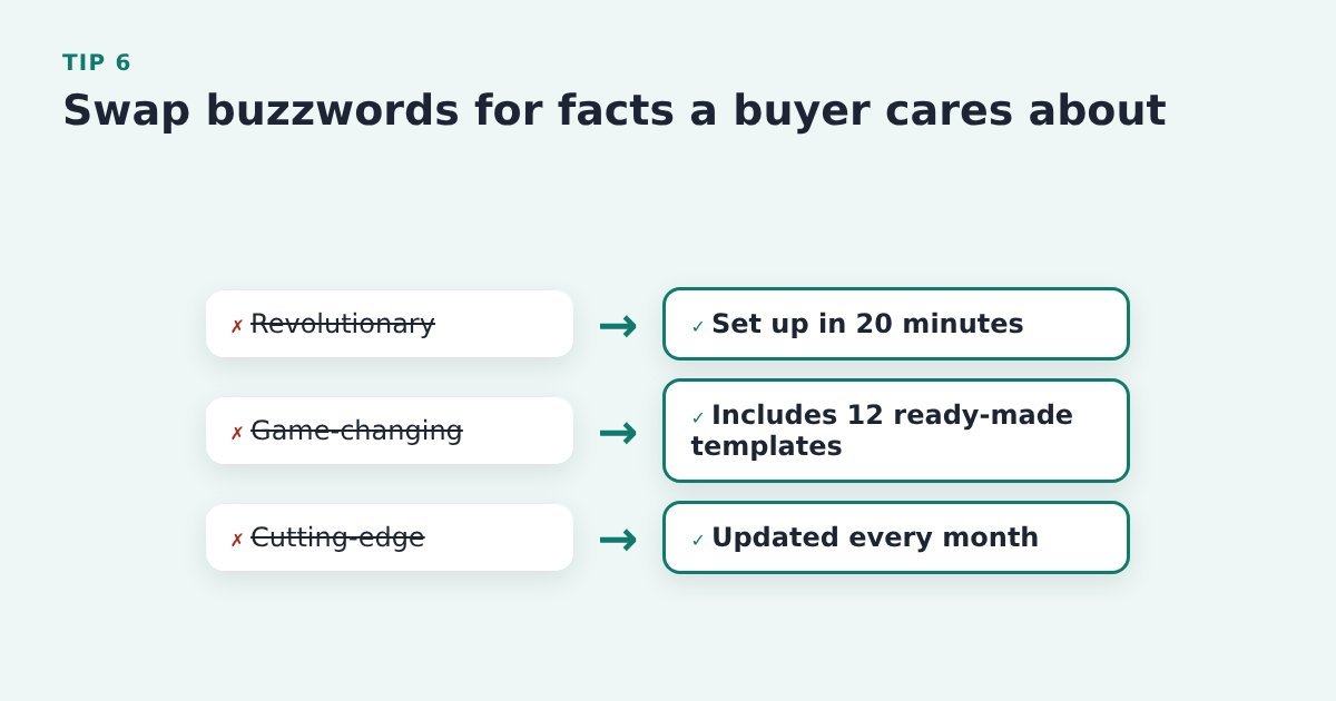
Words like “revolutionary” make a claim with nothing behind it, and Nielsen Norman Group warns that empty buzzwords can make visitors trust you less.
Do it with ThriveCart: search your sales page for words like “revolutionary”, “game-changing” and “cutting-edge” and replace each one with a concrete fact: how long setup takes, what’s included, how often it’s updated. Edit this in your page builder, not in ThriveCart.
Source: Nielsen Norman Group, summaries that build trust
Write for people who skim
Most visitors don’t read a sales page line by line. They scan the headings, the start of each paragraph and anything in bold. These tips make sure what they catch is what matters.
Tip 7: Put the most useful words at the start of each heading
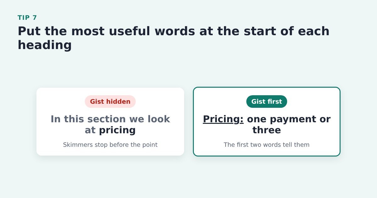
Eye-tracking research shows people read the first words of a heading and skip the rest, so the first two words need to carry the gist.
Do it with ThriveCart: go through every heading on your sales page in your page builder and move the key word to the front: “Pricing: one payment or three”, not “In this section we look at pricing”.
Source: Nielsen Norman Group, F-shaped reading pattern
Tip 8: Start each section with its most important point
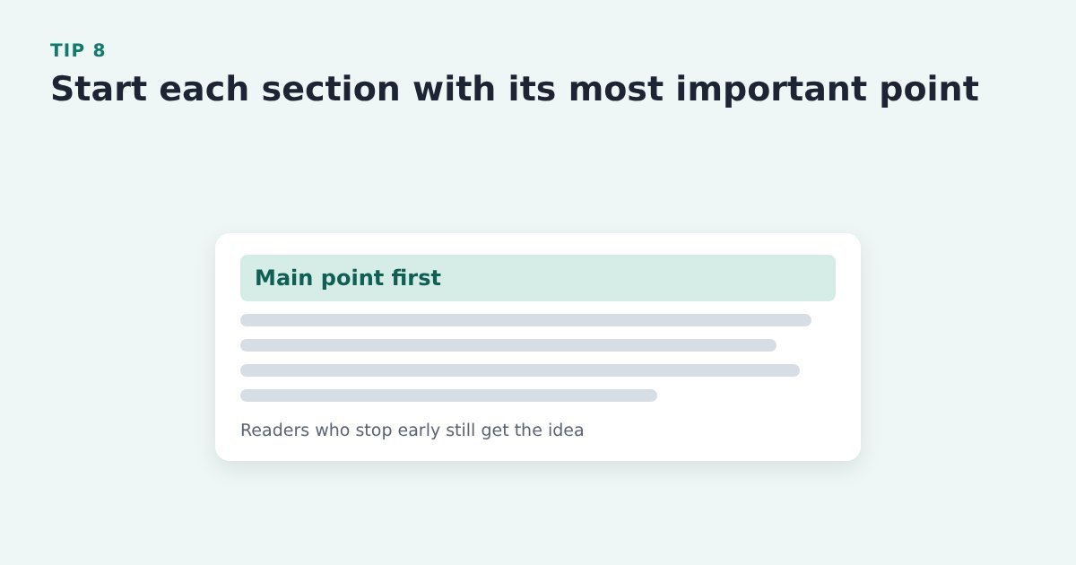
Readers who stop after a sentence or two still leave with the main idea.
Do it with ThriveCart: in your page builder, make the first sentence of each section and paragraph the point itself, then add the detail after it.
Source: Nielsen Norman Group, inverted pyramid
Tip 9: Bold the few words that carry the benefit
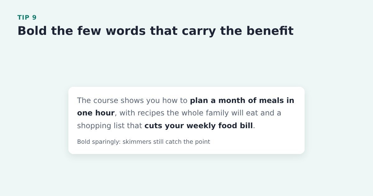
Bold phrases catch a skimming eye, but only when there are a few of them. Bold everything and nothing stands out.
Do it with ThriveCart: format the copy in your page builder and bold only the benefit phrases, a few per section. ThriveCart doesn’t come into it.
Source: Nielsen Norman Group, F-shaped reading pattern
Tip 10: Turn lists and steps into bullets or numbers
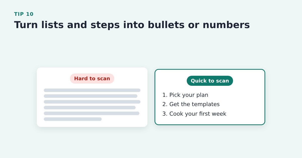
A list is quicker to scan than a paragraph, so benefits and steps set out this way are far more likely to be read.
Do it with ThriveCart: in your page builder, turn your “what’s included” and “how it works” paragraphs into bulleted or numbered lists.
Source: Nielsen Norman Group, F-shaped reading pattern
Tip 11: Add a short video that shows what they are buying
Seeing the product in use, or a quick walk through what’s inside, answers “what exactly do I get?” faster than any paragraph.
Do it with ThriveCart: add a short explainer or walkthrough video to your sales page in your page builder, near the top or just before the Buy button, and keep it short.
Source: MailerLite, e-commerce conversion tactics
Buttons that get the click
Two kinds of ThriveCart seller. If your Buy button goes straight to ThriveCart, its only job is to get people to the checkout, and you can follow up only with the abandoners who typed their details into it. If your Buy button opens a short opt-in for name and email first, you already have everyone who clicked and can follow up with all of them. Your job then is to make that opt-in feel like the first step of the order, and to spare buyers typing the same details again at ThriveCart.
The button tips below work either way.
Tip 12: Give each page one main call to action
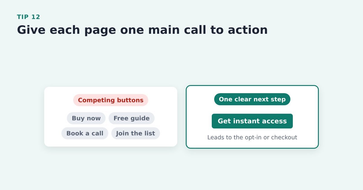
Several competing buttons make visitors choose between them, and some choose nothing. One obvious next step is easier to take.
Do it with ThriveCart: decide on the single next step (the button that leads to your opt-in or your ThriveCart checkout) and make it the one that stands out. Move other links, like free guides or booking a call, off the page or turn them into quiet text links.
Source: PinnacleCart, ways to increase add-to-cart rate
Tip 13: Use plain button text, not clever wording
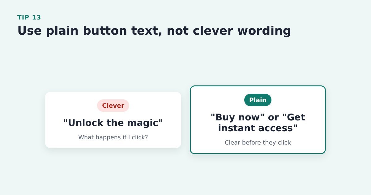
Clarity beats creativity on a button. People should know what will happen before they click.
Do it with ThriveCart: use plain wording like “Buy now” or “Get instant access” on the button that leads to ThriveCart.
Source: PinnacleCart, ways to increase add-to-cart rate
Tip 14: Label the button with what happens next

Vague labels like “Get started” or “Learn more” leave people guessing, and Nielsen Norman Group found that “Get started” can stop users in their tracks.
Do it with ThriveCart: name the next step on the button before ThriveCart, for example “Get instant access”, “Take the 2-minute quiz” or “See the course modules”.
Source: Nielsen Norman Group, “Get Started” stops users
Tip 15: Make sure the button keeps its promise
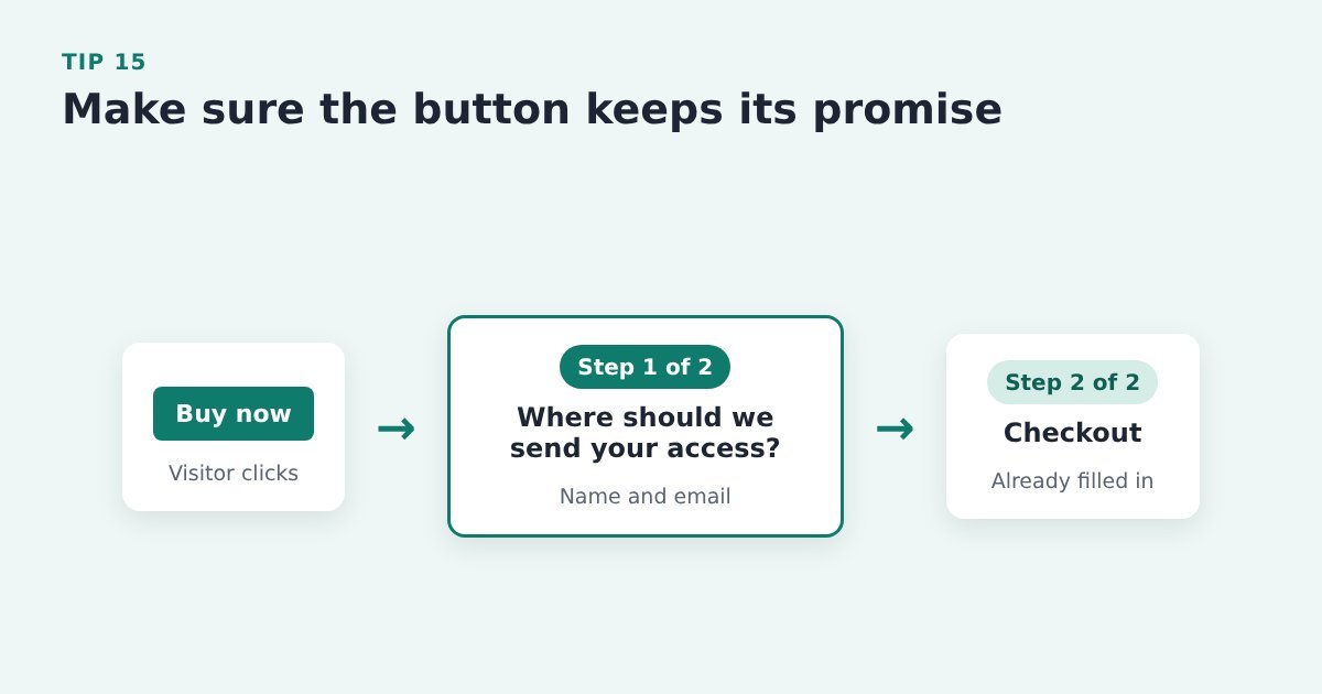
If the label says one thing and the next screen does another, people feel tricked and leave.
Do it with ThriveCart: if your Buy button opens a pre-cart opt-in, make the popup read like step 1 of the order (“Step 1 of 2: where should we send your access?”), not like a newsletter sign-up. Then pass the details on so the ThriveCart checkout opens already filled in. As a bonus, your abandoned cart emails can now reach everyone who clicked Buy.
Source: Nielsen Norman Group, “Get Started” stops users
Tip 16: Show different visitors a different call to action
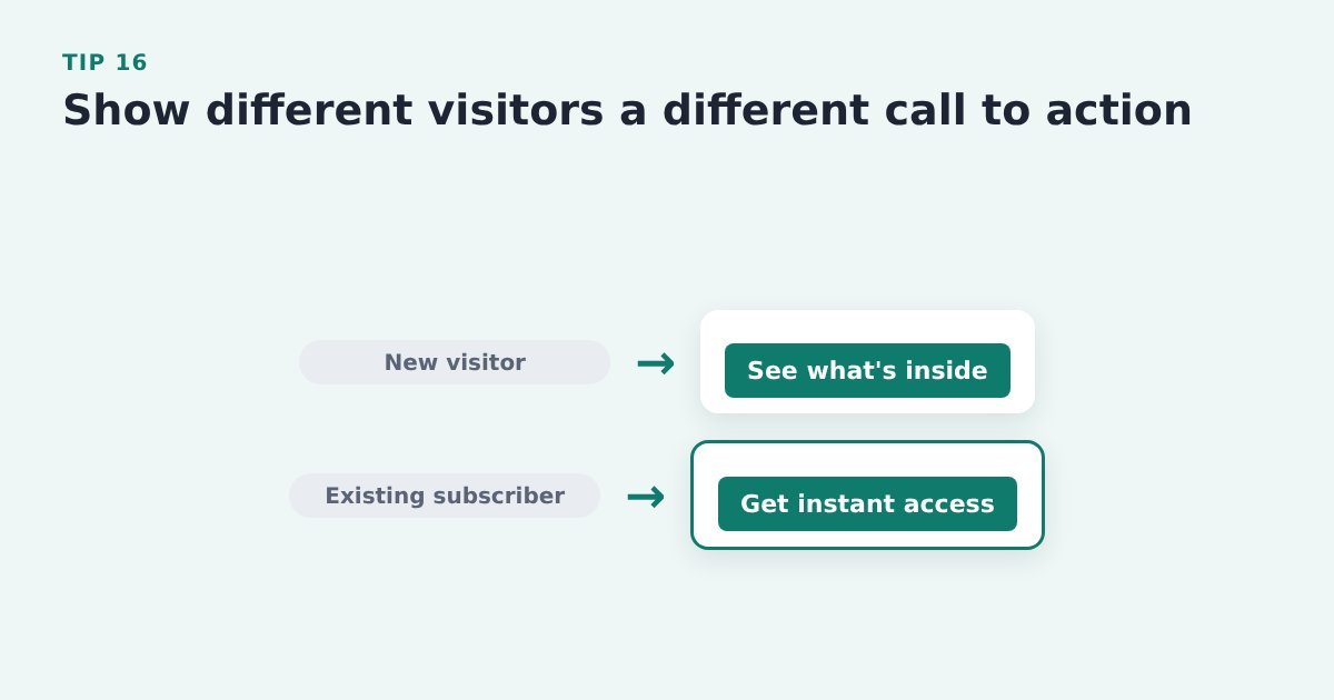
Someone who already knows you needs a different nudge from a first-time visitor.
Do it with ThriveCart: where your page builder or email tool allows it, show existing subscribers a different button or offer from new visitors, for example “Get instant access” instead of “See what’s inside”.
Evidence: HubSpot reports that personalised calls to action converted 202% better than default versions. HubSpot, landing page best practices
Match the page to the visitor
Tip 17: Send ad traffic to a focused page, not your homepage
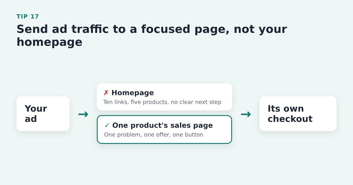
A homepage offers lots of choices. A focused page has one problem, one solution and one call to action, so more of your paid clicks reach the button.
Do it with ThriveCart: point each ad at the sales page for one product, or a landing page specifically for that ad, with its own ThriveCart checkout, rather than at your homepage.
Source: giosg, shopping cart conversion rate trends
Tip 18: Make the page match the ad or email that sent them
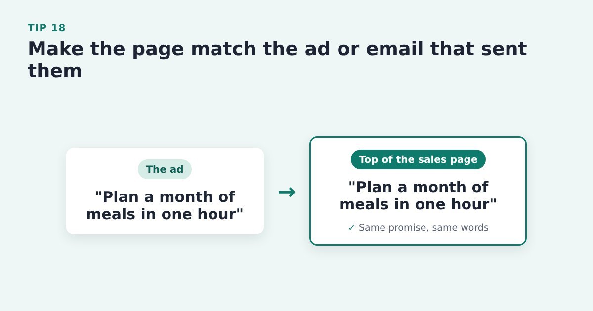
When the headline and offer match what they just clicked, visitors know they’re in the right place and keep reading.
Do it with ThriveCart: repeat the headline idea and the offer from the ad or email, in the same words, at the top of the sales page that leads to ThriveCart.
Source: Unbounce, how to increase conversion rates
Tip 19: Lead with your main option and label it
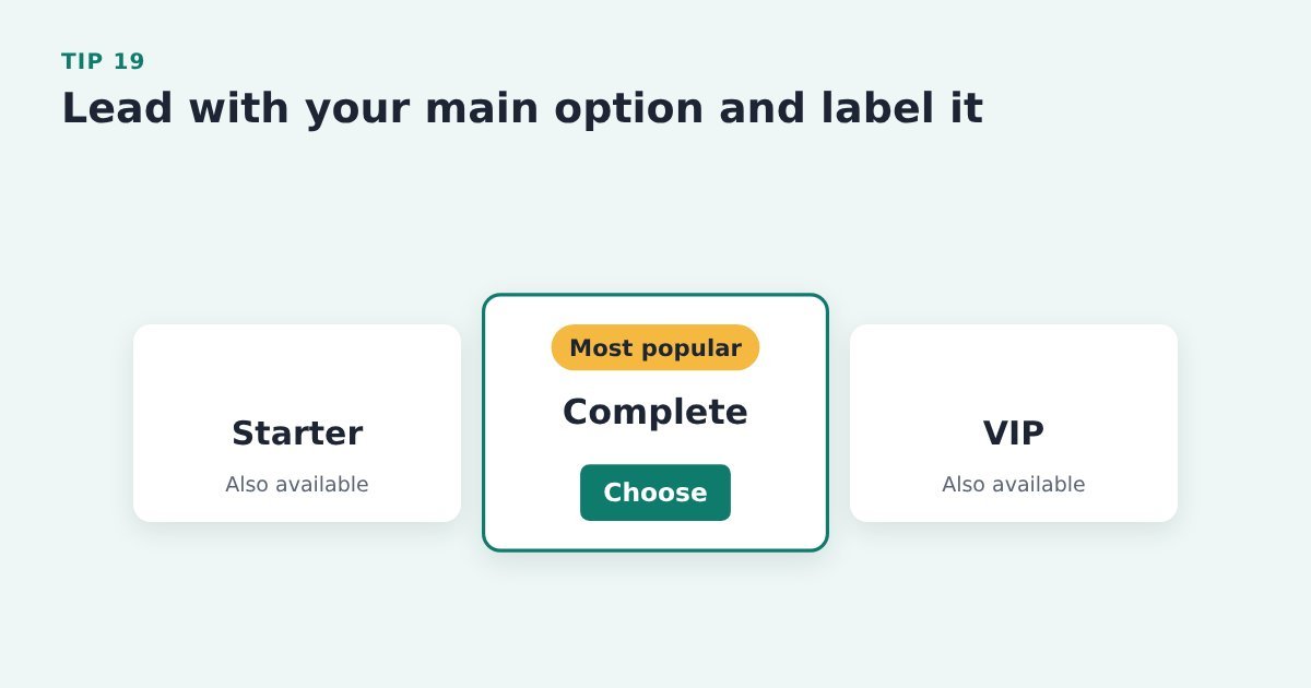
A row of equal choices makes deciding harder. Labelling one clearly gives people a safe default.
Do it with ThriveCart: if you sell several options or ThriveCart pricing options (pay in full or a payment plan, say), label your main one on the sales page (“Most popular”) and lead with it, so it’s the first thing the eye lands on.
Source: PinnacleCart, ways to increase add-to-cart rate
Tip 20: Use a short quiz to point visitors to the right product
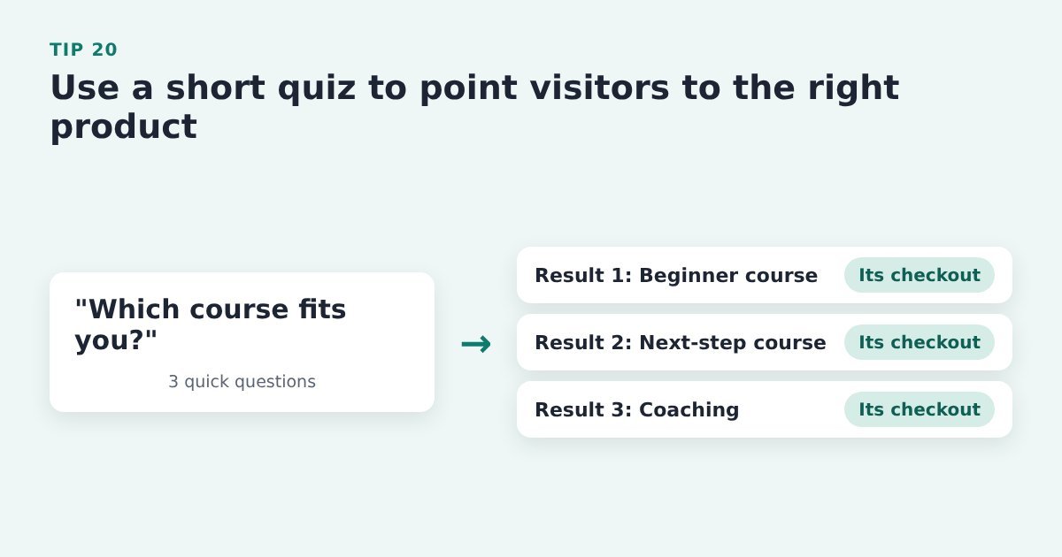
If you sell more than one product, a few quick questions can show people which one fits, rather than leaving them to compare.
Do it with ThriveCart: build a short quiz with your quiz or form tool and link each result to that product’s sales page or ThriveCart checkout.
Source: SamCart, strategies to maximize your conversion rate
Tip 21: Answer real buyer questions in a short FAQ

An unanswered doubt is a reason not to click. An FAQ built from questions buyers actually ask deals with them on the page.
Do it with ThriveCart: pull the questions from your support emails, chat messages and social comments, answer each in a line or two, and put the FAQ above the last Buy button on the sales page.
Source: HubSpot, landing page best practices
Make every click count
These tips get more people to click your Buy button. What happens after the click matters just as much: around 70% of people who reach a checkout leave without buying (Baymard, 2026). If you’ve got a launch coming up or you’re putting more into ads, fix both ends before the traffic arrives. Our ThriveCart checkout tips cover the other end.
A pre-cart opt-in helps with both: the Buy button opens a short popup asking for name and email, so you can follow up with everyone who clicked, not just the people ThriveCart recorded. Make sure to follow the proven 5-steps to increase your sales conversion, so it all works together as a flow that ends in a completed sale.
Cart Conversion Boost is the free WordPress plugin that carries those details into the ThriveCart checkout, so it opens already filled in and buyers never type them twice. It works with the opt-in form on your WordPress site (see the tools it works with). The full 5-step process is free to read.
Sources: Baymard Institute, cart abandonment rate; Nielsen Norman Group, F-shaped reading pattern; Nielsen Norman Group, inverted pyramid; Nielsen Norman Group, “Get Started” stops users; Nielsen Norman Group, summaries that build trust; HubSpot, landing page best practices; Unbounce, how to increase conversion rates; SamCart, strategies to maximize your conversion rate; PinnacleCart, ways to increase add-to-cart rate; giosg, shopping cart conversion rate trends; MailerLite, e-commerce conversion tactics.
Leave a Reply