
Last updated 2 November 2026
“People click Buy, land on my ThriveCart checkout, look at the form and close the tab. I never find out what put them off.” If that sounds familiar, you’re not alone: around 70% of people who reach a checkout leave without buying (Baymard, 2026).
Some of that you can’t help. Some of it is the checkout itself: too many boxes, fields that fight autofill, error messages that don’t say what’s wrong. Every week it stays that way, every visitor you worked hard (or paid) to get, meets the same friction. Over a month that’s multiplying; over 90 days it can be a whole launch.
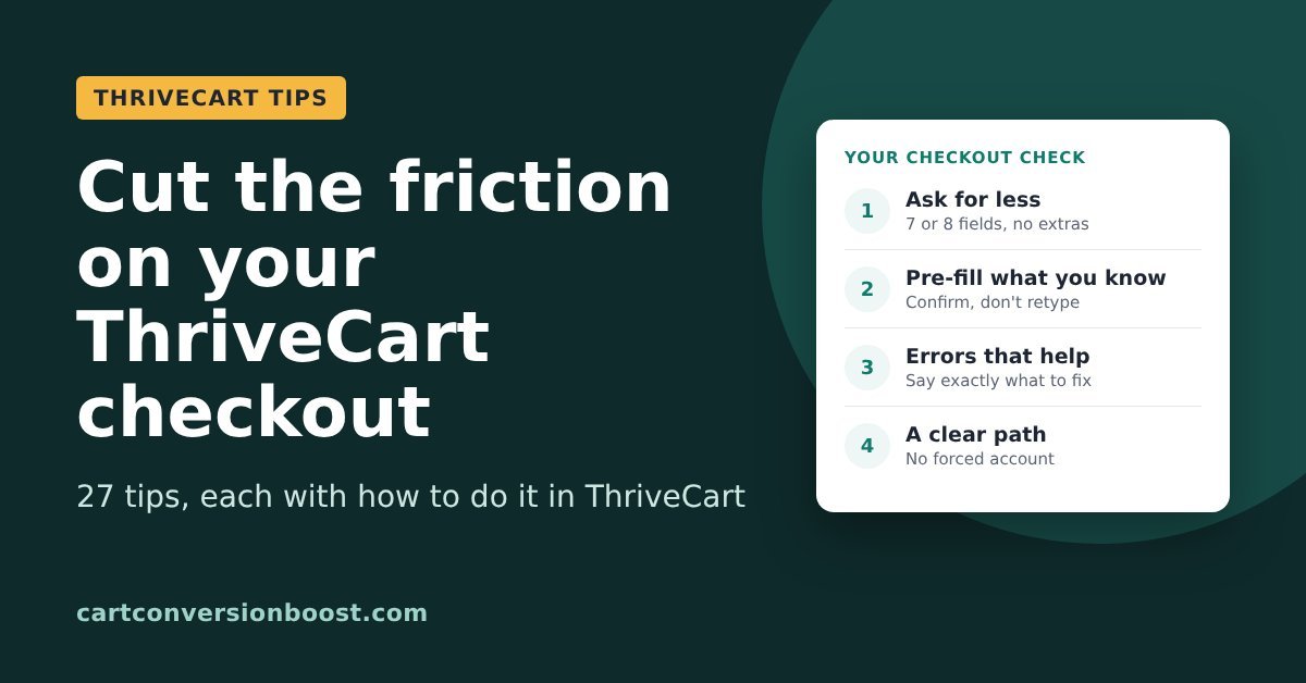
Below are 27 ways to cut that friction, drawn from the Baymard Institute’s checkout research, each with how to do it with ThriveCart. Work through them before your next launch or the next time your ad costs creep up, and we’ll add to this page as we find more.
In this guide
- Ask for less
- Don’t make them type it twice
- Make the form easy to read
- Errors that help instead of block
- The card fields
- Keep the path clear
Two kinds of ThriveCart seller. If your Buy button goes straight to ThriveCart, the checkout is the first place you ask for anything, and anyone who leaves before typing their name and email is gone without a trace. If you capture name and email before the cart (for example, a short opt-in popup on the Buy button), you already have their email and can follow up, so your friction is different: buyers being asked to type the same details again at ThriveCart.
Every tip below helps either way. Fewer, and friendlier fields means more people finish, whichever setup you have.
Ask for less
Tip 1: Cut your checkout to 7 or 8 fields

Every box on the form is something to read, think about and fill in. Cut anything you don’t strictly need to take payment and deliver the product.
Do it with ThriveCart: go through the product’s checkout settings and turn off every field a digital product doesn’t need, such as address, phone and company name.
Evidence: Baymard’s research puts the ideal checkout at 12 to 14 form elements (7 or 8 fields), while the average US checkout shows 23.48. Baymard Institute, cart abandonment rate statistics
Tip 2: Ask for a phone number only if you really need it
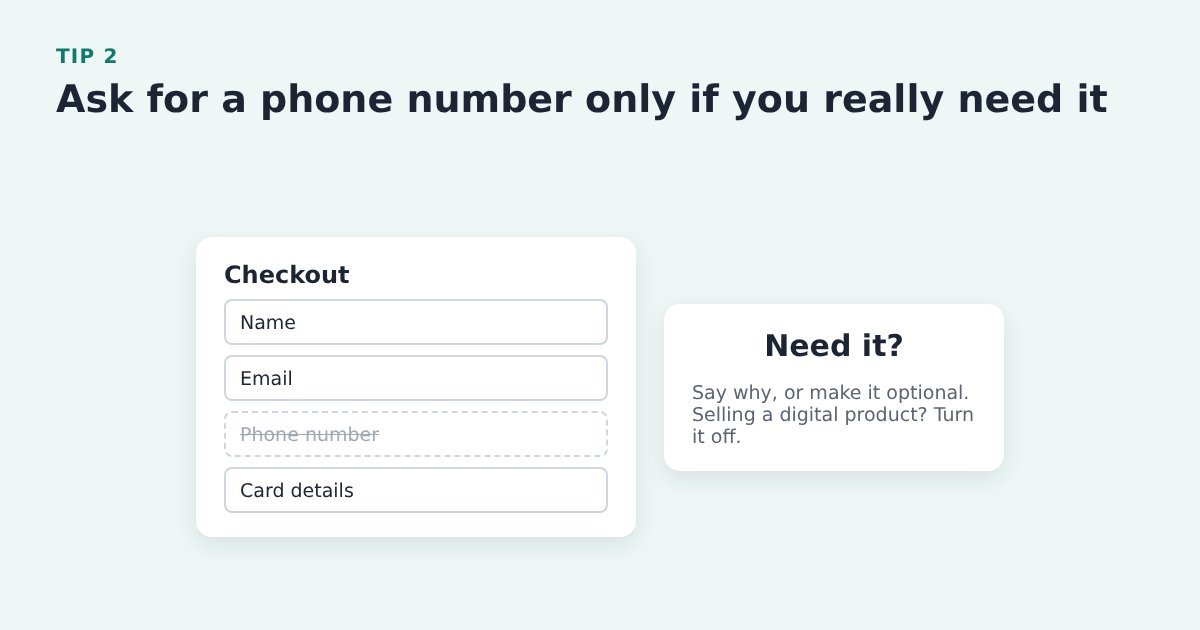
Lots of people don’t want to hand over a phone number to buy a course or a download. If you do need it, say why.
Do it with ThriveCart: turn the phone field off in the product’s checkout settings for digital products, or make it optional.
Evidence: Baymard found over 70% of surveyed shoppers were reluctant to share a phone number. Baymard Institute, current state of checkout UX
Tip 3: Don’t ask for date of birth or gender unless you need them

Every personal question you don’t need gives a hesitant buyer one more reason to leave.
Do it with ThriveCart: check which fields your checkout asks for in the product’s checkout settings, and remove or make optional anything you don’t use.
Evidence: Baymard: 27% of online shoppers are reluctant to give their date of birth, and 14% their gender. Baymard Institute, phone number UX
Tip 4: Hide rarely used optional fields behind a link
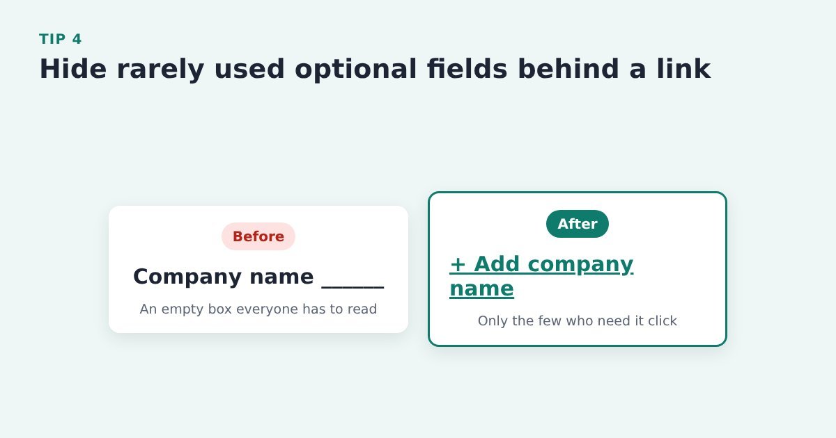
An empty “Company name” box makes everyone stop and wonder if they need it. A small “Add company name” link only gets clicked by the few who do.
Do it with ThriveCart: remove optional fields like company name from the checkout unless your buyers need them for invoices.
Evidence: Baymard found rarely used optional fields slowed checkout by 5 to 30%. Baymard Institute, current state of checkout UX
Tip 5: Use one Full Name field, not two
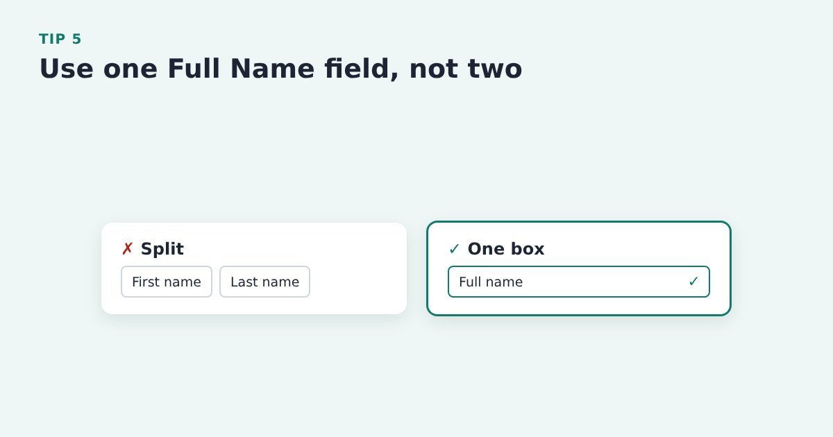
Split first and last name boxes trip people up, and plenty type their whole name into the first box anyway.
Do it with ThriveCart: check the product’s checkout settings for the name fields shown. If you capture name and email before the cart and pass them in, buyers rarely have to type their name at all.
Evidence: Baymard: 89% of benchmarked sites use more than one name field, and 42% of test participants typed their full name into the first-name box at least once. Baymard Institute, checkout form fields
Tip 6: Combine split fields into one box
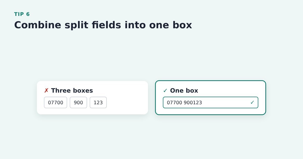
A phone number split across three boxes means three chances to get it wrong. Fewer boxes, fewer mistakes.
Do it with ThriveCart: keep each checkout field as a single box (one name field, one phone field) rather than adding split custom fields.
Source: Baymard Institute, form design best practices
Don’t make them type it twice
Tip 7: Pre-fill what you already know
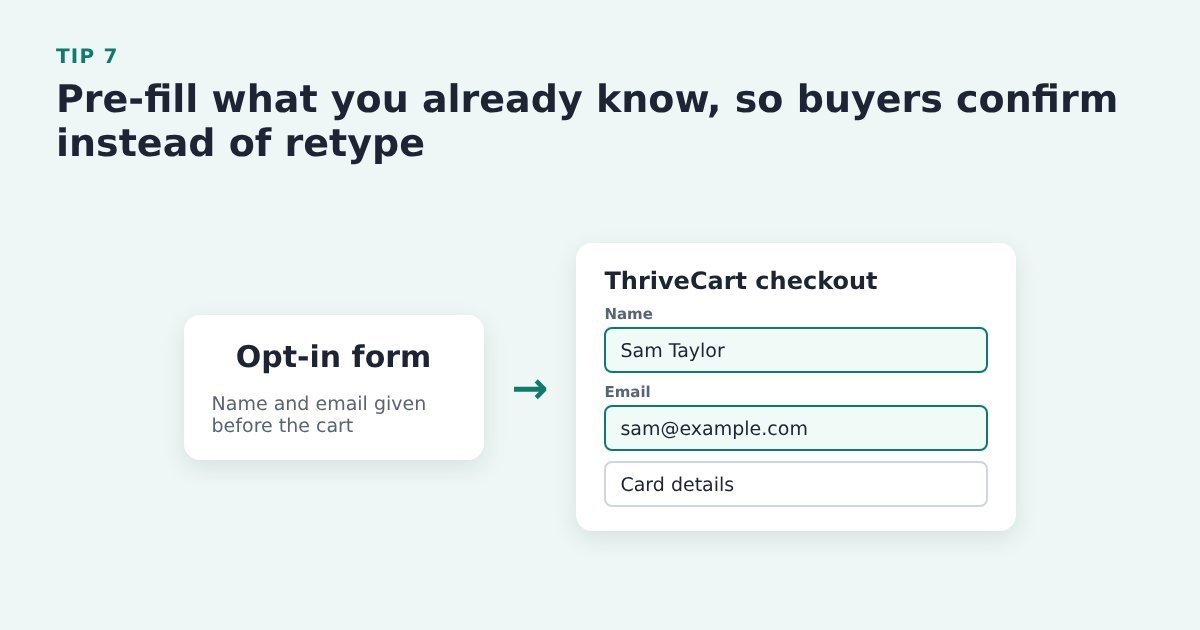
If someone has already given you their name and email, asking again is pure friction. Let them confirm instead of retype.
Do it with ThriveCart: if you capture name and email before the cart, pass them into the ThriveCart checkout so it opens already filled in. This is exactly what the free Cart Conversion Boost plugin does. If you also send recovery emails, see our ThriveCart abandoned cart email tips.
Source: Baymard Institute, form design best practices
Tip 8: Make sure every field works with browser autofill
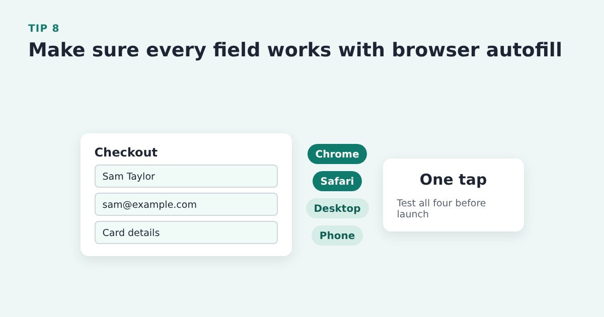
Autofill lets a buyer fill the whole form in a tap. If a field fights it, they’re back to typing on a phone keyboard.
Do it with ThriveCart: test autofill on your ThriveCart checkout in Chrome and Safari, on desktop and on a phone, before every launch.
Source: Baymard Institute, how to reduce cart abandonment
Tip 9: If an error appears, keep the card details they already typed
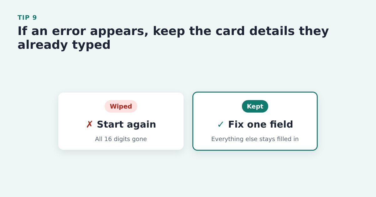
Nobody wants to type 16 digits twice. Clear only the field that needs fixing.
Do it with ThriveCart: trigger a card error in ThriveCart’s test mode and check the rest of the details stay filled in. Card fields come from your payment gateway, so raise anything odd with them or ThriveCart support.
Evidence: Baymard: on more than a third of test sites, errors cleared the card data users had typed. Baymard Institute, card number field must auto-format spaces
Make the form easy to read
Tip 10: Lay out the form in one column
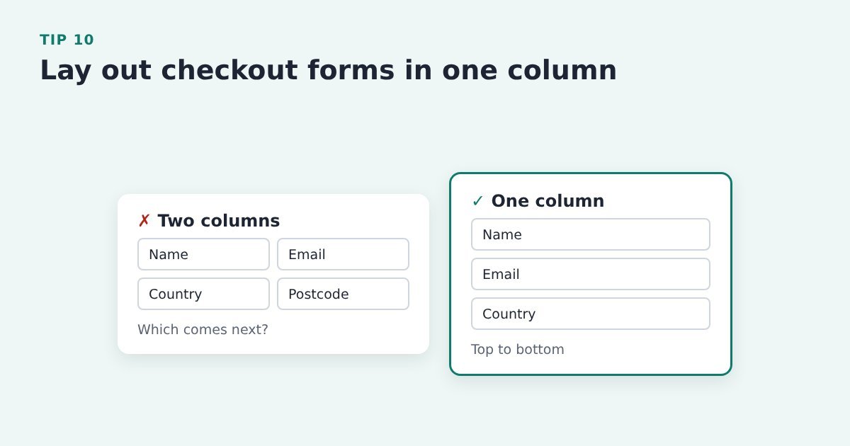
Two-column forms leave people unsure which field comes next. One column reads top to bottom.
Do it with ThriveCart: pick a ThriveCart checkout template that stacks fields in one column, and check it on a phone.
Source: Baymard Institute, form design best practices
Tip 11: Put labels above the fields, not just inside them
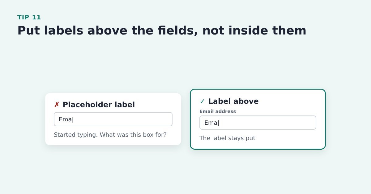
Placeholder text vanishes the moment someone starts typing, so they lose track of what the box was for.
Do it with ThriveCart: check your ThriveCart template keeps a visible label above each field. If labels disappear when you type, try another template.
Source: Baymard Institute, form design best practices
Tip 12: Mark both required and optional fields clearly
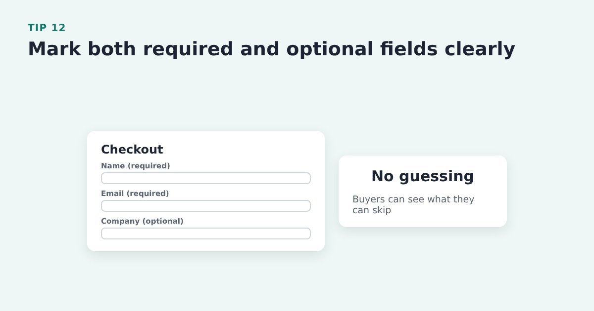
If only the optional fields are marked, people miss the required ones, and vice versa. Don’t make buyers guess.
Do it with ThriveCart: check your template shows which fields are required and which are optional, and make any extra fields clearly optional.
Evidence: Baymard: 32% of test participants missed a required field when only optional fields were marked. Baymard Institute, current state of checkout UX
Errors that help instead of block
Tip 13: Check each field as the buyer leaves it

Mistakes are easier to fix one at a time than all at once after pressing Pay.
Do it with ThriveCart: test your ThriveCart checkout in test mode with deliberate typos, and note which errors appear and when. Card fields come from the payment gateway, so you can test them but not restyle them.
Evidence: Baymard: 31% of sites in its checkout benchmark have no inline validation at all. Baymard Institute, inline form validation
Tip 14: Don’t flag a blank field before they’ve had a chance to type
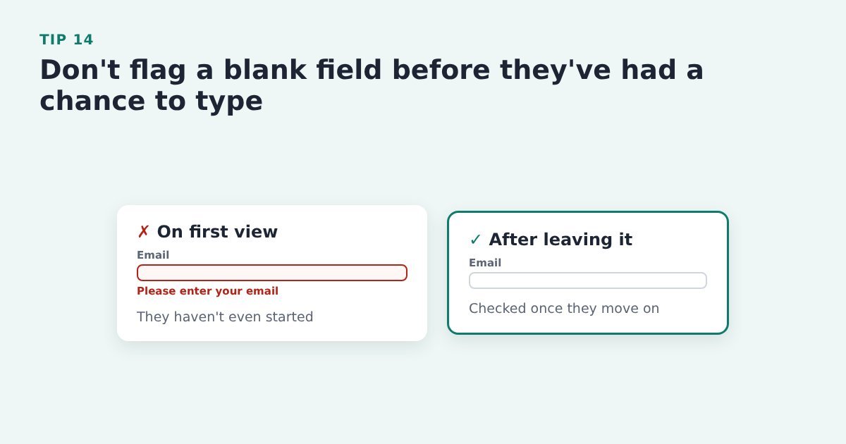
A red error on a box nobody has touched yet feels like being told off before you’ve started.
Do it with ThriveCart: click through your checkout in test mode and watch for warnings on untouched fields. If you see any, raise it with ThriveCart support rather than working around it.
Source: Baymard Institute, inline form validation
Tip 15: Show a tick when a field is filled in correctly
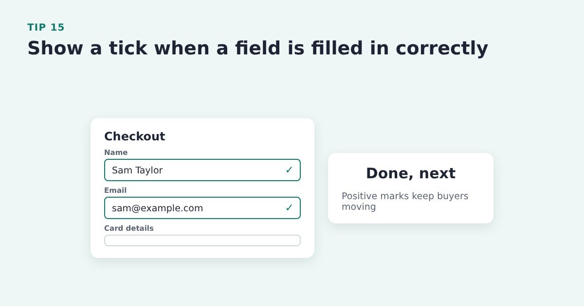
Positive confirmation tells the buyer a field is done and keeps them moving, rather than only shouting when something’s wrong.
Do it with ThriveCart: check whether your checkout template confirms correct entries, and compare templates in test mode. Gateway card fields can’t be restyled.
Source: Baymard Institute, inline form validation
Tip 16: Say exactly what to fix, not just “Invalid input”

“Card number is missing 2 digits” gets fixed in a second. “Invalid input” gets a sigh and sometimes a closed tab.
Do it with ThriveCart: the wording on the card fields comes from your payment gateway, so test a mistyped card on your checkout and check the message is clear.
Evidence: Baymard: 94% of sites still use generic validation errors. Baymard Institute, current state of checkout UX
Tip 17: Take the buyer straight to the first problem
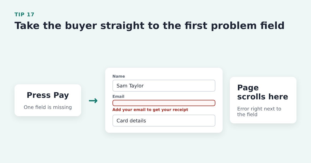
Don’t make people hunt up and down the page to find out what went wrong.
Do it with ThriveCart: in test mode, submit your checkout with a required field left blank and see where the page lands. Report anything confusing to ThriveCart support.
Source: Baymard Institute, the checkout UX guide
Tip 18: Don’t reject valid details, like a + sign in an email
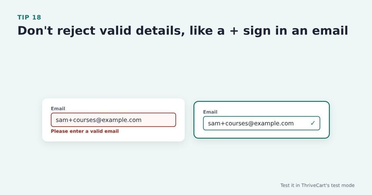
Some buyers use addresses like name+courses@example.com. If the form rejects them, they can’t buy.
Do it with ThriveCart: place a test order in ThriveCart’s test mode using an email with a + sign and check it’s accepted.
Source: Baymard Institute, form design best practices
The card fields
The card fields on a ThriveCart checkout come from your payment gateway (Stripe, PayPal and so on), so you can’t restyle them. You can test them, though, and raise anything that trips buyers up.
Tip 19: Let buyers type spaces in the card number
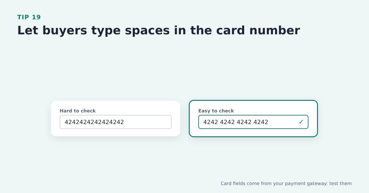
People read card numbers in groups of four. Accepting spaces, and adding them automatically, makes typos easy to spot.
Do it with ThriveCart: card fields come from your payment gateway, so test typing a card number with spaces on your ThriveCart checkout.
Evidence: Baymard: 15% of benchmarked ecommerce sites don’t auto-format spaces in the card number field. Baymard Institute, card number field must auto-format spaces
Tip 20: Format the expiry date as MM / YY, like the card
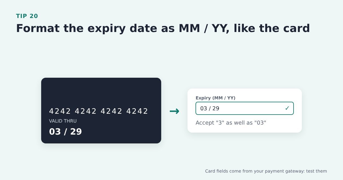
Buyers copy what’s printed on the card. A field that matches it, and accepts “3” as well as “03”, avoids needless errors.
Do it with ThriveCart: the expiry field comes from your gateway too, so test it on your checkout on desktop and on a phone.
Evidence: Baymard: 72% of benchmarked sites don’t match their expiry date fields to the format on physical cards. Baymard Institute, format expiry date fields like the card
Keep the path clear
Tip 21: Don’t make buyers create an account before they pay

An account form standing between someone and the Pay button is a hurdle they didn’t ask for.
Do it with ThriveCart: ThriveCart’s checkout doesn’t need an account to buy. Keep any member area login, such as ThriveCart Learn, for after purchase.
Evidence: Baymard: 18% of US shoppers abandoned because the site required an account. Baymard Institute, current state of checkout UX
Tip 22: Offer an account on the thank-you page, after they’ve paid
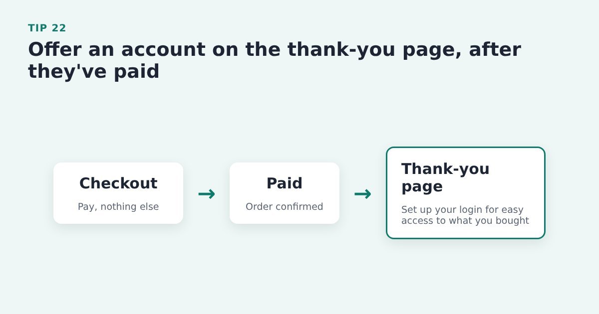
Once they’ve paid, an account is a benefit (easy access to what they bought) rather than a barrier.
Do it with ThriveCart: let people buy without an account, and offer member access, for example to ThriveCart Learn, on the success page.
Evidence: Baymard: 42% of benchmarked sites interrupt users before or during checkout to suggest creating an account. Baymard Institute, save account creation for the confirmation step
Tip 23: If you need a password, keep the rules simple
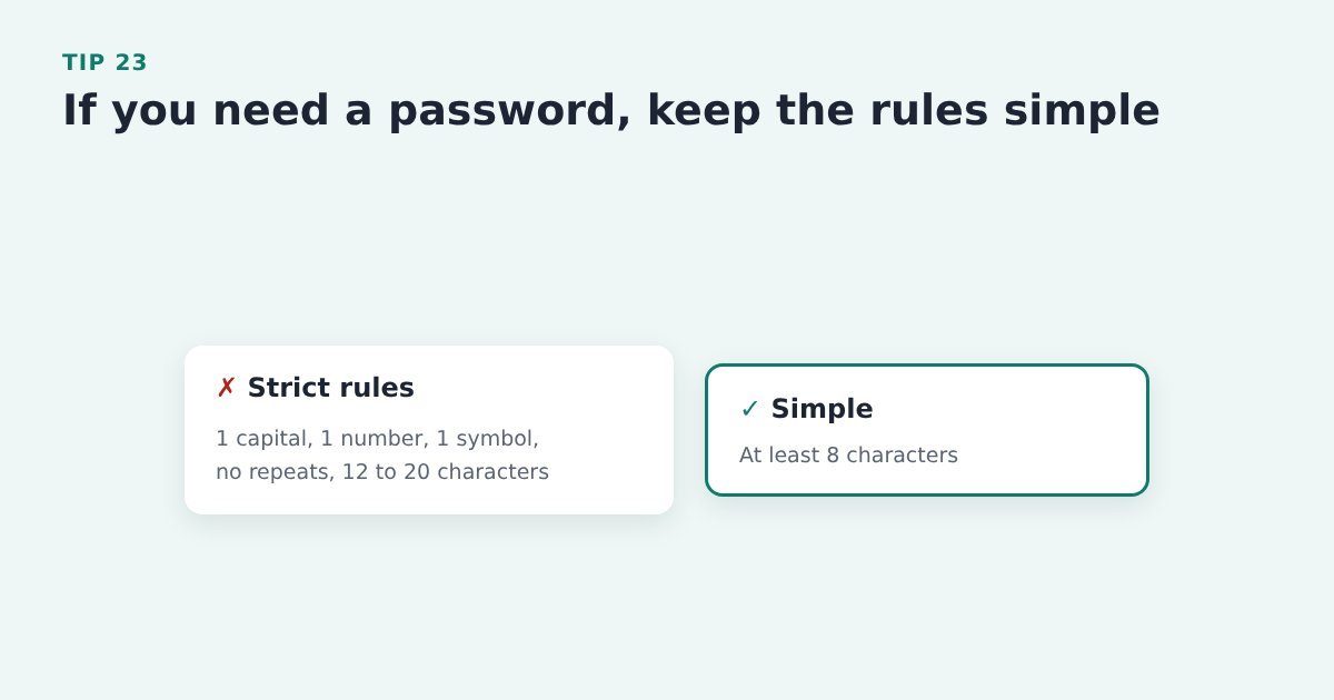
Strict rules (a capital, a number, a symbol) mean failed attempts and locked-out buyers. A simple minimum length is enough for most.
Do it with ThriveCart: if buyers need a login after purchase for a member area, keep your password rules to a simple minimum length.
Evidence: Baymard: strict password rules caused up to 19% abandonment among returning users who had sign-in trouble. Baymard Institute, current state of checkout UX
Tip 24: Use an enclosed checkout with one way back
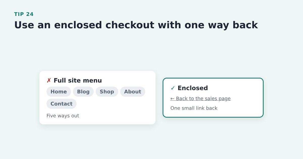
A full site menu on the checkout is five ways out. One small link back to the sales page is enough.
Do it with ThriveCart: use a ThriveCart checkout without your site menu. If you embed the checkout on one of your own pages, use a layout without the main menu and add one small link back to the sales page.
Source: Baymard Institute, how to reduce cart abandonment
Tip 25: Tuck the coupon box behind a small link
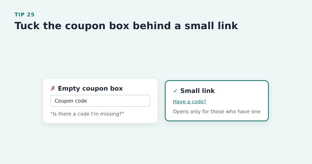
An empty coupon box sends buyers without a code off to search for one, and some never come back. 8% of people do that. That is a lot of lost sales.
Do it with ThriveCart: check whether your checkout shows a coupon box. If you don’t run coupons, make sure it isn’t showing. If you do, send any codes as a link instead.
Better yet, put the coupon option below the “Pay” button and hide it behind a link to open the coupon box. People with a coupon will find it. People without a coupon will ignore it.
Source: Baymard Institute, avoid Apply buttons in checkout
Tip 26: Don’t make buyers click Apply to save their details
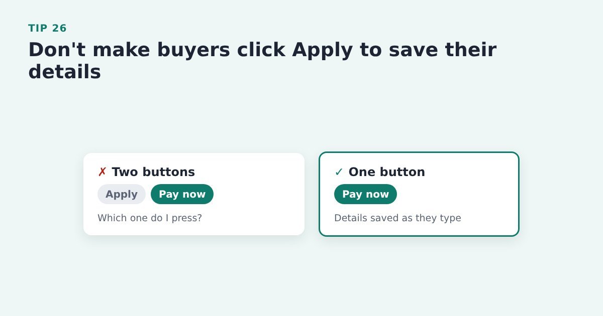
An extra “Apply” button next to “Pay now” makes people stop and wonder which to press. Keep one main button.
Do it with ThriveCart: go through your checkout looking for any extra apply clicks (coupons are the usual one) and remove them where you can.
Evidence: Baymard: 22% of benchmarked sites still require users to select an Apply button to save checkout inputs. Baymard Institute, avoid Apply buttons in checkout
Tip 27: Keep checkout a straight line
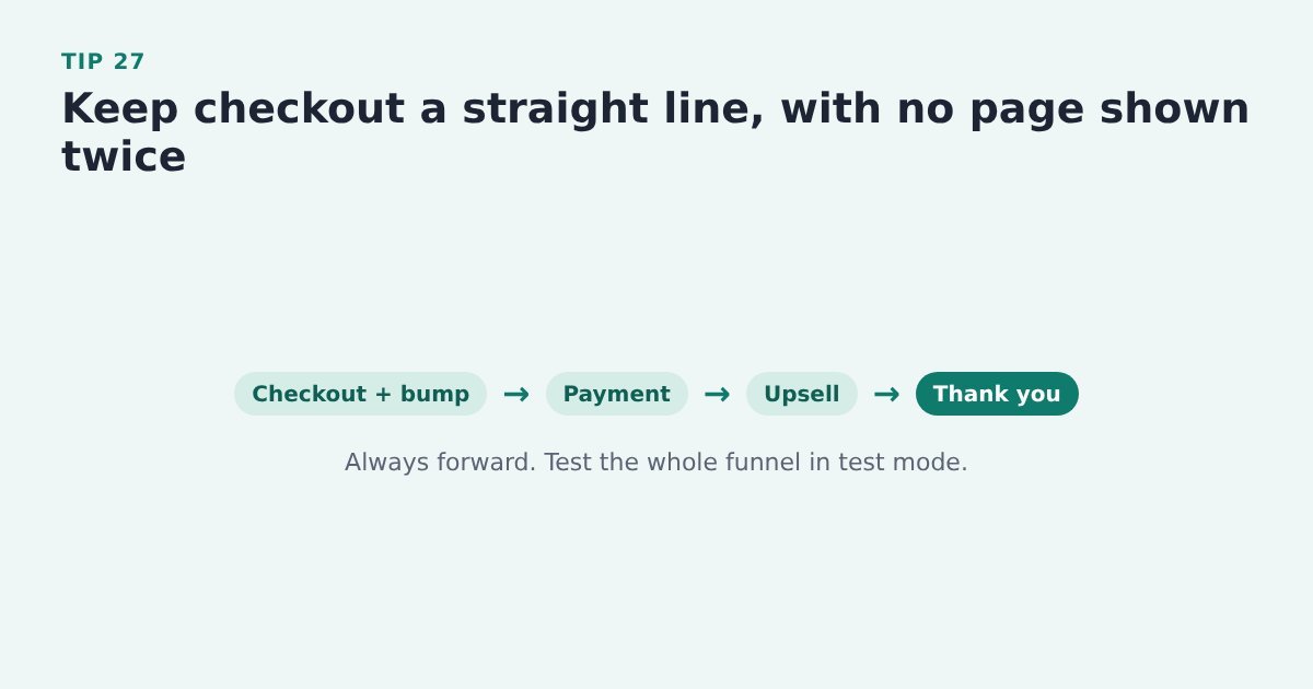
Showing the buyer the same page twice feels like going round in circles. Plan each step once so they always move forward.
Do it with ThriveCart: click through your whole ThriveCart funnel in test mode, including bumps, upsells and the success page, and check no step repeats.
Source: Baymard Institute, the checkout UX guide
Make your checkout the easy part
If a launch is coming up, or last month’s sales were quieter than the traffic deserved, the checkout is one of the cheapest places to look. Most of the tips above take minutes in ThriveCart and cost nothing.
The biggest single cut is not making buyers type their name and email at all. A pre-cart opt-in on your Buy button collects them first, so you can follow-up with the 70% who will abandon the cart.
And Cart Conversion Boost is the free WordPress plugin that carries them into the ThriveCart checkout, so the cart opens already filled in. It works with opt-in forms from tools like Thrive Leads, Kit, Flodesk, MailerLite, Mailchimp, ActiveCampaign, AWeber, GetResponse, BirdSend, Contact Form 7 and ConvertBox (see the full list). The full 5-step process is free to read.
Sources: Baymard Institute, cart abandonment rate statistics; Baymard Institute, form design best practices; Baymard Institute, current state of checkout UX; Baymard Institute, how to reduce cart abandonment; Baymard Institute, checkout form fields; Baymard Institute, inline form validation; Baymard Institute, the checkout UX guide; Baymard Institute, phone number UX; Baymard Institute, card number field must auto-format spaces; Baymard Institute, format expiry date fields like the card; Baymard Institute, save account creation for the confirmation step; Baymard Institute, avoid Apply buttons in checkout.
Leave a Reply