Cart Conversion Boost for WordPress and ThriveCart

Author: CartConversion

  • How to Measure and Test Your ThriveCart Funnel: 24 Tips

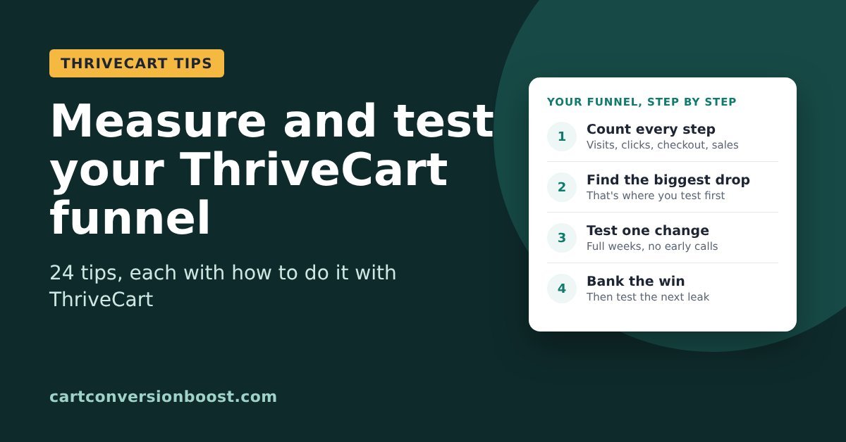
    How to Measure and Test Your ThriveCart Funnel: 24 Tips

    Last updated 16 November 2026

    “I keep changing my sales page and checkout, to optimise it for more sales, and I can’t tell if any of it made a difference.”

    If that sounds like you after a quiet sales month or a launch that came in under target, you probably have plenty of ideas. What’s missing is the numbers that show which ones work.

    Around 70% of people who reach a checkout leave without buying (Baymard, 2026).

    Some of that is normal. 42% are just browsing and not ready to buy (Baymard, 2026). But if you keep in touch with them, many will come back when you’ve helped them better understand your offering, and when they’re ready.

    Baymard bar chart, reasons for abandoning online purchases at checkout (2026 survey of 1,083 US adults, multiple answers allowed): browsing or not ready to buy 42%, extra costs too high 40%, delivery too slow 20%, did not trust the site with a credit card 19%, had to create an account 18%, too long or complex checkout 17%, website errors 17%, return policy 13%, could not see total cost upfront 12%, card declined 10%, not enough payment methods 9%, do not know 7%
    Source: Baymard Institute, 2026

    The part you can fix sits somewhere specific in your funnel: a step people skip, a field that errors on a phone, a page that looks fine on your laptop and broken on theirs. A week of guessing costs a week of sales. Leave it a month and you’ve paid for a month of traffic into the same leak. .

    Below are 24 tips for measuring and testing a funnel that ends in a ThriveCart checkout, each with how to do it with ThriveCart. They come from research by Baymard, CXL, Klaviyo, Shopify, HubSpot, PinnacleCart and ThriveCart itself.

    And we add to this page as we find more.

    In this guide

    1. Find where buyers drop off
    2. Decide what to test
    3. Run tests you can trust
    4. Keep improving after the test

    Find where buyers drop off

    Start by counting. ThriveCart shows you sales, and your website analytics shows you visits and clicks. Put the two side by side and the leak usually shows itself.

    Two kinds of ThriveCart seller. If your Buy button goes straight to ThriveCart, your funnel runs sales page, Buy click, checkout, sale, and you only know who left the checkout if they typed their name and email into it. If you capture name and email before the cart (for example, a short opt-in popup on the Buy button), you have one more step to measure and the email of everyone who clicked Buy, so you can follow up with all of them. The step to watch closely is then the checkout itself, where buyers are asked to type those same details again.

    Every tip below works either way.

    Tip 1: Track your funnel one step at a time
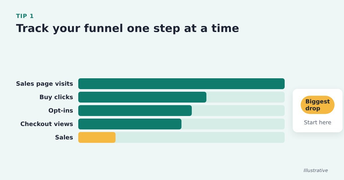
    Illustrative funnel chart with five steps: sales page visits, Buy clicks, opt-ins, checkout views and sales, with the biggest drop between two steps highlighted as the place to start

    One conversion rate tells you sales are low. Numbers for each step tell you where.

    Do it with ThriveCart: for the same week, count sales page visits, Buy button clicks, opt-ins (if you use one), checkout views and ThriveCart sales. The biggest drop between two steps is where you start.

    Source: PinnacleCart, ways to increase add-to-cart rate

    Tip 2: Find the checkout errors that happen most and fix those first
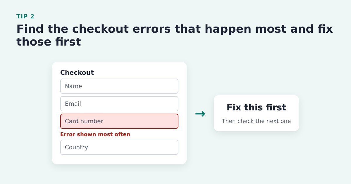
    A checkout form where one field is marked in red as the error shown most often, labelled fix this first

    A field that keeps throwing an error is a leak you can often fix in an afternoon.

    Do it with ThriveCart: connect your analytics in the tracking settings of your ThriveCart product and watch which step of the checkout loses most buyers. Then fill the checkout in yourself, on a phone and on a desktop computer, to see the error messages your buyers see.

    Source: Baymard Institute, current state of checkout UX

    Tip 3: Check conversion by device and browser, not just the average
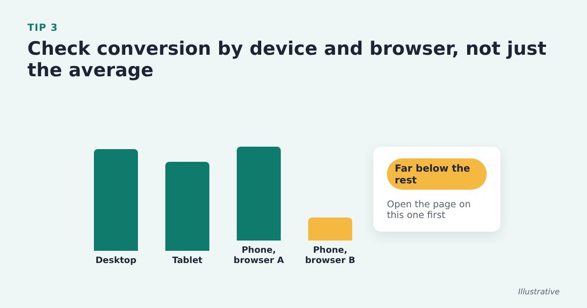
    Illustrative bar chart of conversion by device and browser, where one mobile browser converts far below the others and is highlighted

    A healthy average can hide a page that’s broken on one kind of phone.

    Do it with ThriveCart: split the sales page by device and browser in your website analytics, and check which of those splits ThriveCart’s own reports show. If one converts far below the rest, open the page on that device first.

    Source: CXL, conversion research

    Tip 4: Check your visitors’ real screen sizes before deciding what goes above the fold
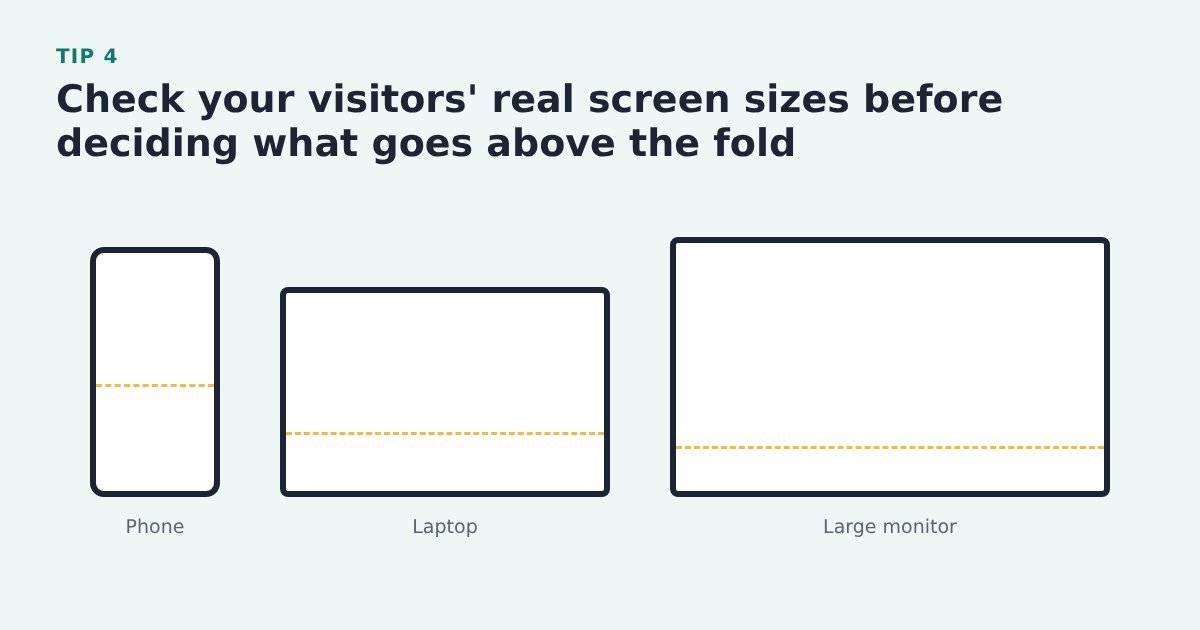
    A phone, a laptop and a large monitor side by side, each with a dashed fold line at a different height

    The fold sits in a different place on a phone, a laptop and a big monitor.

    Do it with ThriveCart: look up the screen sizes for your sales page in your website analytics and design for the ones your visitors actually use. This one is about the sales page: the ThriveCart checkout isn’t where it applies.

    Source: CXL, mastering above the fold

    Tip 5: Watch recordings and heatmaps before you redesign

    A sales page outline with a heatmap that fades out before the Buy button, labelled few visitors reach here

    You see where visitors really look and where they stop, instead of guessing.

    Do it with ThriveCart: add a heatmap or session recording tool to the sales page and check how many visitors scroll as far as the Buy button. Then test a layout change rather than rebuilding on a hunch.

    Options on WordPress include;

    Opti-Behavior, Microsoft Clarity, Hotjar, Crazy Egg, Mouseflow, Lucky Orange, Aurora Heatmap.

    As far as we are aware, its not yet possible to add heatmaps or mouse trackers to your ThriveCart checkout. Here’s hoping its in the development pipeline.

    Source: CXL, visual hierarchy for UX and conversions

    Tip 6: Let your customers’ emails tell you what to test next
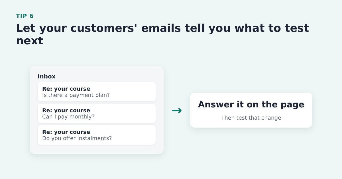
    An inbox with three emails asking the same question about a payment plan, leading to: answer it on the page

    The question people keep asking points straight at the weakest part of the page.

    Do it with ThriveCart: keep a list of the questions buyers and nearly-buyers email you. Answer the common ones on the sales page or the ThriveCart checkout, and test that change first.

    Source: PinnacleCart, ways to increase add-to-cart rate

    Tip 7: Compare your recovery email click rates with a benchmark

    Illustrative bar chart of click rates for three abandoned cart emails, with the weakest, email 2, highlighted as the one to work on first

    Click rates for each email show you which message to work on first.

    Do it with ThriveCart: ThriveCart passes abandoners to your email tool, and your email tool sends and reports. Open the reports for the tag or list ThriveCart adds abandoners to, read the open rate and click rate for each email and work on the weakest one. This covers the abandoners whose email you have: those who typed it into the checkout, or everyone who clicked Buy if you capture name and email before the cart. For the sequence itself, see our 5-step process to better sales conversion.

    Evidence: Shopify, citing Klaviyo benchmark data, puts the average abandoned cart email click rate at 6%, and 11.3% for the top 10% of Klaviyo’s ecommerce customers. Shopify, abandoned cart emails: best practices and examples

    Decide what to test

    Once you know where buyers drop off, choose what to change. The best tests come from evidence, and they change something the visitor will notice.

    Tip 8: Fix the checkout basics before you buy new tools
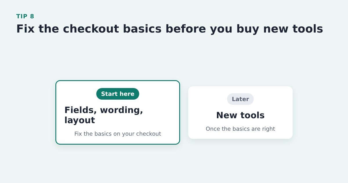
    Two columns: start here with fields, wording and layout; later, new tools

    Most checkout gains come from layout, form fields and wording, not new technology.

    Do it with ThriveCart: go through your ThriveCart checkout for fields you don’t need, unclear wording and clutter before you pay for another app. Our ThriveCart checkout guide has 27 tips for that.

    Evidence: Baymard estimates large sites could raise conversion by 35.26% through better checkout design alone. Baymard Institute, checkout UX benchmark

    Tip 9: Start every test with a hypothesis
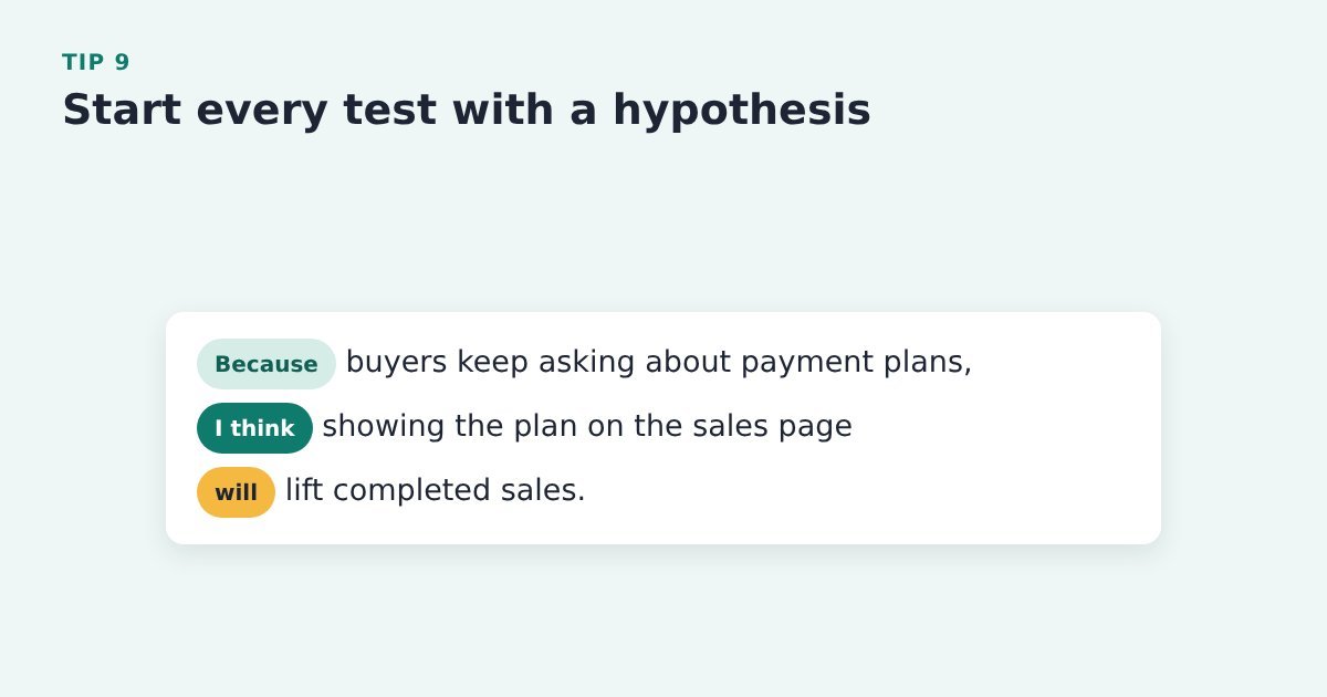
    A card with a written hypothesis: because buyers keep asking about payment plans, showing the plan on the sales page should lift sales

    A random change teaches you very little, even when it wins.

    Do it with ThriveCart: write one line before you touch the page: because of this evidence, I think this change will do this. Take the evidence from your ThriveCart sales figures and customer emails, then make the change in your page builder or checkout settings.

    Then start testing it.

    Source: CXL, 12 A/B testing mistakes I see all the time

    Tip 10: Test the offer, copy and layout, not the button colour

    Comparison: green versus orange button is crossed out; a new headline, a clearer offer and a better page order are ticked

    There is no best button colour. The tests worth your traffic change what the visitor understands.

    Do it with ThriveCart: pick changes to the headline, the offer or the order of the page – they matter far more. Make them in your page builder, then compare orders in your ThriveCart sales figures. Our sales page copy tips have ideas to test.

    Source: CXL, 12 A/B testing mistakes I see all the time

    Tip 11: If your page gets few sales, test big changes
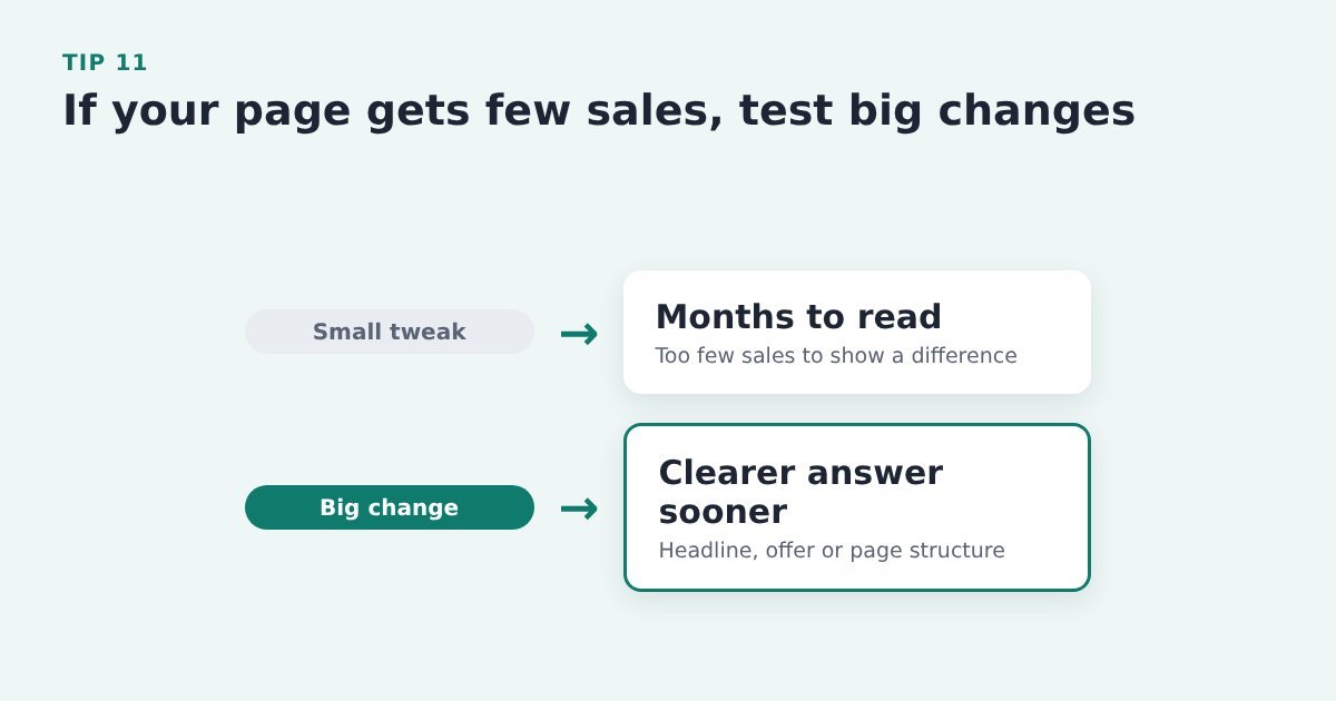
    Two paths for a quiet page: a small tweak takes months to read, a big change gives a clearer answer sooner

    Small tweaks need a lot of sales to show a result, so on a quiet page they can take months.

    Do it with ThriveCart: change the headline, the offer or the page structure rather than a single word, then compare ThriveCart orders for each version.

    Source: CXL, 12 A/B testing mistakes I see all the time

    Tip 12: Test where your Buy button sits
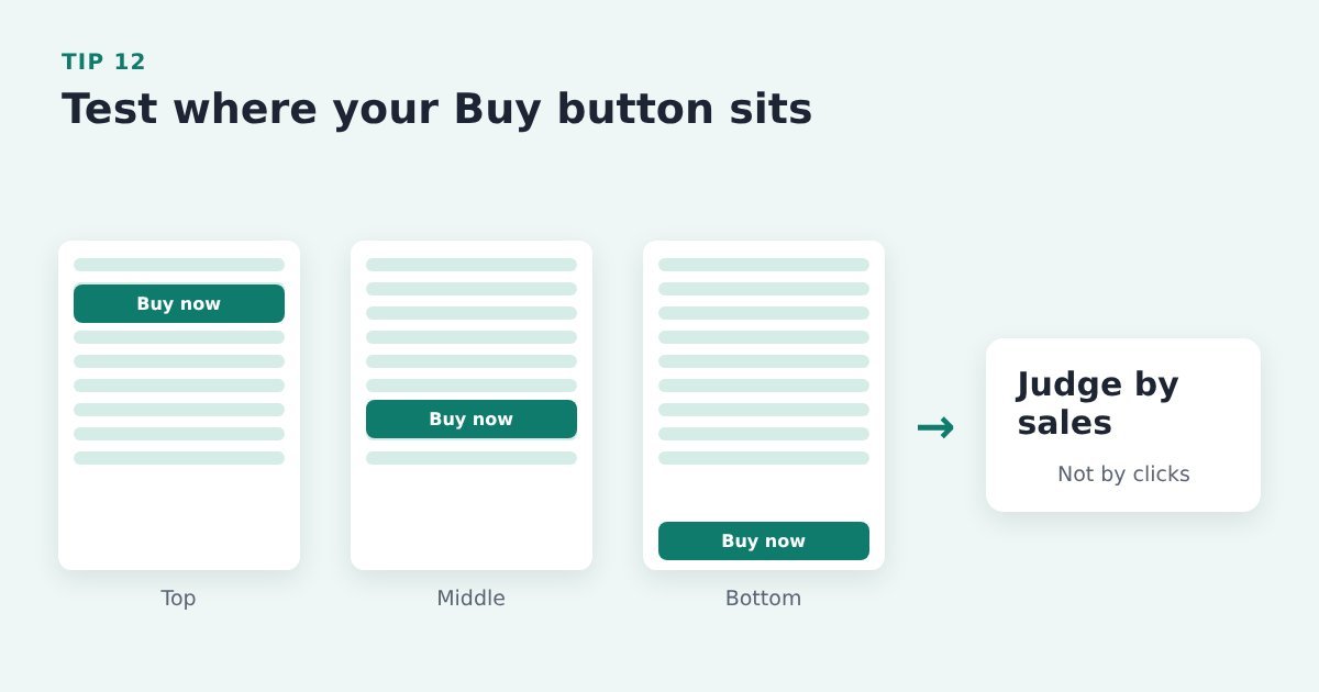
    Three sales page outlines with the Buy button at the top, the middle and the bottom, judged by completed sales

    Above the fold isn’t automatically best, and clicks alone can mislead you. If its too early on the page, more people might click it, but they’re not yet ready to buy so click back. Which messes with your stats.

    Do it with ThriveCart: try the button in different places on the sales page with your page builder or a testing tool, and judge each version by completed ThriveCart sales, not clicks.

    Source: CXL, mastering above the fold

    Tip 13: Compare a one-page checkout with a multi-step one
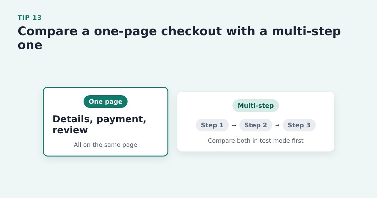
    Comparison: a one-page checkout with the review on the same page, and a three-step checkout

    Layout choices change results, so compare them with real buyers instead of guessing.

    Do it with ThriveCart: Have a look through the checkout templates ThriveCart offers and try them in test mode before you change anything on the live checkout. If you go one-page, keep the review on that same page.

    In general, multi-step checkouts are better for higher priced items. But if you’ve got the name and email before the car, which is a wise move, you may find conversion are better with a one-page checkout.

    Source: Wingify (VWO), optimising your checkout page

    Run tests you can trust

    A test is only useful if you can trust its result. These following tips stop you picking a ‘winner’ that was never really there.

    Tip 14: Change one thing at a time

    Version A and version B of a page that are identical except for the button wording, which is highlighted

    If you change the headline and the button together, you won’t know which one did the work.

    Do it with ThriveCart: test one change on your sales page or ThriveCart checkout, such as the button wording, and compare sales over the same period.

    Source: Aftersell, cart optimisation strategies

    Tip 15: Don’t run two tests on the same page at once
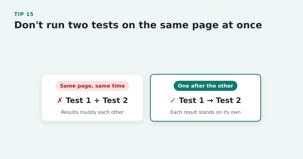
    Two tests overlapping on one page are crossed out; test 1 then test 2, one after the other, is ticked

    Two tests on the same traffic can muddy each other’s results.

    Do it with ThriveCart: finish one test before you start the next on the same page, and keep a simple list of what’s running where.

    Source: CXL, 12 A/B testing mistakes I see all the time

    Tip 16: Run each test in full seven-day blocks

    A two-week calendar with a test that starts on a Monday and stops on a Sunday, covering two full weeks

    Conversion changes from one day of the week to another.

    Do it with ThriveCart: start and stop each test on the same weekday and run it for at least two full weeks. Make the change in your page builder or testing tool, then compare orders in your ThriveCart sales figures.

    Evidence: In an example in the article, CXL found Thursdays made twice as much money as Saturdays and Sundays. CXL, 12 A/B testing mistakes I see all the time

    Tip 17: Don’t call a test early

    A checklist before you pick a winner: at least 95% significance, 350 to 400 conversions per version and 2 to 4 weeks, as recommended by CXL

    An early lead often disappears once more buyers come through.

    Do it with ThriveCart: let the test run until it reaches the marks shown, before you pick a winner. A page with few sales won’t get there quickly, which is another reason to test big changes (tip 11).

    Evidence: CXL recommends at least 95% significance, 350 to 400 conversions per variation and 2 to 4 weeks of testing. CXL, 12 A/B testing mistakes I see all the time

    Tip 18: Check your tracking, and note anything unusual, before you trust a result
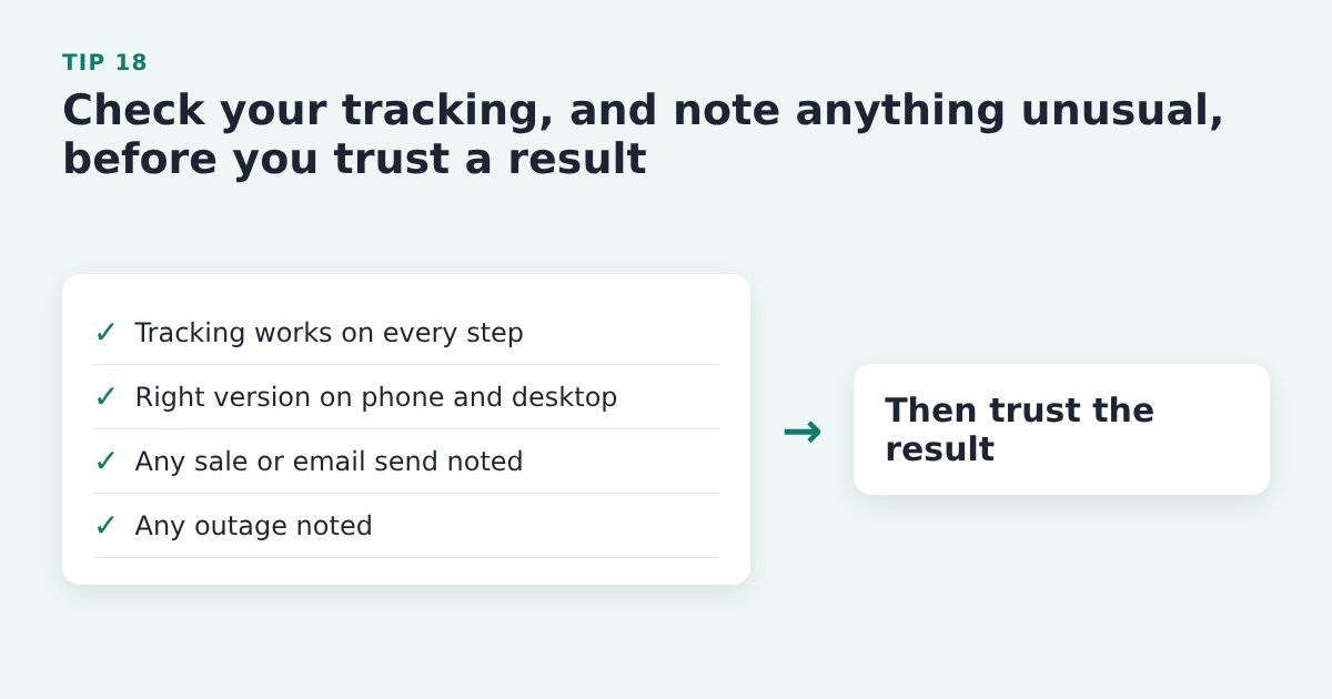
    A checklist: tracking works, the right version shows on phone and desktop, any promotion or email send noted, any outage noted

    A broken tag or a surprise promotion can make a loser look like a winner. Or vice-versa.

    Do it with ThriveCart: use ThriveCart’s test mode to run through the checkout, check your page builder or testing tool shows the right version on phone and desktop, and write down any sale, email send or outage during the test.

    Source: CXL, 12 A/B testing mistakes I see all the time

    Tip 19: Break your results down by segment
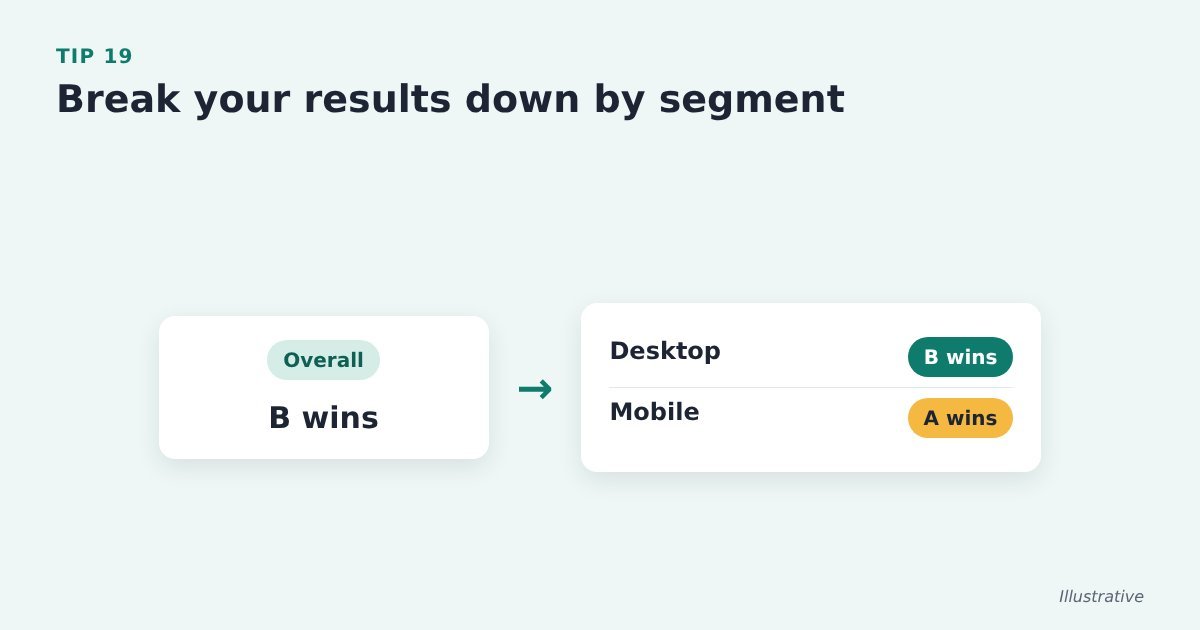
    Illustrative chart: overall, version B wins, but split by device, B wins on desktop and A wins on mobile

    Averages hide differences: a version can win on desktop and lose on mobile.

    Do it with ThriveCart: send your test data to your analytics tool and compare device, traffic source and new versus returning visitors alongside ThriveCart’s sales figures. Check which tracking your page builder or testing tool supports.

    Source: CXL, 12 A/B testing mistakes I see all the time

    Tip 20: Watch average order value as well as conversion rate
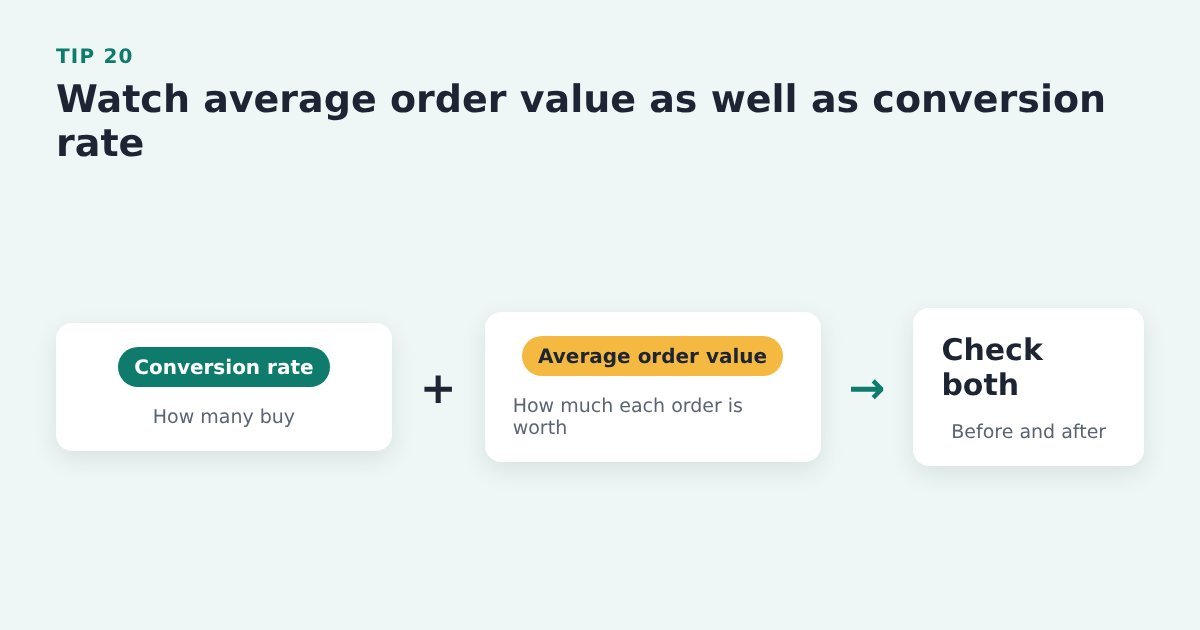
    Two cards side by side, conversion rate and average order value, with the note: check both before and after

    A change that brings more orders but smaller ones may not be a win.

    Do it with ThriveCart: compare orders and revenue in your ThriveCart sales figures before and after the change, not just the number of sales.

    Source: ThriveCart, 10 tips for maximising your conversions

    Keep improving after the test

    These tips keep the gains coming once your first test is done, and make sure the buyers you win get a good start.

    Tip 21: Don’t give up after a failed test
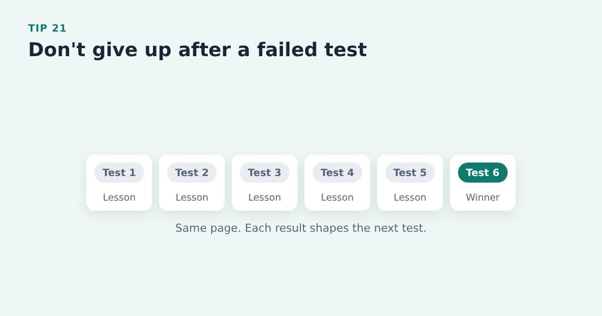
    A row of six tests on the same page: the first five teach something, the sixth wins

    A losing test still tells you something about your buyers.

    Do it with ThriveCart: write down what you learned, use it for your next hypothesis and test again on the same page.

    Evidence: CXL describes a case study that needed six tests on the same page to reach a satisfactory lift. CXL, 12 A/B testing mistakes I see all the time

    Tip 22: Keep banking the small wins
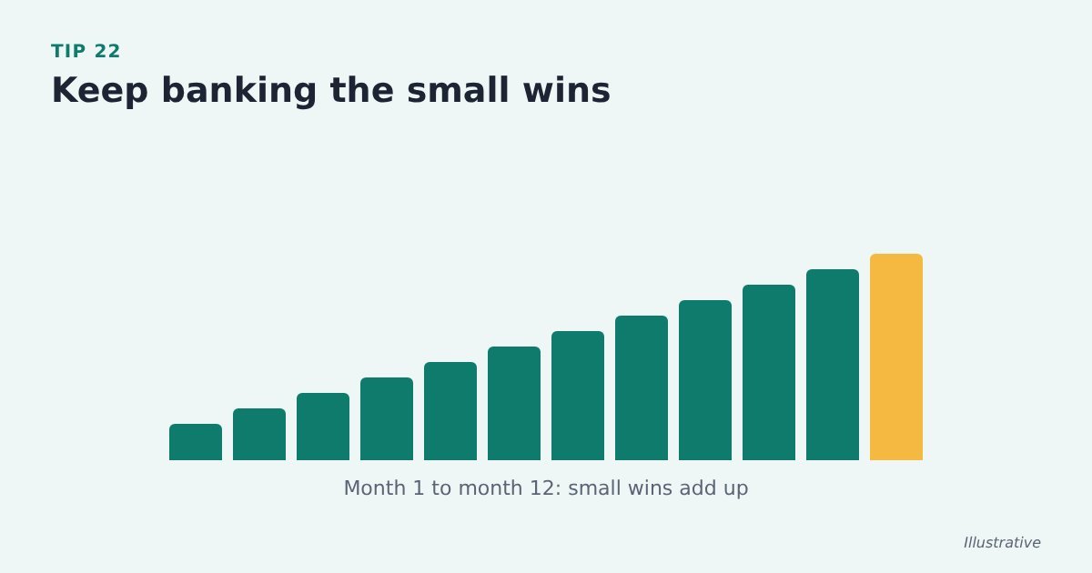
    Illustrative chart of small monthly gains stepping up over twelve months

    Gains of a few per cent add up over a year.

    A 1% relative improvement in sales conversion each week compounds to a 67.8% improvement over 52 weeks.

    Keep tweaking!

    Do it with ThriveCart: roll each winner out on the live page, note it in your test log and move on to the next test.

    Evidence: CXL works out that a 5% improvement each month gives about an 80% lift over 12 months. CXL, 12 A/B testing mistakes I see all the time

    Tip 23: Write your welcome emails with as much care as your abandon sequence

    Flow: a new opt-in goes into a welcome series of three emails, written with the same care as the abandon sequence

    New subscribers are at their most interested just after they opt in.

    Do it with ThriveCart: give new opt-ins a welcome series in your email tool, written as carefully as your abandoned cart emails.

    Evidence: Klaviyo’s 2026 data puts the average welcome series click rate at 6.5%. Klaviyo, 2026 abandoned cart benchmarks

    Tip 24: Use your thank-you page

    A thank-you page that confirms access, explains the next step and offers one related next step

    Just after paying, a buyer wants to know what happens next. A dead end wastes that moment.

    Do it with ThriveCart: set a custom success URL on the ThriveCart product that points to a page confirming their access, explaining the next step and offering one related next step. Maybe an upsell or related product. Maybe an invited into your inner-sanctum of higher-level customers.

    Source: HubSpot, landing page best practices


    Fix the leak before your next launch

    Once you’ve tracked each step, one gap often stands out: people who wanted the product enough to click Buy, then stopped at the checkout. If you have a launch coming up or a new product going live, that’s the step to fix before the traffic arrives.

    A short opt-in on the Buy button gives you the name and email of everyone who clicks it. Cart Conversion Boost is the free WordPress plugin that carries those details from your opt-in form into the ThriveCart checkout, so it opens already filled in and buyers don’t type them twice. It works with Thrive Architect, Kit, Elementor, MailerLite and a growing list of other tools. The full 5-step process is free to read.


    Sources: Baymard Institute, cart abandonment rate; PinnacleCart, ways to increase add-to-cart rate; Baymard Institute, current state of checkout UX; CXL, conversion research; CXL, mastering above the fold; CXL, visual hierarchy for UX and conversions; Shopify, abandoned cart emails: best practices and examples; Baymard Institute, checkout UX benchmark; CXL, 12 A/B testing mistakes I see all the time; Wingify (VWO), optimising your checkout page; Aftersell, cart optimisation strategies; ThriveCart, 10 tips for maximising your conversions; Klaviyo, 2026 abandoned cart benchmarks; HubSpot, landing page best practices.
  • Sales Page Copy and Buttons That Convert: 21 Tips

    Sales Page Copy and Buttons That Convert: 21 Tips

    Last updated 9 November 2026

    “Urgh!! Plenty of people read my sales page. Hardly any of them click the button.”

    If that sounds familiar, the problem is usually the page, not the traffic (assuming your traffic matches your products).

    Visitors skim, can’t quite tell what you sell, there’s just not enough intrigue or fascinating or interest – or they aren’t sure what the button will do, and they leave before your ThriveCart checkout ever loads.

    Leave it for a week and that’s a week of clicks you paid for that never reach the checkout. Leave it for a month, or a whole launch, and it turns into the quiet sales month you can’t quite explain. It matters most when you’re about to spend: a launch coming up, a new product going live, or ad costs that keep creeping up.

    Below are 21 tips for sales page copy and call to action buttons, each with how to do it if you sell with ThriveCart. They’re pulled from research by Nielsen Norman Group, HubSpot, Unbounce, SamCart and others.

    And we add to this page as we find more.

    In this guide

    1. Make it clear in five seconds
    2. Write for people who skim
    3. Buttons that get the click
    4. Match the page to the visitor

    Make it clear in five seconds

    Before anyone reads your copy closely, they decide whether it’s for them. These six tips make that decision easy.

    Tip 1: Check a newcomer can tell what you sell in five seconds

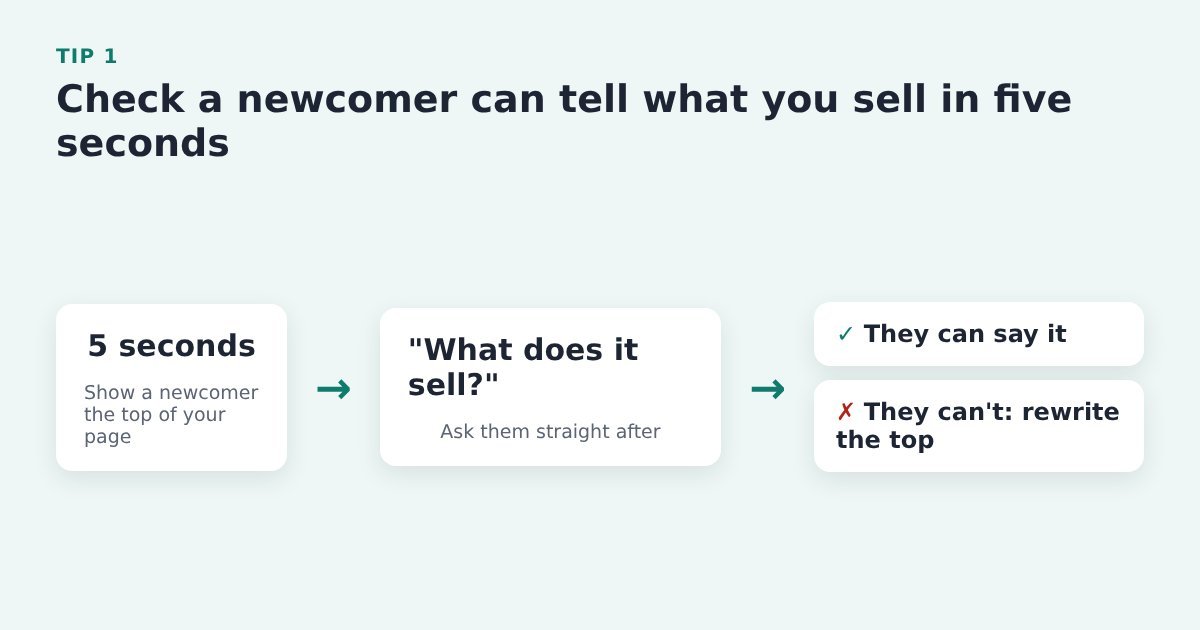
    Five-second test: show a newcomer the top of your sales page for five seconds, ask what it sells, and rewrite the top if they cannot say

    Visitors skim the top of a page and decide quickly whether to stay. If they can’t say what you sell, they won’t scroll down to the button.

    Do it with ThriveCart: show the top of your sales page (everything above the first Buy button) to someone who doesn’t know the product for five seconds, then ask what you sell. If they can’t say, rewrite the top before you change anything else.

    Source: HubSpot, landing page best practices

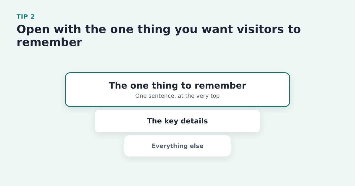
    Tip 2: Open with the one thing you want visitors to remember

    Inverted pyramid: the one thing to remember sits at the top of the sales page, then the key details, then everything else

    Plenty of visitors only read the first lines, so the most important message has to come first. The detail can follow underneath.

    Do it with ThriveCart: write that one sentence at the top of your sales page in your page builder (Thrive Architect, Elementor or similar), not in ThriveCart. The sales page is where people decide; the checkout is where they pay.

    Source: Nielsen Norman Group, inverted pyramid

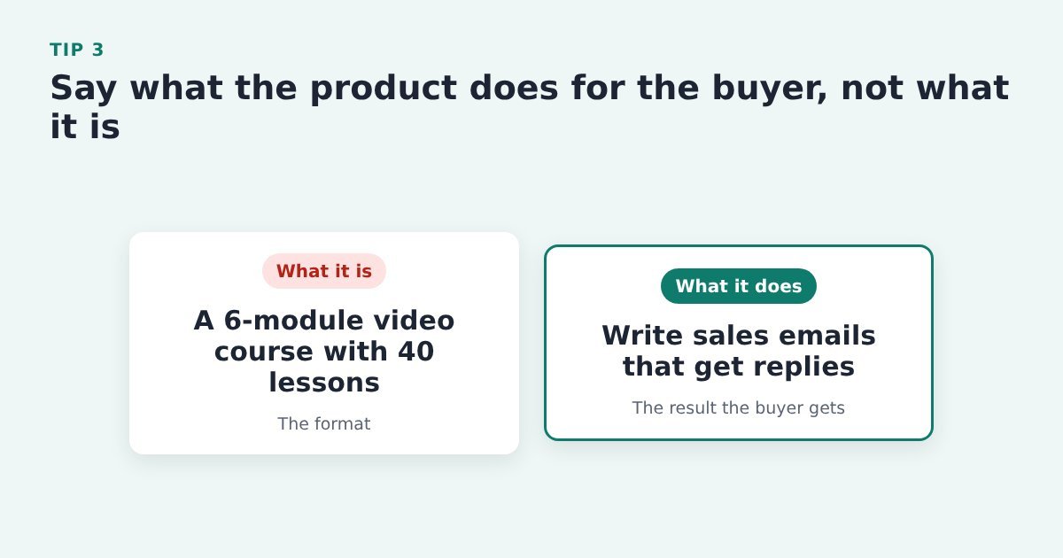
    Tip 3: Say what the product does for the buyer, not what it is

    Comparison: describing the format, a 6-module video course, versus describing the result, write sales emails that get replies

    People buy the result. “Six modules and 40 lessons” describes the box; the outcome tells them why it matters to them.

    Do it with ThriveCart: rewrite the headline and first paragraph of the sales page that leads to your ThriveCart checkout around the result the buyer gets, and move the format (modules, videos, downloads) further down.

    Source: PinnacleCart, ways to increase add-to-cart rate

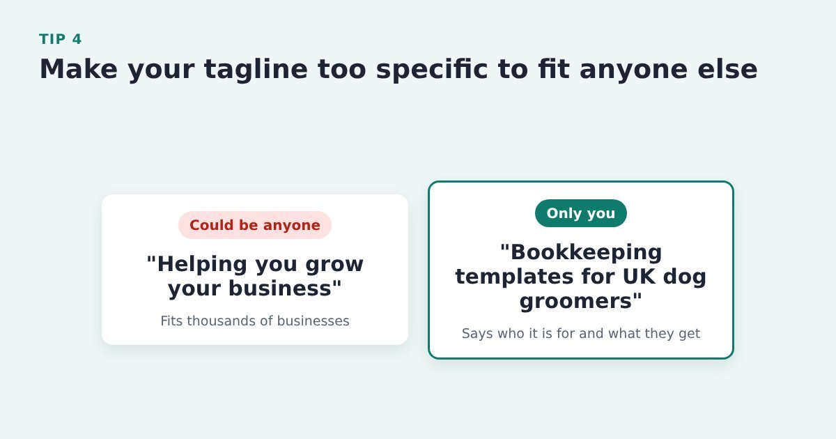
    Tip 4: Make your tagline too specific to fit anyone else

    Comparison: a vague tagline that fits thousands of businesses versus a specific one naming who it is for and what they get

    A tagline that could describe thousands of other businesses tells the visitor nothing about why you’re the right choice.

    Do it with ThriveCart: in your page builder, rewrite the line under your headline so it names who the product is for and what they get. Nothing needs to change in ThriveCart.

    Source: Nielsen Norman Group, summaries that build trust

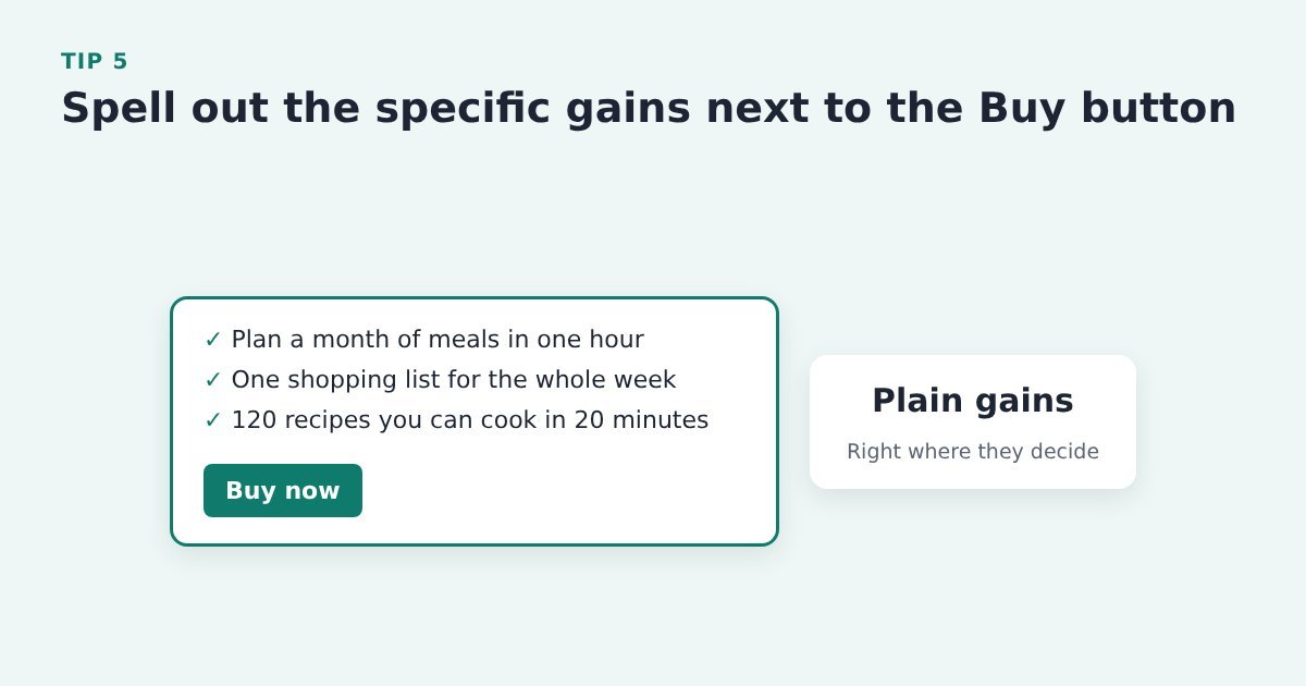
    Tip 5: Spell out the specific gains next to the Buy button

    A Buy button with three specific, plain-language gains listed just above it

    The button is where people make the call, so the reasons to say yes belong right beside it, in plain words, not three screens up.

    Do it with ThriveCart: add three or four specific gains just above the button that leads to your ThriveCart checkout (or to your opt-in), in the words a buyer would use.

    Source: SamCart, strategies to maximize your conversion rate

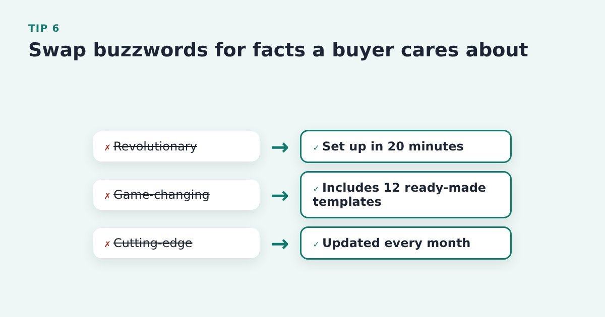
    Tip 6: Swap buzzwords for facts a buyer cares about

    Buzzwords such as revolutionary, game-changing and cutting-edge crossed out and replaced with concrete facts

    Words like “revolutionary” make a claim with nothing behind it, and Nielsen Norman Group warns that empty buzzwords can make visitors trust you less.

    Do it with ThriveCart: search your sales page for words like “revolutionary”, “game-changing” and “cutting-edge” and replace each one with a concrete fact: how long setup takes, what’s included, how often it’s updated. Edit this in your page builder, not in ThriveCart.

    Source: Nielsen Norman Group, summaries that build trust

    Write for people who skim

    Most visitors don’t read a sales page line by line. They scan the headings, the start of each paragraph and anything in bold. These tips make sure what they catch is what matters.

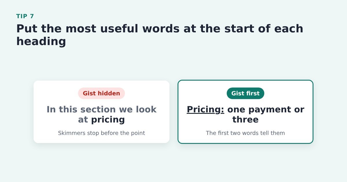
    Tip 7: Put the most useful words at the start of each heading

    Comparison of two sales page headings: one hides the key word at the end, the other starts with Pricing so skimmers get the gist

    Eye-tracking research shows people read the first words of a heading and skip the rest, so the first two words need to carry the gist.

    Do it with ThriveCart: go through every heading on your sales page in your page builder and move the key word to the front: “Pricing: one payment or three”, not “In this section we look at pricing”.

    Source: Nielsen Norman Group, F-shaped reading pattern

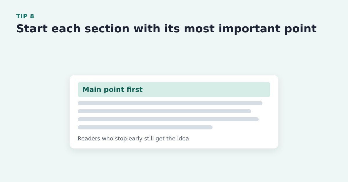
    Tip 8: Start each section with its most important point

    A sales page section where the first line, highlighted, carries the main point and the lines below add detail

    Readers who stop after a sentence or two still leave with the main idea.

    Do it with ThriveCart: in your page builder, make the first sentence of each section and paragraph the point itself, then add the detail after it.

    Source: Nielsen Norman Group, inverted pyramid

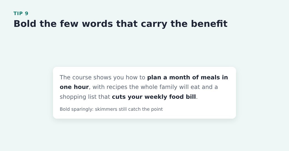
    Tip 9: Bold the few words that carry the benefit

    A short paragraph of sales copy with only the two benefit phrases in bold

    Bold phrases catch a skimming eye, but only when there are a few of them. Bold everything and nothing stands out.

    Do it with ThriveCart: format the copy in your page builder and bold only the benefit phrases, a few per section. ThriveCart doesn’t come into it.

    Source: Nielsen Norman Group, F-shaped reading pattern

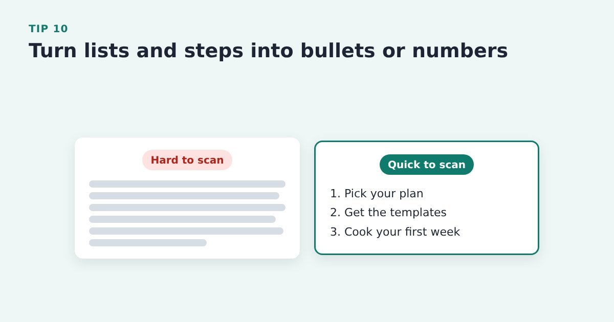
    Tip 10: Turn lists and steps into bullets or numbers

    Comparison: a block of long paragraph text versus the same steps set out as a short numbered list

    A list is quicker to scan than a paragraph, so benefits and steps set out this way are far more likely to be read.

    Do it with ThriveCart: in your page builder, turn your “what’s included” and “how it works” paragraphs into bulleted or numbered lists.

    Source: Nielsen Norman Group, F-shaped reading pattern

    Tip 11: Add a short video that shows what they are buying

    A short video player on a sales page titled 2-minute walkthrough: what's inside

    Seeing the product in use, or a quick walk through what’s inside, answers “what exactly do I get?” faster than any paragraph.

    Do it with ThriveCart: add a short explainer or walkthrough video to your sales page in your page builder, near the top or just before the Buy button, and keep it short.

    Source: MailerLite, e-commerce conversion tactics

    Buttons that get the click

    Two kinds of ThriveCart seller. If your Buy button goes straight to ThriveCart, its only job is to get people to the checkout, and you can follow up only with the abandoners who typed their details into it. If your Buy button opens a short opt-in for name and email first, you already have everyone who clicked and can follow up with all of them. Your job then is to make that opt-in feel like the first step of the order, and to spare buyers typing the same details again at ThriveCart.

    The button tips below work either way.

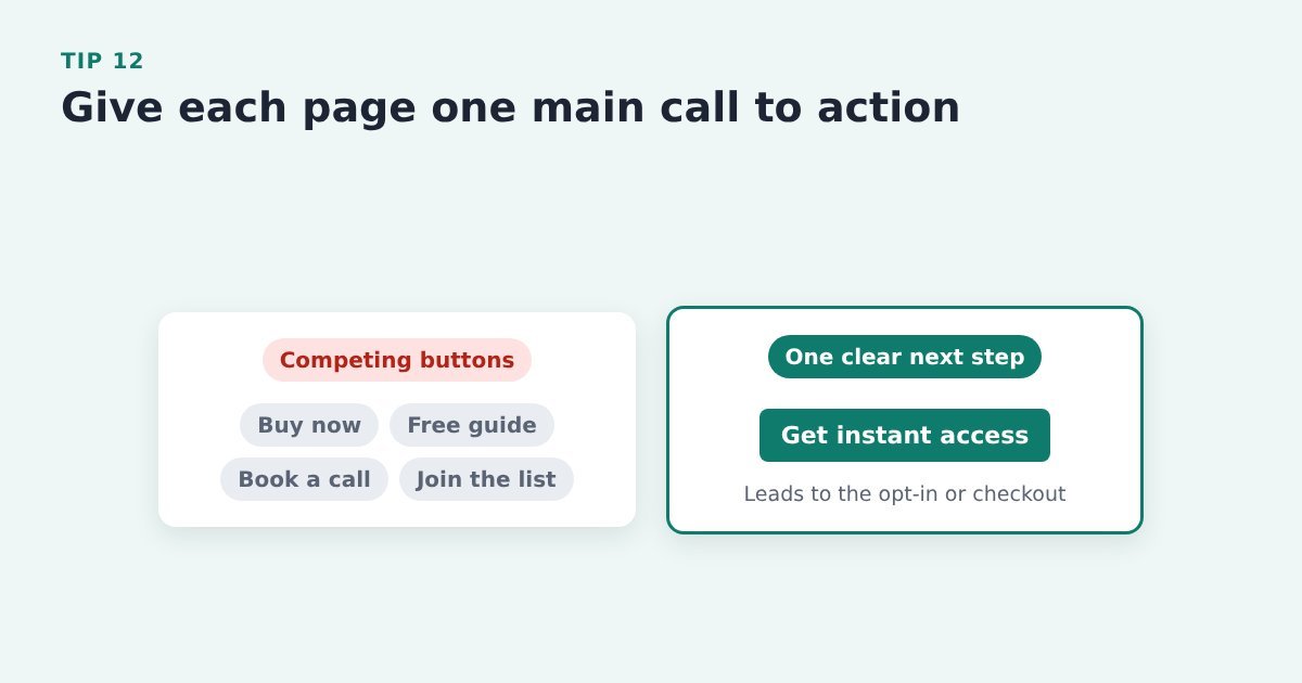
    Tip 12: Give each page one main call to action

    Comparison: a page with four competing buttons versus a page with one clear Get instant access button

    Several competing buttons make visitors choose between them, and some choose nothing. One obvious next step is easier to take.

    Do it with ThriveCart: decide on the single next step (the button that leads to your opt-in or your ThriveCart checkout) and make it the one that stands out. Move other links, like free guides or booking a call, off the page or turn them into quiet text links.

    Source: PinnacleCart, ways to increase add-to-cart rate

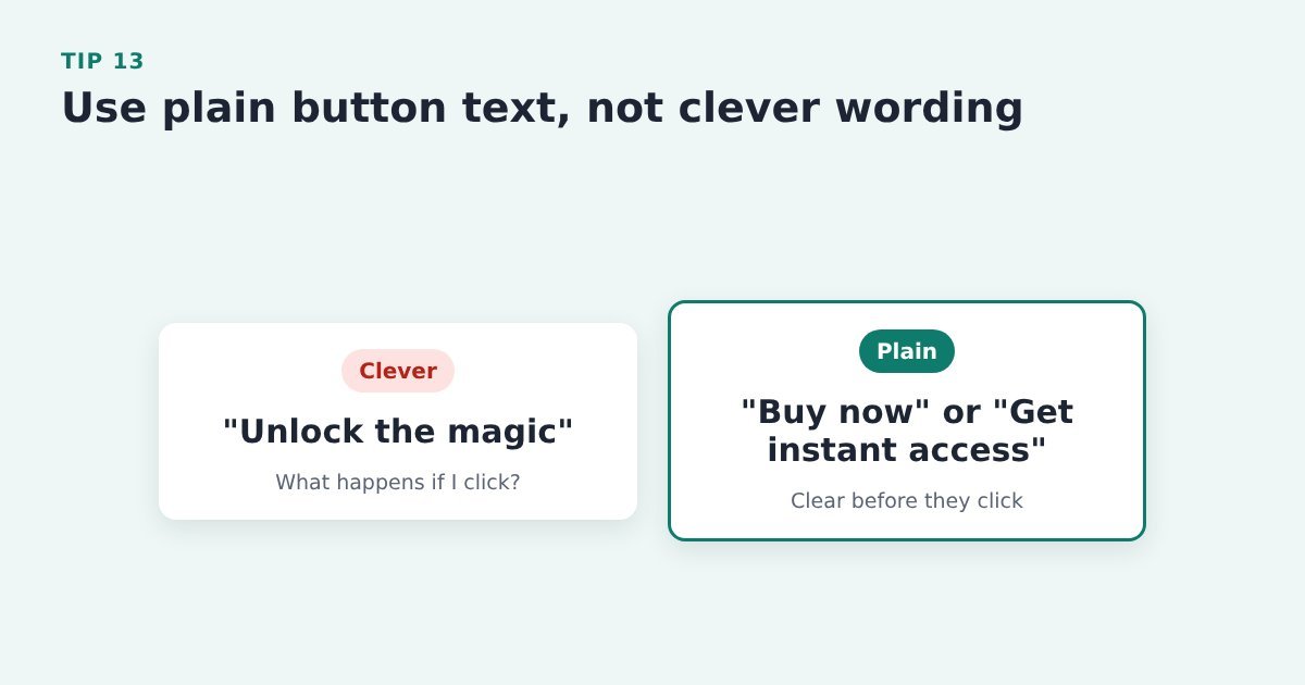
    Tip 13: Use plain button text, not clever wording

    Comparison: clever button text, Unlock the magic, versus plain text, Buy now or Get instant access

    Clarity beats creativity on a button. People should know what will happen before they click.

    Do it with ThriveCart: use plain wording like “Buy now” or “Get instant access” on the button that leads to ThriveCart.

    Source: PinnacleCart, ways to increase add-to-cart rate

    Tip 14: Label the button with what happens next

    A vague Get started button replaced by labels that say what happens next, such as Take the 2-minute quiz

    Vague labels like “Get started” or “Learn more” leave people guessing, and Nielsen Norman Group found that “Get started” can stop users in their tracks.

    Do it with ThriveCart: name the next step on the button before ThriveCart, for example “Get instant access”, “Take the 2-minute quiz” or “See the course modules”.

    Source: Nielsen Norman Group, “Get Started” stops users

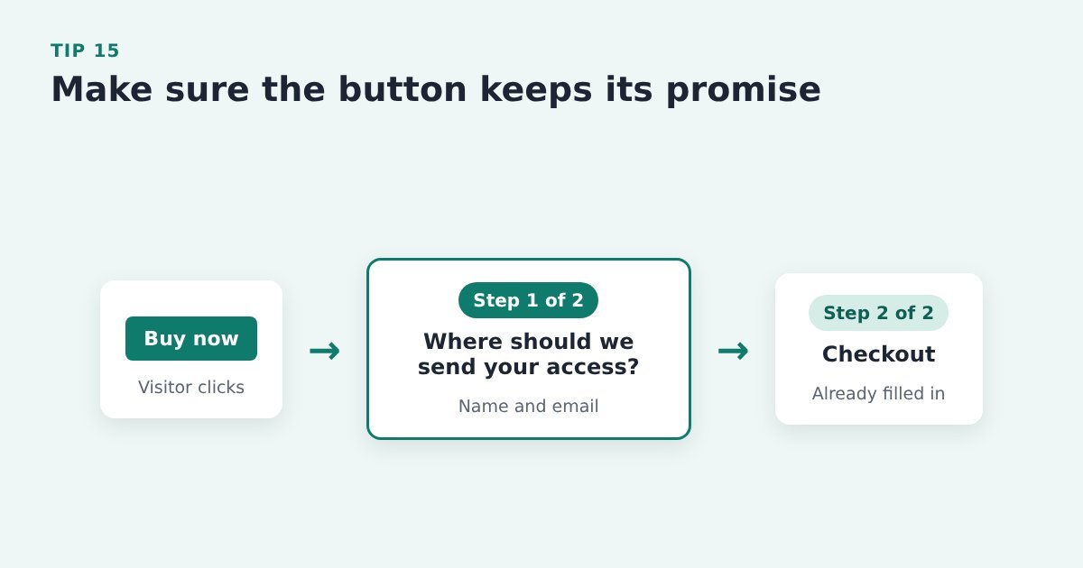
    Tip 15: Make sure the button keeps its promise

    Flow: a Buy now button opens a short opt-in labelled step 1 of 2, then the checkout opens already filled in as step 2

    If the label says one thing and the next screen does another, people feel tricked and leave.

    Do it with ThriveCart: if your Buy button opens a pre-cart opt-in, make the popup read like step 1 of the order (“Step 1 of 2: where should we send your access?”), not like a newsletter sign-up. Then pass the details on so the ThriveCart checkout opens already filled in. As a bonus, your abandoned cart emails can now reach everyone who clicked Buy.

    Source: Nielsen Norman Group, “Get Started” stops users

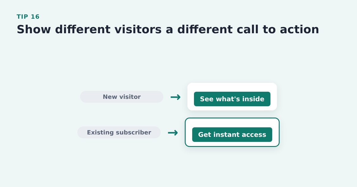
    Tip 16: Show different visitors a different call to action

    Two paths: a new visitor sees a See what's inside button, an existing subscriber sees Get instant access

    Someone who already knows you needs a different nudge from a first-time visitor.

    Do it with ThriveCart: where your page builder or email tool allows it, show existing subscribers a different button or offer from new visitors, for example “Get instant access” instead of “See what’s inside”.

    Evidence: HubSpot reports that personalised calls to action converted 202% better than default versions. HubSpot, landing page best practices

    Match the page to the visitor

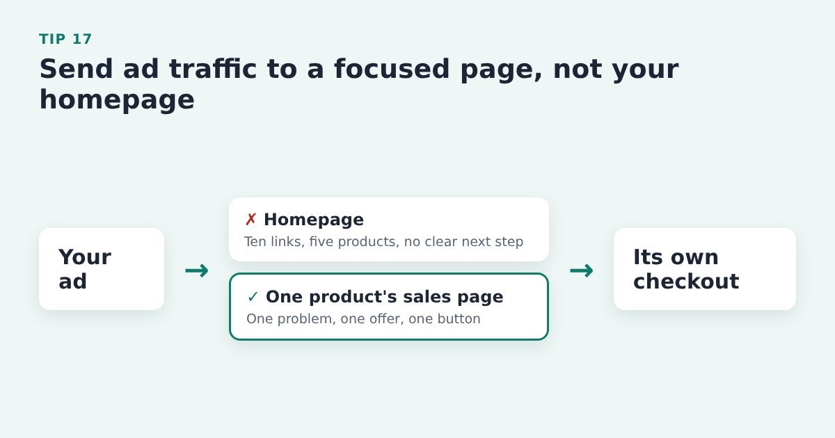
    Tip 17: Send ad traffic to a focused page, not your homepage

    Flow: an ad sends visitors to one product's sales page and its own checkout, not to a homepage with many links

    A homepage offers lots of choices. A focused page has one problem, one solution and one call to action, so more of your paid clicks reach the button.

    Do it with ThriveCart: point each ad at the sales page for one product, or a landing page specifically for that ad, with its own ThriveCart checkout, rather than at your homepage.

    Source: giosg, shopping cart conversion rate trends

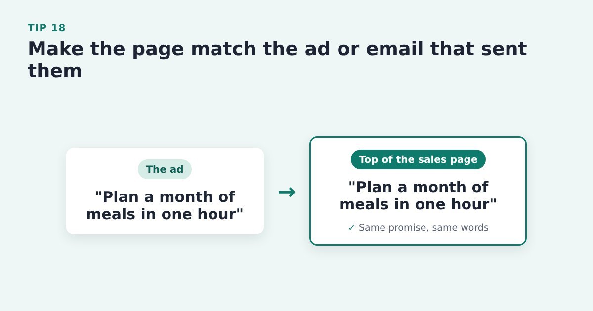
    Tip 18: Make the page match the ad or email that sent them

    The ad headline and the top of the sales page use the same promise in the same words

    When the headline and offer match what they just clicked, visitors know they’re in the right place and keep reading.

    Do it with ThriveCart: repeat the headline idea and the offer from the ad or email, in the same words, at the top of the sales page that leads to ThriveCart.

    Source: Unbounce, how to increase conversion rates

    Tip 19: Lead with your main option and label it

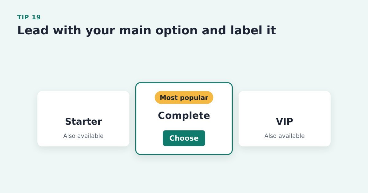
    Three pricing options with the middle one, Complete, highlighted and labelled Most popular

    A row of equal choices makes deciding harder. Labelling one clearly gives people a safe default.

    Do it with ThriveCart: if you sell several options or ThriveCart pricing options (pay in full or a payment plan, say), label your main one on the sales page (“Most popular”) and lead with it, so it’s the first thing the eye lands on.

    Source: PinnacleCart, ways to increase add-to-cart rate

    Tip 20: Use a short quiz to point visitors to the right product

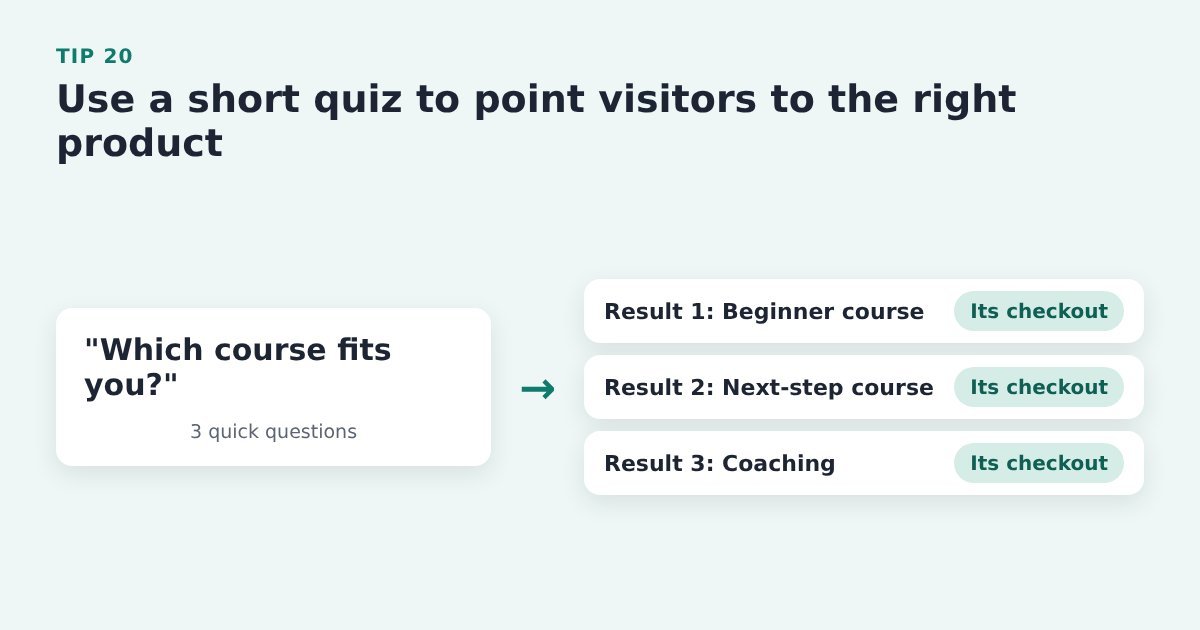
    A three-question quiz leading to three results, each linking to that product's own checkout

    If you sell more than one product, a few quick questions can show people which one fits, rather than leaving them to compare.

    Do it with ThriveCart: build a short quiz with your quiz or form tool and link each result to that product’s sales page or ThriveCart checkout.

    Source: SamCart, strategies to maximize your conversion rate

    Tip 21: Answer real buyer questions in a short FAQ

    Questions from support emails, chats and comments become a short FAQ placed just above the last Buy button

    An unanswered doubt is a reason not to click. An FAQ built from questions buyers actually ask deals with them on the page.

    Do it with ThriveCart: pull the questions from your support emails, chat messages and social comments, answer each in a line or two, and put the FAQ above the last Buy button on the sales page.

    Source: HubSpot, landing page best practices


    Make every click count

    These tips get more people to click your Buy button. What happens after the click matters just as much: around 70% of people who reach a checkout leave without buying (Baymard, 2026). If you’ve got a launch coming up or you’re putting more into ads, fix both ends before the traffic arrives. Our ThriveCart checkout tips cover the other end.

    A pre-cart opt-in helps with both: the Buy button opens a short popup asking for name and email, so you can follow up with everyone who clicked, not just the people ThriveCart recorded. Make sure to follow the proven 5-steps to increase your sales conversion, so it all works together as a flow that ends in a completed sale.

    Cart Conversion Boost is the free WordPress plugin that carries those details into the ThriveCart checkout, so it opens already filled in and buyers never type them twice. It works with the opt-in form on your WordPress site (see the tools it works with). The full 5-step process is free to read.


    Sources: Baymard Institute, cart abandonment rate; Nielsen Norman Group, F-shaped reading pattern; Nielsen Norman Group, inverted pyramid; Nielsen Norman Group, “Get Started” stops users; Nielsen Norman Group, summaries that build trust; HubSpot, landing page best practices; Unbounce, how to increase conversion rates; SamCart, strategies to maximize your conversion rate; PinnacleCart, ways to increase add-to-cart rate; giosg, shopping cart conversion rate trends; MailerLite, e-commerce conversion tactics.

  • Sales Funnels Explained: 6 Ways to Turn More Visitors Into ThriveCart Buyers

    Sales Funnels Explained: 6 Ways to Turn More Visitors Into ThriveCart Buyers

    Let’s start with a confession most online sellers never say out loud: “People land on my sales page every day. A few buy. The rest just… evaporate. I’ve no idea who they were, and I’ve no way to ask them back.”

    If that sounds familiar, you’re not doing anything wrong. You just haven’t been shown how a ThriveCart sales funnel is meant to catch people on the way through. So let’s fix that, with pictures, and without the marketing jargon (well, with as little as humanly possible).

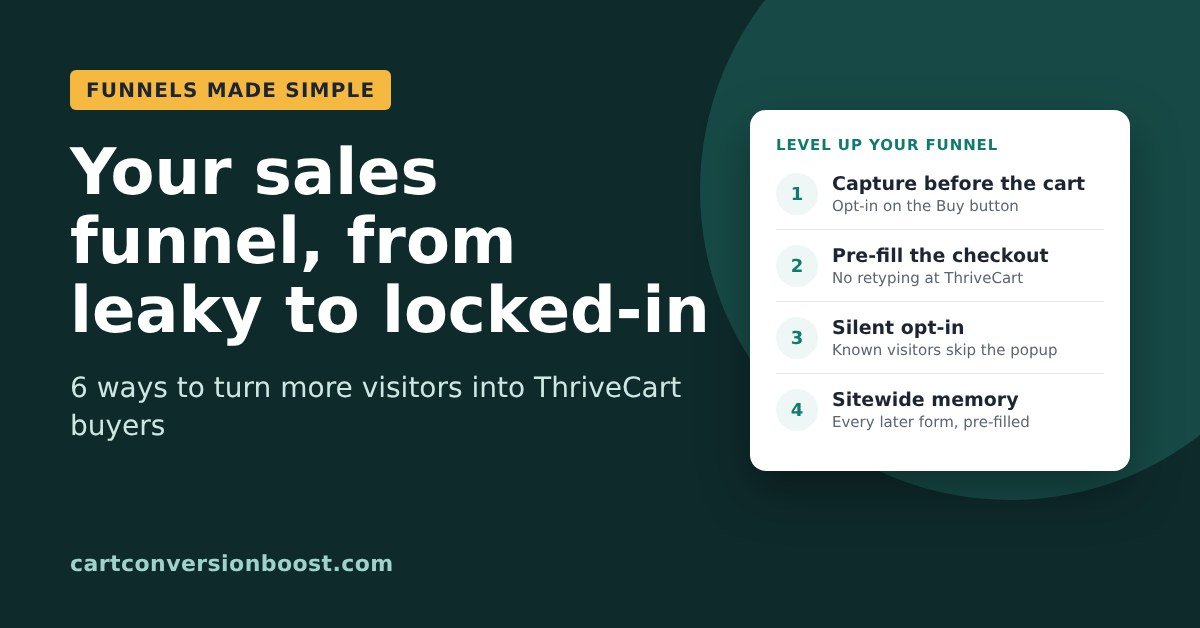
    By the end of this post you’ll know what a funnel actually is, which kind you’re running right now, and six ways to turn more of your visitors into buyers, from the simplest fix up to the clever stuff.

    So what actually is a funnel?

    Picture the funnel in your kitchen drawer. Wide at the top, narrow at the bottom. You pour a lot in, and a smaller, more concentrated stream comes out the other end.

    Funnel your sales

    A sales funnel is exactly that, only with people instead of olive oil. At the wide top is everyone who lands on your page, fresh, new, unfiltered. At the narrow bottom are the people who’ve paid. In between are a few steps (a page to read, a button to click, a form to fill in), and at every step, some people drift away.

    Your job isn’t to build a funnel with no leaks. That’s impossible: on average, 70.2% of people who reach an online checkout leave without buying (Baymard, 2026). That’s about 7 in every 10, and it happens to everyone. Your job is to do 3 things:

    1. Make every step easy, so fewer people drift away.
    2. Know who drifted, so you can catch them and pour them back in with a friendly reminder.
    3. Minimise the leaks. Stop them leaving and /or bring as many as possible back.

    A quick jargon decoder before we go on, so nothing trips you up:

    • Sales page: the page that explains your product and has the Buy button.
    • Checkout: your ThriveCart page, where people type their details and pay.
    • Opt-in: a small form that asks for a name and email.
    • Lead: someone whose name and email you have, so you can follow up.
    • Cart abandonment: when someone reaches the checkout and leaves without paying.

    Right. Let’s look at some actual funnels.

    The 2-step funnel (sales page, then checkout)

    This is the simplest funnel there is, and it’s what most people start with. Someone reads your sales page, clicks Buy, and lands on your ThriveCart checkout. Two steps. Lovely.

    The trouble is what happens when they leave at the checkout. ThriveCart’s own support team told me it only stores someone as a possible abandoned cart after they’ve typed in the name field and clicked back out of it, and then clicked into the email field, typed their email AND then clicked back out of it.

    Plenty of people leave before they get that far. So in a plain 2-step funnel, most of the people who walk away stay complete strangers. You paid (in ads, content or sheer effort) to get them all the way to your till, and they left without so much as a wave.

    Improvement 1: Add an opt-in form to your sales page

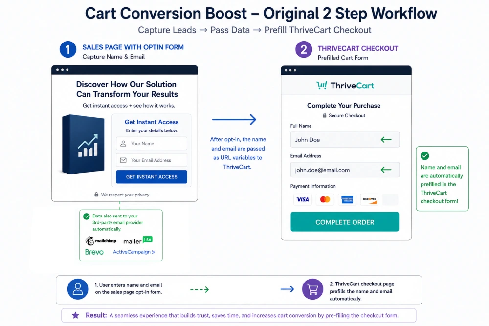
    A 2-step funnel: a sales page with an opt-in form for name and email, which then opens a ThriveCart checkout with the name and email already filled in

    The first upgrade is to put a short opt-in form on the sales page itself. The visitor types their name and email, and two things happen. Their details go to your email provider (Mailchimp, MailerLite, Brevo, ActiveCampaign and so on), so now they’re a lead.

    And Cart Conversion Boost (CCB) passes that same name and email into ThriveCart, so the checkout opens already filled in. No typing it all again.

    The big win: if they abandon the cart, you know who they were, so you can follow them up with a reminder email and win some of those sales back.

    The catch? A form sitting on a sales page asks for details before the visitor has decided anything. It’s easy to scroll straight past, and anyone who skips it and clicks Buy is back to being anonymous.

    NOTE: We have a proven 5-step process that makes this all work seamlessly, so it all flows from sales page to order. More on how to do this later…

    Improvement 2 (better): On clicking the Buy button, it opens a pop-up, with the opt-in form.

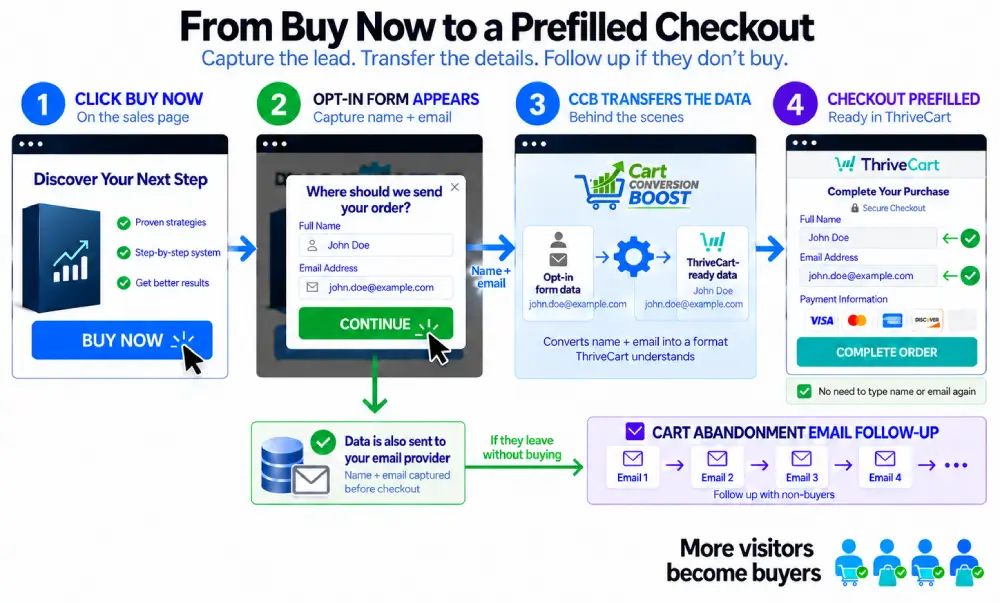
    Four steps from Buy Now to a pre-filled checkout: click Buy Now, a pop-up asks for name and email, Cart Conversion Boost passes the details on, and the ThriveCart checkout opens pre-filled, with abandoned cart emails sent to anyone who leaves

    Here’s the smarter version. Don’t put the opt-in form on your sales page. Instead make the Buy button open a small pop-up that says something like “Where should we send your order?” with boxes for name and email. They fill it in, click Continue, and land on a ThriveCart checkout that’s already filled in for them.

    Why is this better? Timing. You’re asking at the exact moment they’ve decided to buy, so it feels like the first step of the checkout rather than a newsletter sign-up.

    And because everyone who clicks Buy goes through it, you capture 100% of all cart visitor leads.

    If someone wanders off before paying, their details are already with your email provider, ready for your cart abandonment follow-up.

    “But isn’t that an extra step?” Technically, yes. But because Cart Conversion Boost fills in the checkout, it’s not extra typing. They type their name and email once, in the pop-up, and that’s it.

    And because they initiated that popup with their click of the Buy button, they feel compelled to complete it – which more people do!

    The 3-step funnel (squeeze page, sales page, checkout)

    Lots of sellers put a step before the sales page: a squeeze page. That’s a short page offering something free (a guide, a checklist, a mini course; marketers call it a “lead magnet”) in exchange for a name and email. Then the visitor goes on to the sales page, then to the checkout.

    Good news if this is you: you already have their name and email before they get anywhere near the cart, so you can follow up.

    The niggle is different. They gave you their details on the squeeze page, and then ThriveCart asks them to type it all in again. Every extra box at a checkout is one more chance for someone to sigh, check their phone and never come back.

    Improvement 3: Carry their details all the way to the checkout

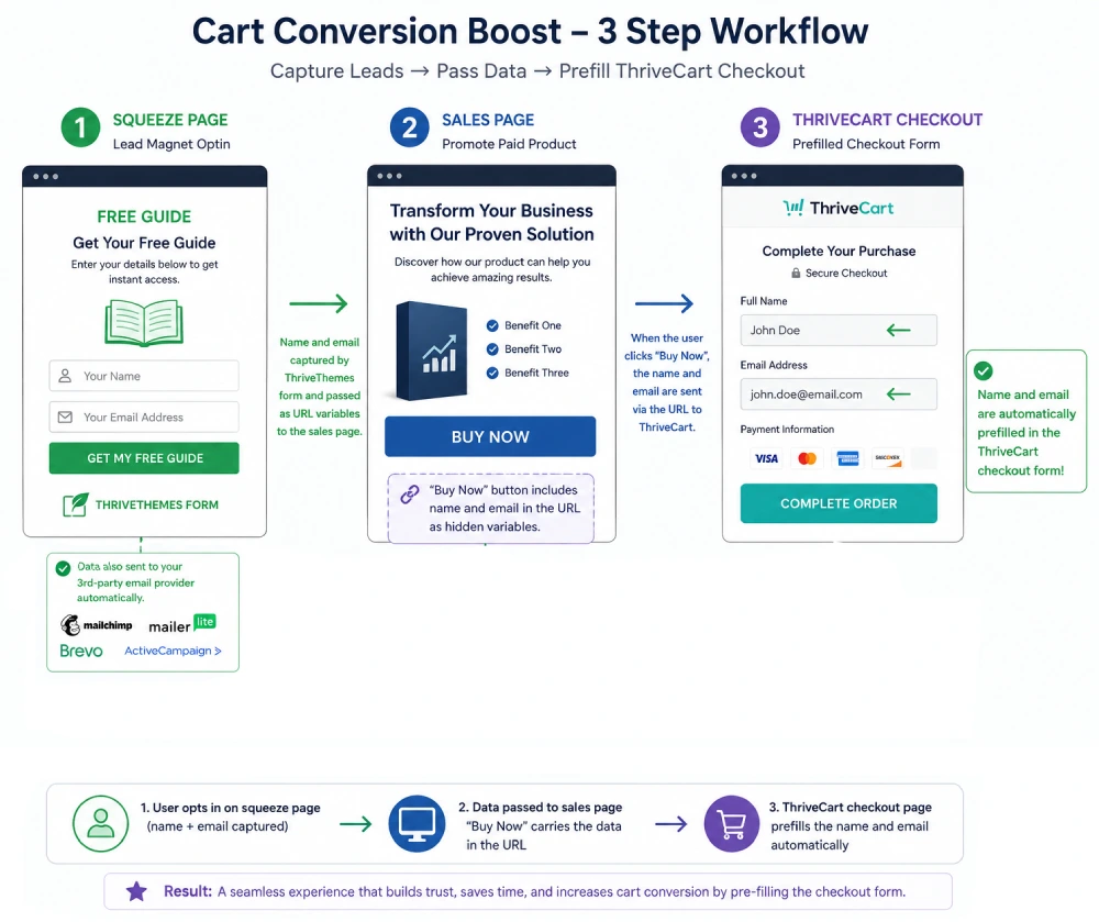
    A 3-step funnel: a squeeze page captures name and email for a free guide, the sales page Buy Now button carries those details, and the ThriveCart checkout opens with them filled in

    Because you already captured the lead on the squeeze page, Cart Conversion Boost simply carries the name and email through to the sales page, and when they click “Buy Now” button, the checkout opens with their details already in place. They opted in once, and they never have to type it again. Smooth.

    Improvement 4 (better): Add a cart opt-in, and pre-fill it

    Here’s a question worth asking: “I already have their email. Why would I ask for it again?”

    Because your lead magnet list tells you who downloaded a freebie. It doesn’t tell you who clicked Buy. Someone who reached your checkout yesterday is a very different person from someone who grabbed your free guide six weeks ago, and they deserve a very different email. One gets “you left something in your cart”; the other gets your usual newsletter.

    So the better setup is a second opt-in on the Buy button (the same pop-up as Improvement 2) that adds people to a separate list used purely for cart abandonment. Now your cart-recovery emails only go to the people who actually reached the checkout.

    “But won’t they be annoyed typing their details for a third time?”

    They would. Which is why Cart Conversion Boost has a feature called “Pre-fill the Opt-in“.

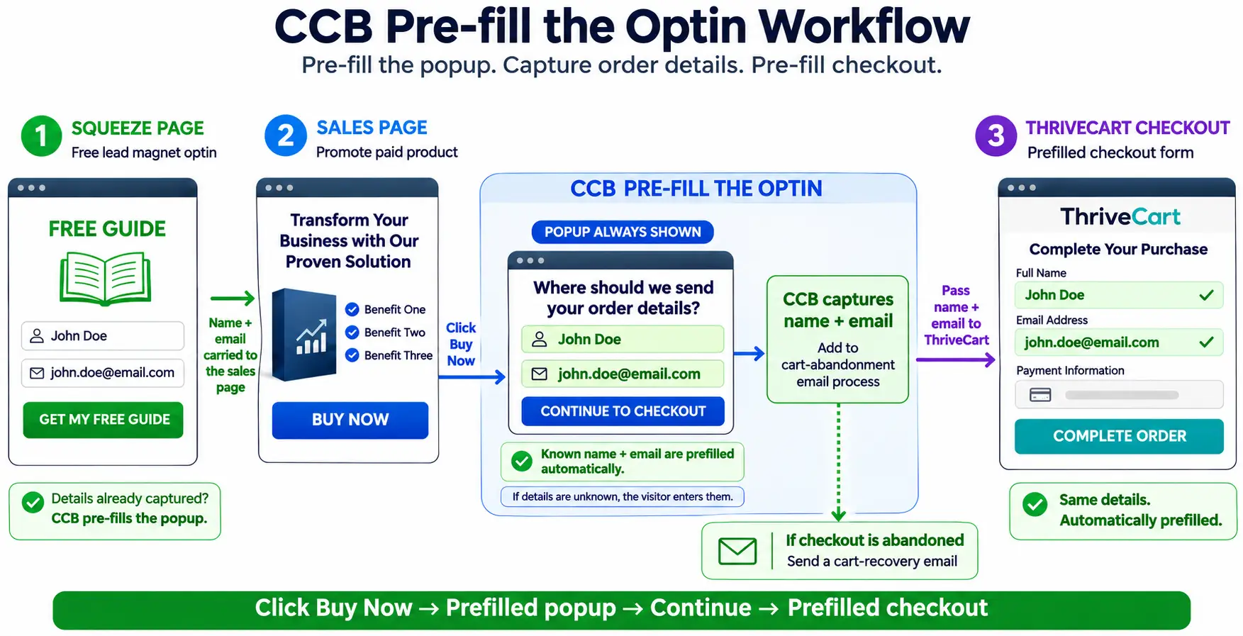
    Pre-fill the Opt-in: after the squeeze page, clicking Buy Now opens a pop-up with the visitor's name and email already filled in, which adds them to the cart abandonment email process and passes them to a pre-filled ThriveCart checkout

    When they click Buy Now, the pop-up opens with their name and email already in it. They just click “Continue to checkout”. That one click adds them to your cart abandonment list and sends them on to a checkout that’s filled in too. If CCB doesn’t know them yet (say they arrived on the sales page from somewhere else), the pop-up is simply empty and they fill it in as normal. And anything a visitor types themselves is never overwritten.

    Improvement 5 (better still): The Silent Opt-in

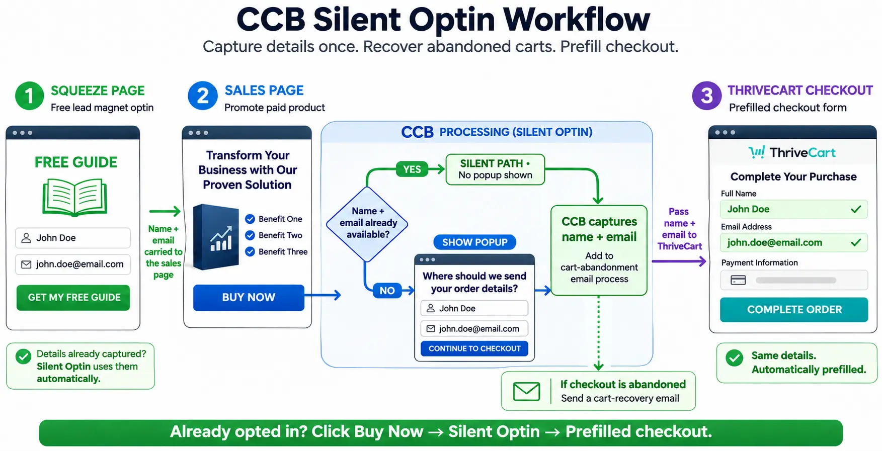
    Silent Opt-in: when Buy Now is clicked, if the name and email are already known no pop-up is shown, the visitor is added to the cart abandonment email process and goes straight to a pre-filled ThriveCart checkout; if not, the pop-up shows as normal

    Now for the fun one. If Cart Conversion Boost already knows who someone is, why show them a pop-up at all?

    With the Silent Opt-in, a known visitor clicks Buy Now and the pop-up never appears. Behind the scenes, CCB quietly submits the completed opt-in for them, so they still go into your cart abandonment list, and the next thing they see after the Buy button is straight to the checkout, pre-filled with their name and email.

    It’s the VIP treatment: waved past the queue and straight to the till, while you still get everything you need to follow up.

    And if the visitor isn’t known yet, or your form has something CCB can’t fill in for them (like a tick box or a captcha), the pop-up just shows as normal, and prefilled where it can. Nobody gets stuck.

    Improvement 6: When visitors wander off (and they will)

    Here’s the thing the neat diagrams don’t show: real people don’t walk through funnels in a straight line. They opt in, then read a blog post, then look at your other product, then make a cup of tea, then come back to the first one. Every time they meet another form, they’re asked to type their details all over again.

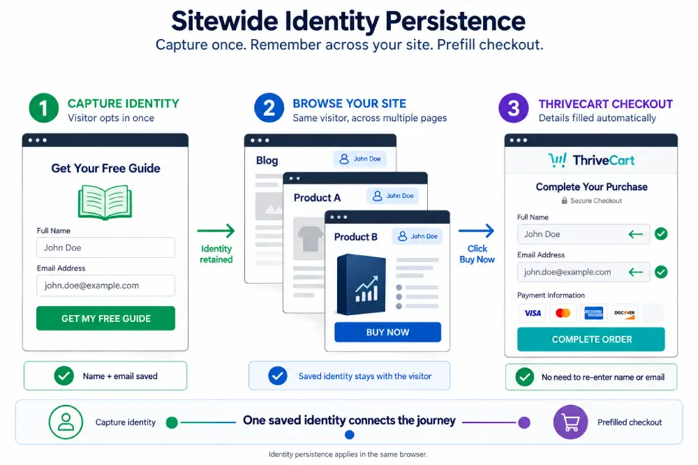
    Sitewide Identity Persistence: a visitor opts in once, their name and email are remembered as they browse the blog and other product pages, and the ThriveCart checkout is filled in automatically

    That’s what Sitewide Identity Persistence fixes. Once a visitor has given their name and email on any connected opt-in, Cart Conversion Boost remembers them as they move around your site.

    Any later opt-in form or ThriveCart checkout they meet in that same browser session is filled in for them. Product A, Product B, a different opt-in, wherever they end up: they’re recognised.

    The details are kept in the visitor’s own browser session (not a cookie, and not on your server), and they clear when the visitor closes the tab.

    So which funnel should you use?

    Keep it simple. If you run a 2-step funnel, put the opt-in pop-up on your Buy button (Improvement 2), so everyone who clicks Buy becomes a lead and the checkout arrives pre-filled.

    If you run a 3-step funnel, add a cart opt-in on the Buy button for a separate cart abandonment list, and use Pre-fill the Opt-in or the Silent Opt-in so known visitors barely notice it.

    Whichever you run, Sitewide Identity Persistence quietly smooths out every detour along the way.

    What a leaky funnel costs you

    Leaving things as they are costs nothing today, which is what makes it deceptive.

    But every week, a funnel that doesn’t capture people before the cart lets a stream of interested buyers leave without a trace. Over a month, that’s a lot of people you’ll never be able to remind. Over a quarter, it’s a launch’s worth.

    It stings most when it matters most: a launch you’ve spent weeks on, ad costs creeping up, or a quiet sales month you’d rather not repeat. Those are exactly the moments to make sure every checkout visitor counts.

    In my own data, after adding a pre-cart opt-in with Cart Conversion Boost plus a follow-up sequence, 5-20% of the people who left the cart came back and bought, which works out at roughly 12-47% more sales. Your results will vary, but that’s extra sales from traffic you’re already getting. More sales. Same traffic.

    Get your funnel working harder today

    Cart Conversion Boost is a WordPress plugin. Your opt-in form captures the lead, and CCB is the bridge that carries the name and email into ThriveCart. It works with Elementor (free and Pro), Thrive Architect, Thrive Leads, Kit, Flodesk, MailerLite, Mailchimp, ActiveCampaign, AWeber, GetResponse, BirdSend, Contact Form 7, ConvertBox and more (the full list is on the Now works with page). No Zapier, no code.

    The free plugin includes every feature in this post (pre-filled checkout, Pre-fill the Opt-in, the Silent Opt-in and Sitewide Identity Persistence), connected to one product. When you want it on more products, Pro gives you unlimited products.

    Want to see the whole system, including the follow-up emails that bring abandoners back? Learn the 5 steps to boost your sales conversion.

    Cart Conversion Boost is an independent tool and isn’t affiliated with Elementor, Thrive Themes or ThriveCart.

  • Elementor and ThriveCart: How to Stop Losing the Buyers Who Walk Away

    Elementor and ThriveCart: How to Stop Losing the Buyers Who Walk Away

    Picture it. Someone has read your Elementor sales page right to the bottom. They’ve watched the video. They click Buy, land on your ThriveCart checkout and start reaching for their card.

    Then the doorbell rings. The kids scream. The boss calls. Tab closed. Gone.

    And here’s the bit that really stings: you have no idea who they were. People reach your checkout every day, and most of the ones who leave are complete strangers to you.

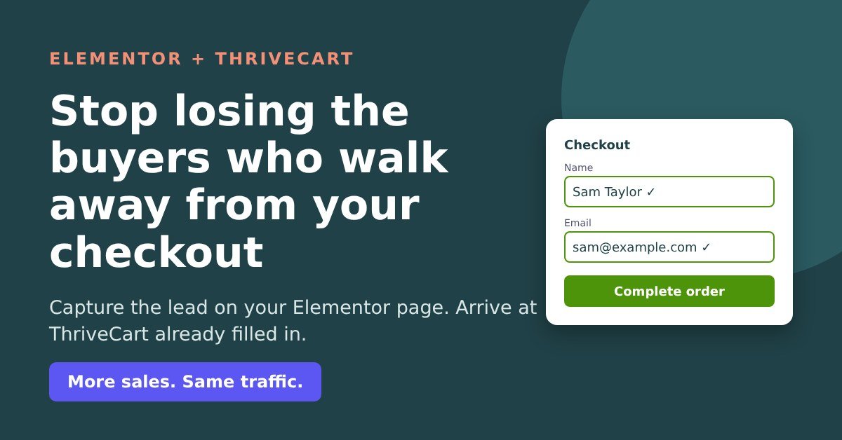
    If you build your pages in Elementor and sell through ThriveCart, this post is for you. I’ll show you what Elementor can already do about it (more than most people think), where it runs out of road, and the simplest way to close the gap.

    You’re not imagining it: most checkout visitors leave

    On average, 70.2% of people who reach an online checkout leave without buying (Baymard, 2026, an average across 50 studies). That’s roughly 7 in every 10. It isn’t an Elementor problem or a ThriveCart problem. It’s just what people do.

    What matters is what happens next. If you know who they were, you can send a friendly reminder and win some of them back. If you don’t, they’re gone, and so is whatever you spent on ads, content and time to get them there.

    “Doesn’t ThriveCart catch them anyway?”

    Partly, and it’s a useful feature. But ThriveCart’s own support team told me a buyer is only stored as a possible abandoned cart after they’ve typed in the name field and clicked back out of it, and the same again for email. Plenty of people leave before they get that far. ThriveCart also doesn’t send the reminder emails itself; it passes the name and email to your email provider, which sends the sequence. So with checkout capture alone, most of the people who walk away stay anonymous.

    Which kind of Elementor seller are you?

    Seller one: your Buy button goes straight to ThriveCart. This is most people. Nobody is captured before the checkout, so you can’t reach most of the people who leave. The fix is a short opt-in on your Buy button: they click Buy, a small pop-up asks “Where should we send your order details?” and asks for their name and email; then they carry on to the checkout. That captures 100% of all cart visitor leads, so everyone who walks away can get a follow-up.

    The catch? Now they have to type their name and email again at ThriveCart, which is exactly the kind of friction that makes people give up.

    Seller two: you already capture the lead with an Elementor form or pop-up. Good news: you already have their email and can follow up. Your problem is similar – Buyers have to retype details they gave you thirty seconds ago, and every extra field at a checkout is another chance to lose them.

    Either way, the answer is the same: capture the lead before the cart, then make the checkout arrive already filled in.

    In fact, we have a proven 5-step process that makes this all work seamlessly to increase sales (more on that later).

    “Hang on, can’t Elementor Pro already do this?”

    Partly, yes, and it would be daft to pretend otherwise – its just a bit tricky (our solution makes it a lot simpler and less technical).

    An Elementor Pro form has a Redirect action, and you can put field shortcodes into the redirect address. Paste something like this, swapping in your own ThriveCart link and field IDs:

    https://yourname.thrivecart.com/your-product/?passthrough[customer_email]=[field id="email"]&passthrough[customer_name]=[field id="name"]

    When someone submits the form, Elementor swaps in what they typed and ThriveCart opens with their name and email filled in. Elementor’s help pages don’t really mention it, but it’s a known trick. If you have one product, one form, and you’re happy working with codes, it’s a perfectly reasonable option.

    Here’s where it runs out of road:

    • It fails silently. A typo in a field ID or a missing passthrough[...] and the checkout simply isn’t pre-filled. No error, no warning. You only find out if you happen to test it.
    • Every form needs its own codes. Two products, three pop-ups, a squeeze page? That’s a hand-built address on each one. Change a ThriveCart product link and you’re hunting through every form to update it.
    • Awkward names can trip it up. There’s a long-running Elementor GitHub thread about form values in redirect addresses not being encoded properly. Elementor marked it fixed, but some users in the thread said spaces and characters like “ö” still caused trouble. Worth testing with a name like Zoë Smith.
    • It forgets them straight away. The trick works for that one form, once. If the visitor then goes to your second product’s sales page and clicks Buy, Elementor has no idea who they are.
    • It’s Elementor Pro forms only. If you use free Elementor with a Kit, Flodesk, MailerLite or Mailchimp form, there’s no equivalent.

    What Cart Conversion Boost (CCB) adds on top

    It’s a WordPress plugin that takes the name and email from your opt-in and passes them into ThriveCart, so the checkout arrives pre-filled. To be clear about what it does and doesn’t do: your opt-in form captures the lead, and CCB is the bridge that carries it to the checkout. Instead of hand-building codes, you point your opt-in’s redirect at your CCB link for that product, and the plugin does the rest, automatically adding all the technical code for you.

    Change a product link? You change it once, in one place.

    The basic pre-fill is nice – CCB makes it easier.

    In addition, these are the features Elementor can’t do at all, that Cart Conversion Boost can:

    1. Sitewide memory

    Once a visitor gives their name and email on any connected opt-in, Cart Conversion Boost remembers them across your whole site for that visit. Product one’s sales page, product two’s sales page, a different opt-in, an embedded checkout: wherever they go next, it’s already filled in. It works from links in your emails too, so a subscriber who clicks through from your newsletter arrives as a known visitor. The details sit in the browser session (not a cookie, not your server) and clear when they close the tab.

    2. Silent opt-in

    Why make someone fill in a pop-up for details you already have? With silent opt-in, a known visitor clicks Buy and never sees the pop-up. The opt-in is submitted quietly in the background, so they’re still added to that email list, and they land straight on a pre-filled checkout. One click from ‘interested’ to ‘paying’. If a form has something CCB can’t fill (a tick box or a captcha), the pop-up simply shows as normal, so nobody gets stuck.

    3. Pre-filled opt-ins

    If you’d rather keep the pop-up showing, it can open with their details already in it. They just confirm and carry on. Anything they type themselves is never overwritten.

    4. Works with free Elementor too

    No Elementor Pro? No problem. Drop your Kit, Flodesk, MailerLite or Mailchimp form onto the page with an HTML or Shortcode widget, and CCB handles the checkout. Your ThriveCart checkout can be on thrivecart.com, on your own domain, or embedded right in your Elementor page. No Zapier, no code.

    Your three options

    Option 1: Live with it. Free, zero effort, and every day it quietly costs you the people you’ll never hear from again. It bites hardest when it matters most: a launch you’ve worked on for weeks, ad costs creeping up, or a quiet month you’d rather not repeat. Seven days of anonymous walk-aways is a week of buyers you can’t remind. Ninety days is a quarter’s worth.

    Option 2: Hand-build the codes. Fine for one form if you’re technical and careful. Then maintain them on every form and pop-up, test them after every change, and accept that visitors are forgotten the moment they move page.

    Option 3: Install Cart Conversion Boost. Capture the lead before the cart, pre-fill the checkout without codes, remember the visitor sitewide, and let known visitors skip the pop-up entirely.

    In my own data, after adding a pre-cart opt-in with CCB and a follow-up sequence, 5-20% of the people who left the cart came back and bought, which works out at roughly 12-47% more sales. Your results will vary, but that’s the kind of gain you get from traffic you’re already paying for. More sales. Same traffic.

    Get it on your Elementor site today

    CCB works with Elementor and Elementor Pro, alongside Thrive Architect, Thrive Leads, Kit, Flodesk, MailerLite, Mailchimp, ActiveCampaign, AWeber, GetResponse, BirdSend, Contact Form 7 and ConvertBox (the full list is on the Now works with page). Setup is simple: install the plugin, add your ThriveCart product, then point your opt-in’s redirect at your CCB link. No codes to build, nothing to maintain on every form.

    The free plugin includes every feature in this post (sitewide memory, silent opt-in and pre-filled opt-ins), connected to one product, with no licence key needed. When you want it on more products, Pro gives you unlimited products.

    Running ThriveCart on a live product and happy to share your results? I’m also looking for Beta Testers. You get a lifetime Pro licence (1 site, unlimited products, normally $97) free, in return for honest feedback, your before and after conversion numbers and an honest review within 3 weeks. You keep the licence whatever your results, and it isn’t conditional on a positive review. Apply to be a Beta Tester.

    If you’ve got a launch coming up, or you’re tired of watching checkout visitors vanish without a trace, now’s a good time to stop guessing who they were.

    Cart Conversion Boost is an independent tool and isn’t affiliated with Elementor, Thrive Themes or ThriveCart.

  • How to Cut Friction on Your ThriveCart Checkout: 27 Tips

    How to Cut Friction on Your ThriveCart Checkout: 27 Tips

    Last updated 2 November 2026

    “People click Buy, land on my ThriveCart checkout, look at the form and close the tab. I never find out what put them off.” If that sounds familiar, you’re not alone: around 70% of people who reach a checkout leave without buying (Baymard, 2026).

    Some of that you can’t help. Some of it is the checkout itself: too many boxes, fields that fight autofill, error messages that don’t say what’s wrong. Every week it stays that way, every visitor you worked hard (or paid) to get, meets the same friction. Over a month that’s multiplying; over 90 days it can be a whole launch.

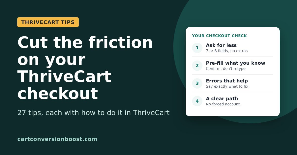
    Below are 27 ways to cut that friction, drawn from the Baymard Institute’s checkout research, each with how to do it with ThriveCart. Work through them before your next launch or the next time your ad costs creep up, and we’ll add to this page as we find more.

    In this guide

    1. Ask for less
    2. Don’t make them type it twice
    3. Make the form easy to read
    4. Errors that help instead of block
    5. The card fields
    6. Keep the path clear

    Two kinds of ThriveCart seller. If your Buy button goes straight to ThriveCart, the checkout is the first place you ask for anything, and anyone who leaves before typing their name and email is gone without a trace. If you capture name and email before the cart (for example, a short opt-in popup on the Buy button), you already have their email and can follow up, so your friction is different: buyers being asked to type the same details again at ThriveCart.

    Every tip below helps either way. Fewer, and friendlier fields means more people finish, whichever setup you have.

    Ask for less

    Tip 1: Cut your checkout to 7 or 8 fields

    Comparison: the average US checkout shows 23.48 form elements, Baymard's ideal is 7 or 8 fields

    Every box on the form is something to read, think about and fill in. Cut anything you don’t strictly need to take payment and deliver the product.

    Do it with ThriveCart: go through the product’s checkout settings and turn off every field a digital product doesn’t need, such as address, phone and company name.

    Evidence: Baymard’s research puts the ideal checkout at 12 to 14 form elements (7 or 8 fields), while the average US checkout shows 23.48. Baymard Institute, cart abandonment rate statistics

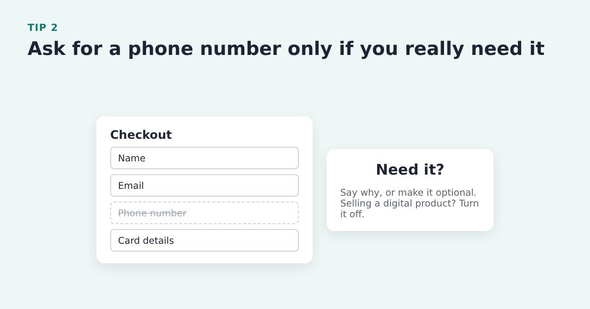
    Tip 2: Ask for a phone number only if you really need it

    A checkout form with name, email and card details kept and the phone number field crossed out

    Lots of people don’t want to hand over a phone number to buy a course or a download. If you do need it, say why.

    Do it with ThriveCart: turn the phone field off in the product’s checkout settings for digital products, or make it optional.

    Evidence: Baymard found over 70% of surveyed shoppers were reluctant to share a phone number. Baymard Institute, current state of checkout UX

    Tip 3: Don’t ask for date of birth or gender unless you need them

    A checkout form with date of birth and gender fields crossed out, leaving name, email and card details

    Every personal question you don’t need gives a hesitant buyer one more reason to leave.

    Do it with ThriveCart: check which fields your checkout asks for in the product’s checkout settings, and remove or make optional anything you don’t use.

    Evidence: Baymard: 27% of online shoppers are reluctant to give their date of birth, and 14% their gender. Baymard Institute, phone number UX

    Tip 4: Hide rarely used optional fields behind a link

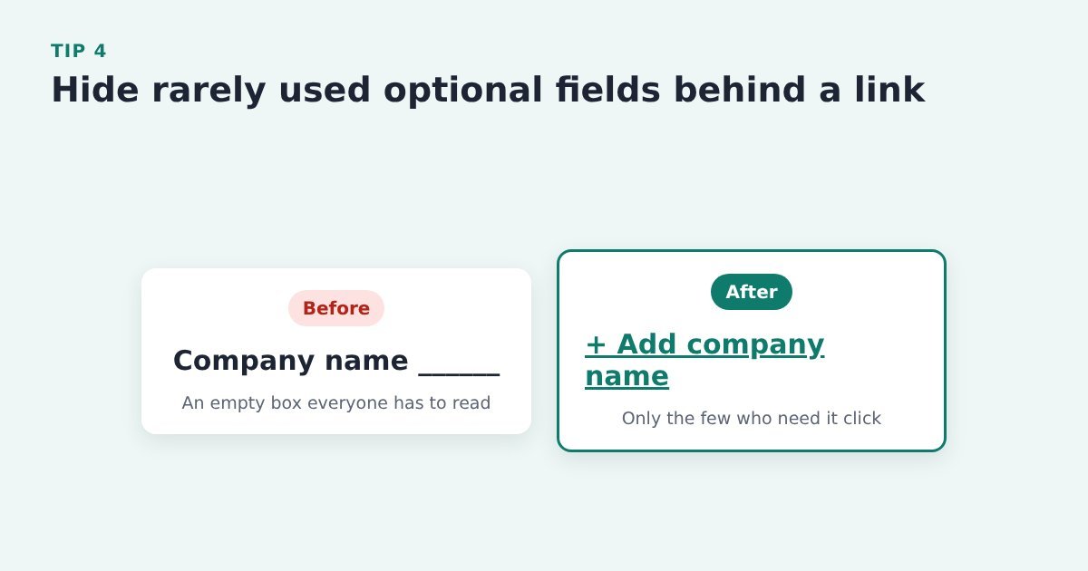
    Before and after: an empty company name box replaced by a small Add company name link

    An empty “Company name” box makes everyone stop and wonder if they need it. A small “Add company name” link only gets clicked by the few who do.

    Do it with ThriveCart: remove optional fields like company name from the checkout unless your buyers need them for invoices.
    Evidence: Baymard found rarely used optional fields slowed checkout by 5 to 30%. Baymard Institute, current state of checkout UX

    Tip 5: Use one Full Name field, not two

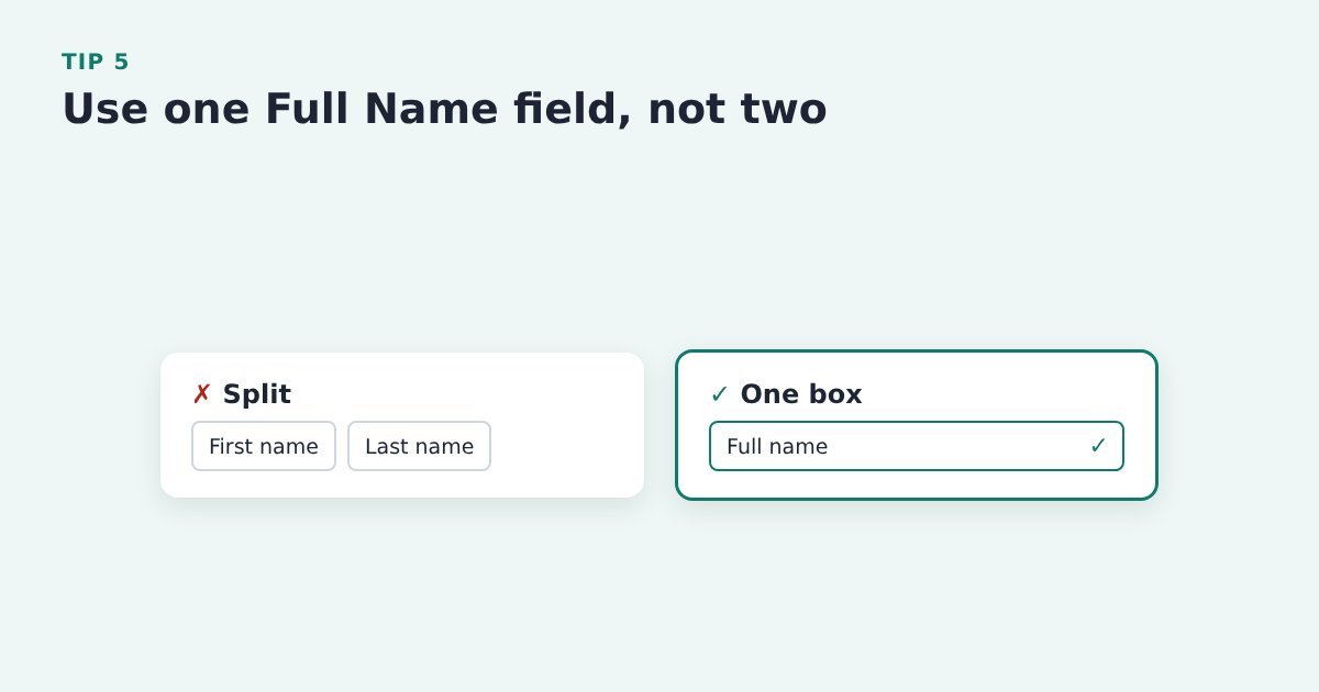
    Comparison: separate first name and last name boxes versus a single full name field with a tick

    Split first and last name boxes trip people up, and plenty type their whole name into the first box anyway.

    Do it with ThriveCart: check the product’s checkout settings for the name fields shown. If you capture name and email before the cart and pass them in, buyers rarely have to type their name at all.

    Evidence: Baymard: 89% of benchmarked sites use more than one name field, and 42% of test participants typed their full name into the first-name box at least once. Baymard Institute, checkout form fields

    Tip 6: Combine split fields into one box

    Comparison: a phone number split across three boxes versus one box holding the whole number

    A phone number split across three boxes means three chances to get it wrong. Fewer boxes, fewer mistakes.
    Do it with ThriveCart: keep each checkout field as a single box (one name field, one phone field) rather than adding split custom fields.
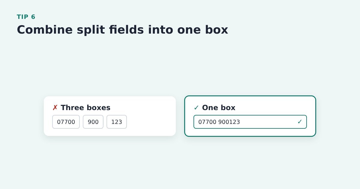
    Source: Baymard Institute, form design best practices

    Don’t make them type it twice

    Tip 7: Pre-fill what you already know

    Flow: name and email given in an opt-in form arrive already filled in on the ThriveCart checkout

    If someone has already given you their name and email, asking again is pure friction. Let them confirm instead of retype.
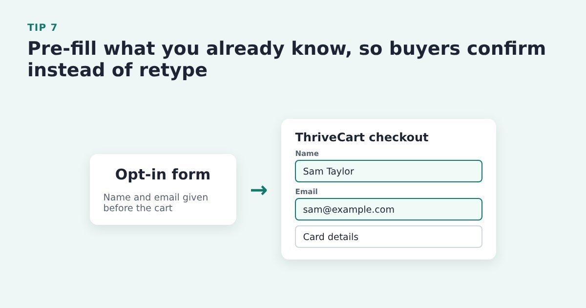
    Do it with ThriveCart: if you capture name and email before the cart, pass them into the ThriveCart checkout so it opens already filled in. This is exactly what the free Cart Conversion Boost plugin does. If you also send recovery emails, see our ThriveCart abandoned cart email tips.

    Source: Baymard Institute, form design best practices

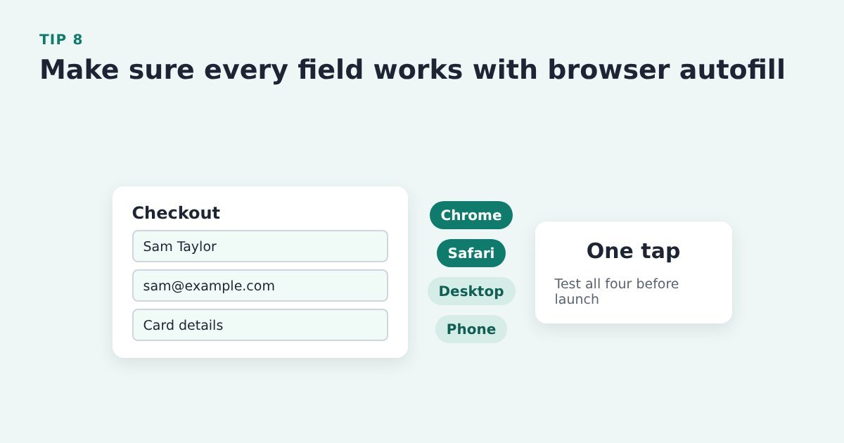
    Tip 8: Make sure every field works with browser autofill

    A checkout filled in by browser autofill, with Chrome, Safari, desktop and phone listed as the four things to test

    Autofill lets a buyer fill the whole form in a tap. If a field fights it, they’re back to typing on a phone keyboard.

    Do it with ThriveCart: test autofill on your ThriveCart checkout in Chrome and Safari, on desktop and on a phone, before every launch.

    Source: Baymard Institute, how to reduce cart abandonment

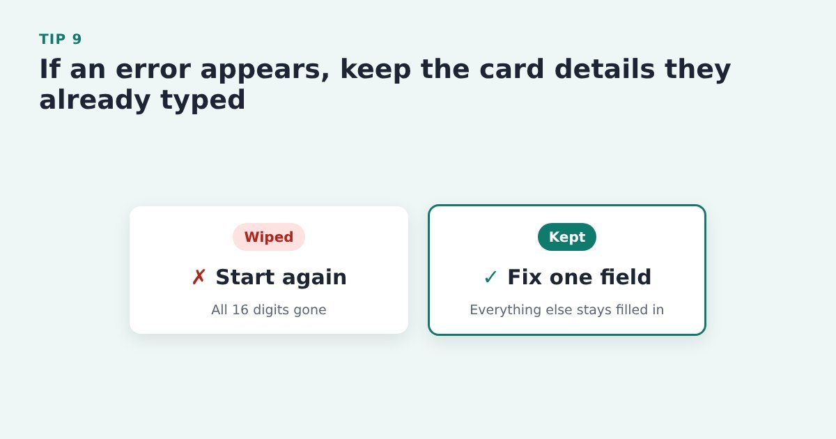
    Tip 9: If an error appears, keep the card details they already typed

    Comparison: an error that wipes all the card details versus one that keeps everything and asks to fix one field

    Nobody wants to type 16 digits twice. Clear only the field that needs fixing.

    Do it with ThriveCart: trigger a card error in ThriveCart’s test mode and check the rest of the details stay filled in. Card fields come from your payment gateway, so raise anything odd with them or ThriveCart support.

    Evidence: Baymard: on more than a third of test sites, errors cleared the card data users had typed. Baymard Institute, card number field must auto-format spaces

    Make the form easy to read

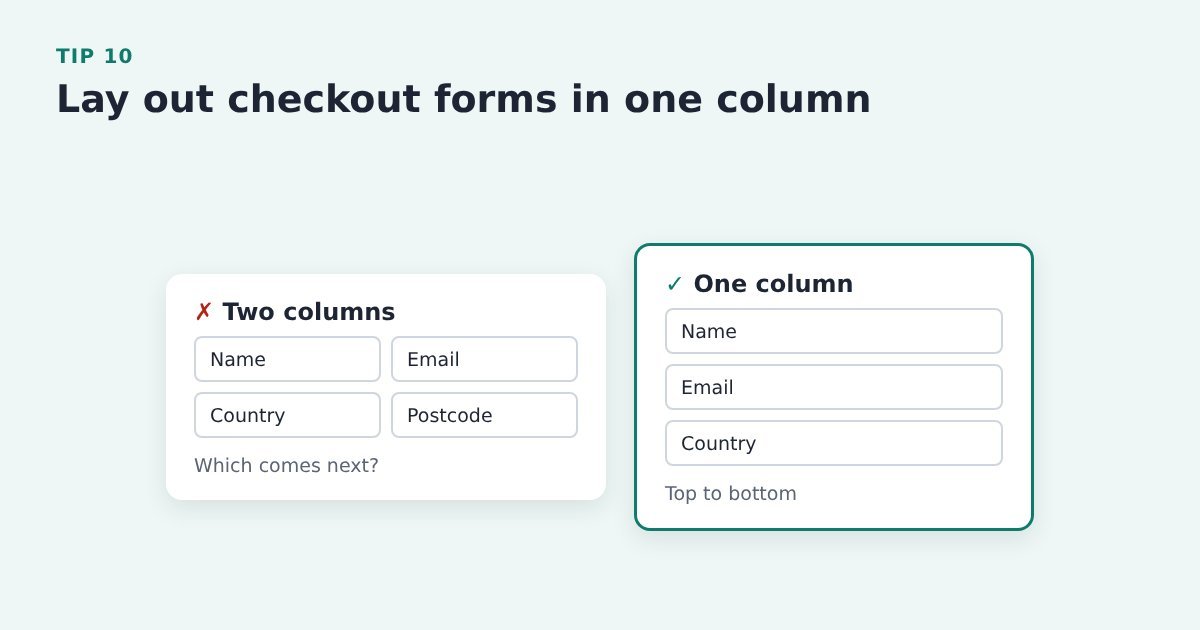
    Tip 10: Lay out the form in one column

    Comparison: a two-column checkout form where the order is unclear versus a one-column form read top to bottom

    Two-column forms leave people unsure which field comes next. One column reads top to bottom.

    Do it with ThriveCart: pick a ThriveCart checkout template that stacks fields in one column, and check it on a phone.

    Source: Baymard Institute, form design best practices

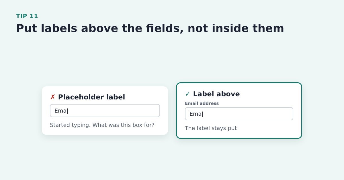
    Tip 11: Put labels above the fields, not just inside them

    Comparison: a placeholder label that disappears while typing versus a label that stays above the email field

    Placeholder text vanishes the moment someone starts typing, so they lose track of what the box was for.

    Do it with ThriveCart: check your ThriveCart template keeps a visible label above each field. If labels disappear when you type, try another template.

    Source: Baymard Institute, form design best practices

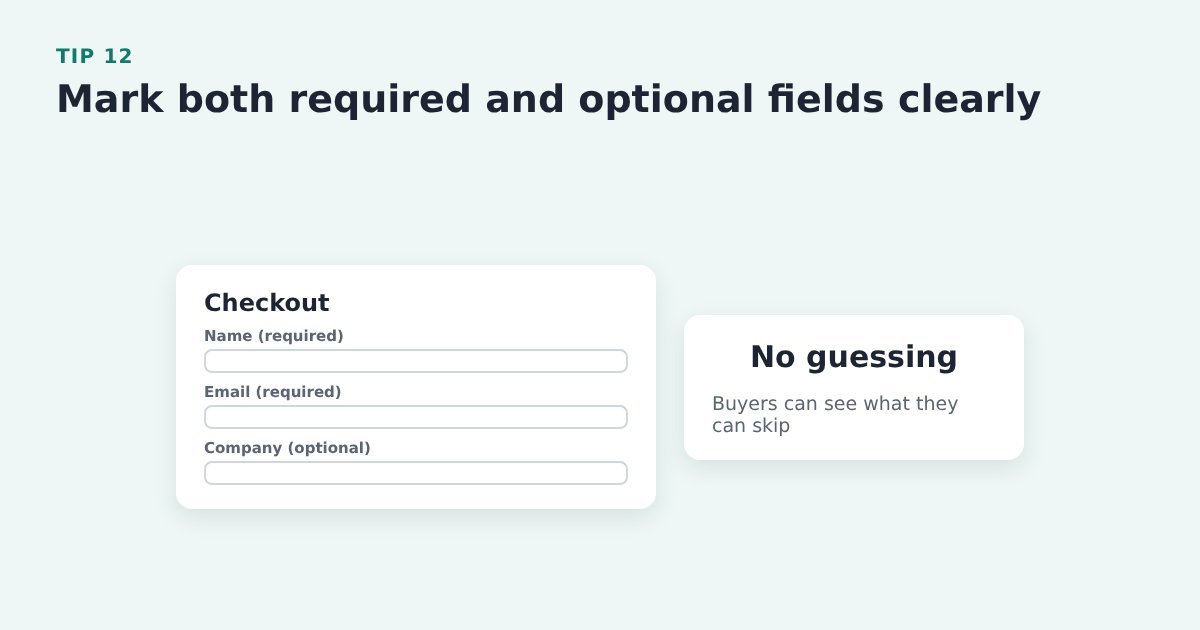
    Tip 12: Mark both required and optional fields clearly

    A checkout with name and email labelled required and company labelled optional

    If only the optional fields are marked, people miss the required ones, and vice versa. Don’t make buyers guess.

    Do it with ThriveCart: check your template shows which fields are required and which are optional, and make any extra fields clearly optional.

    Evidence: Baymard: 32% of test participants missed a required field when only optional fields were marked. Baymard Institute, current state of checkout UX

    Errors that help instead of block

    Tip 13: Check each field as the buyer leaves it

    Comparison: five errors shown at once after pressing Pay versus fields checked one by one as the buyer goes

    Mistakes are easier to fix one at a time than all at once after pressing Pay.

    Do it with ThriveCart: test your ThriveCart checkout in test mode with deliberate typos, and note which errors appear and when. Card fields come from the payment gateway, so you can test them but not restyle them.

    Evidence: Baymard: 31% of sites in its checkout benchmark have no inline validation at all. Baymard Institute, inline form validation

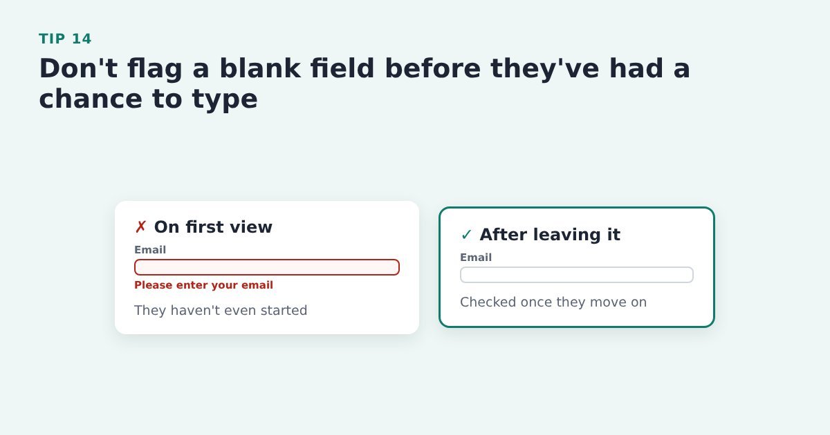
    Tip 14: Don’t flag a blank field before they’ve had a chance to type

    Comparison: an empty email field already showing an error on first view versus one checked only after the buyer leaves it

    A red error on a box nobody has touched yet feels like being told off before you’ve started.

    Do it with ThriveCart: click through your checkout in test mode and watch for warnings on untouched fields. If you see any, raise it with ThriveCart support rather than working around it.

    Source: Baymard Institute, inline form validation

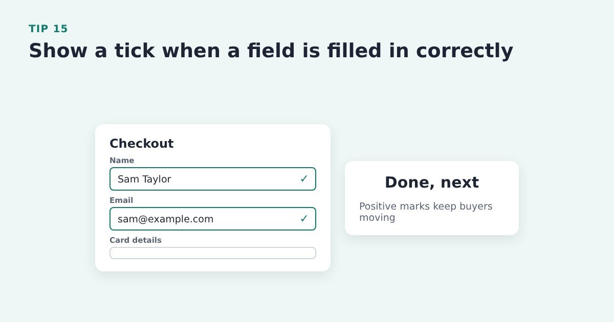
    Tip 15: Show a tick when a field is filled in correctly

    A checkout with green ticks next to the correctly filled name and email fields

    Positive confirmation tells the buyer a field is done and keeps them moving, rather than only shouting when something’s wrong.

    Do it with ThriveCart: check whether your checkout template confirms correct entries, and compare templates in test mode. Gateway card fields can’t be restyled.

    Source: Baymard Institute, inline form validation

    Tip 16: Say exactly what to fix, not just “Invalid input”

    Comparison: a card number error saying Invalid input versus one saying the card number is missing 2 digits

    “Card number is missing 2 digits” gets fixed in a second. “Invalid input” gets a sigh and sometimes a closed tab.

    Do it with ThriveCart: the wording on the card fields comes from your payment gateway, so test a mistyped card on your checkout and check the message is clear.

    Evidence: Baymard: 94% of sites still use generic validation errors. Baymard Institute, current state of checkout UX

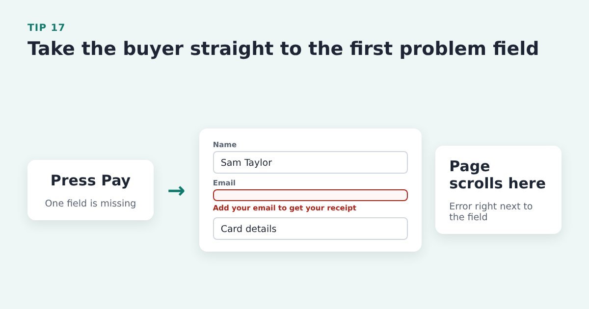
    Tip 17: Take the buyer straight to the first problem

    Flow: the buyer presses Pay with the email missing, and the page scrolls to the email field with the error right beside it

    Don’t make people hunt up and down the page to find out what went wrong.

    Do it with ThriveCart: in test mode, submit your checkout with a required field left blank and see where the page lands. Report anything confusing to ThriveCart support.

    Source: Baymard Institute, the checkout UX guide

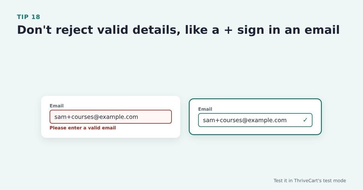
    Tip 18: Don’t reject valid details, like a + sign in an email

    Comparison: an email address with a plus sign rejected as invalid versus the same address accepted with a tick

    Some buyers use addresses like name+courses@example.com. If the form rejects them, they can’t buy.

    Do it with ThriveCart: place a test order in ThriveCart’s test mode using an email with a + sign and check it’s accepted.

    Source: Baymard Institute, form design best practices

    The card fields

    The card fields on a ThriveCart checkout come from your payment gateway (Stripe, PayPal and so on), so you can’t restyle them. You can test them, though, and raise anything that trips buyers up.

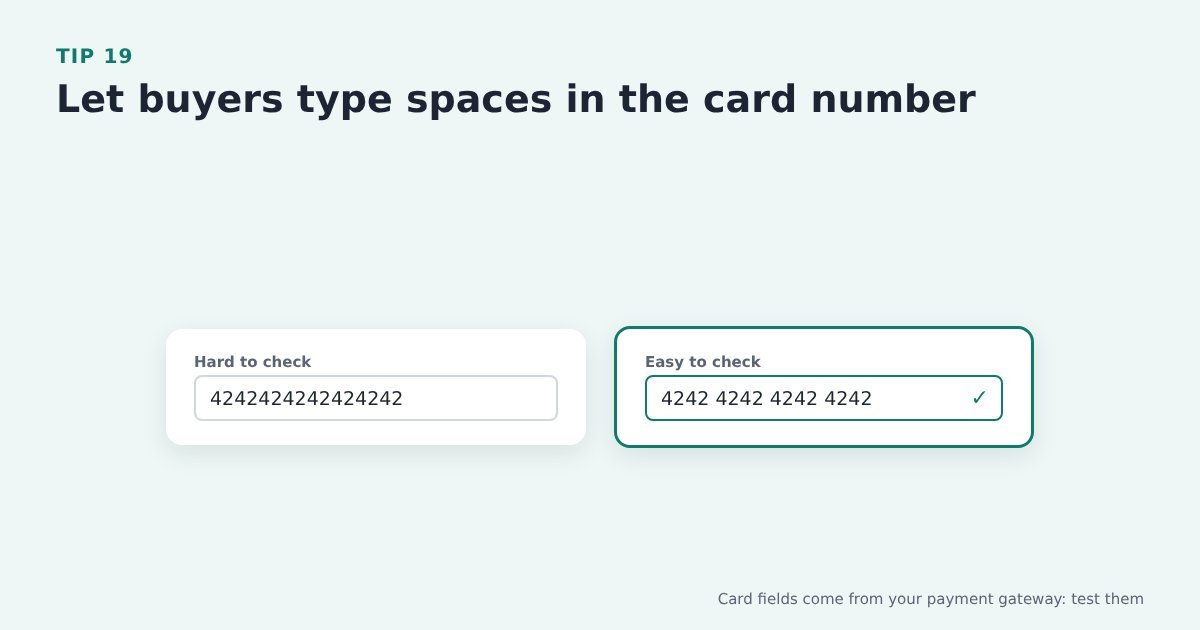
    Tip 19: Let buyers type spaces in the card number

    Comparison: a card number typed as one long string versus the same number grouped in fours

    People read card numbers in groups of four. Accepting spaces, and adding them automatically, makes typos easy to spot.

    Do it with ThriveCart: card fields come from your payment gateway, so test typing a card number with spaces on your ThriveCart checkout.

    Evidence: Baymard: 15% of benchmarked ecommerce sites don’t auto-format spaces in the card number field. Baymard Institute, card number field must auto-format spaces

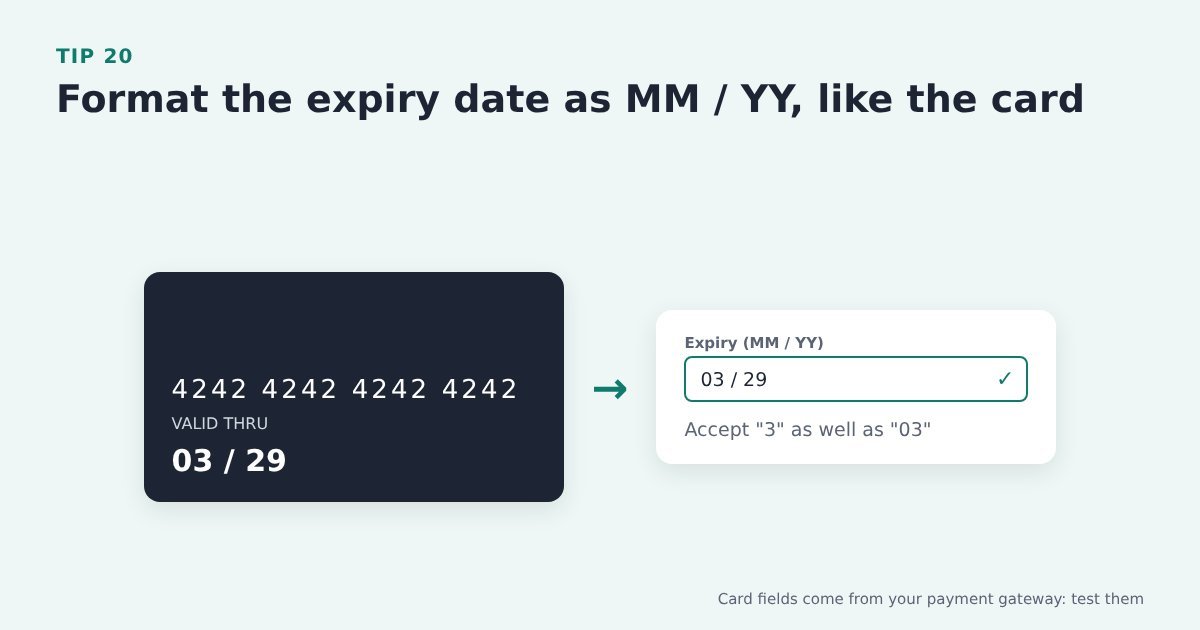
    Tip 20: Format the expiry date as MM / YY, like the card

    A payment card showing the expiry date 03 / 29 next to a checkout expiry field in the same MM / YY format

    Buyers copy what’s printed on the card. A field that matches it, and accepts “3” as well as “03”, avoids needless errors.

    Do it with ThriveCart: the expiry field comes from your gateway too, so test it on your checkout on desktop and on a phone.

    Evidence: Baymard: 72% of benchmarked sites don’t match their expiry date fields to the format on physical cards. Baymard Institute, format expiry date fields like the card

    Keep the path clear

    Tip 21: Don’t make buyers create an account before they pay

    Comparison: a sign up to buy step before payment versus guest checkout that lets the buyer pay straight away

    An account form standing between someone and the Pay button is a hurdle they didn’t ask for.

    Do it with ThriveCart: ThriveCart’s checkout doesn’t need an account to buy. Keep any member area login, such as ThriveCart Learn, for after purchase.

    Evidence: Baymard: 18% of US shoppers abandoned because the site required an account. Baymard Institute, current state of checkout UX

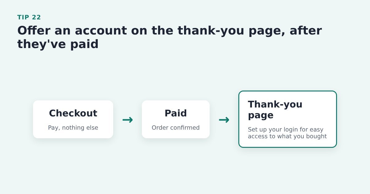
    Tip 22: Offer an account on the thank-you page, after they’ve paid

    Flow: checkout, payment confirmed, then the thank-you page invites the buyer to set up a login

    Once they’ve paid, an account is a benefit (easy access to what they bought) rather than a barrier.

    Do it with ThriveCart: let people buy without an account, and offer member access, for example to ThriveCart Learn, on the success page.

    Evidence: Baymard: 42% of benchmarked sites interrupt users before or during checkout to suggest creating an account. Baymard Institute, save account creation for the confirmation step

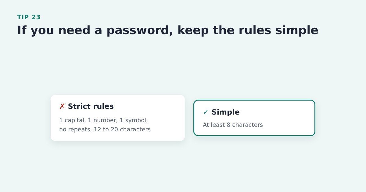
    Tip 23: If you need a password, keep the rules simple

    Comparison: a long list of strict password rules versus a simple at least 8 characters rule

    Strict rules (a capital, a number, a symbol) mean failed attempts and locked-out buyers. A simple minimum length is enough for most.

    Do it with ThriveCart: if buyers need a login after purchase for a member area, keep your password rules to a simple minimum length.

    Evidence: Baymard: strict password rules caused up to 19% abandonment among returning users who had sign-in trouble. Baymard Institute, current state of checkout UX

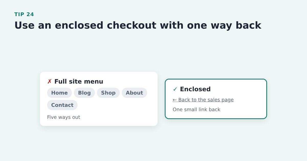
    Tip 24: Use an enclosed checkout with one way back

    Comparison: a checkout showing the full site menu with five links versus an enclosed checkout with one link back to the sales page

    A full site menu on the checkout is five ways out. One small link back to the sales page is enough.

    Do it with ThriveCart: use a ThriveCart checkout without your site menu. If you embed the checkout on one of your own pages, use a layout without the main menu and add one small link back to the sales page.

    Source: Baymard Institute, how to reduce cart abandonment

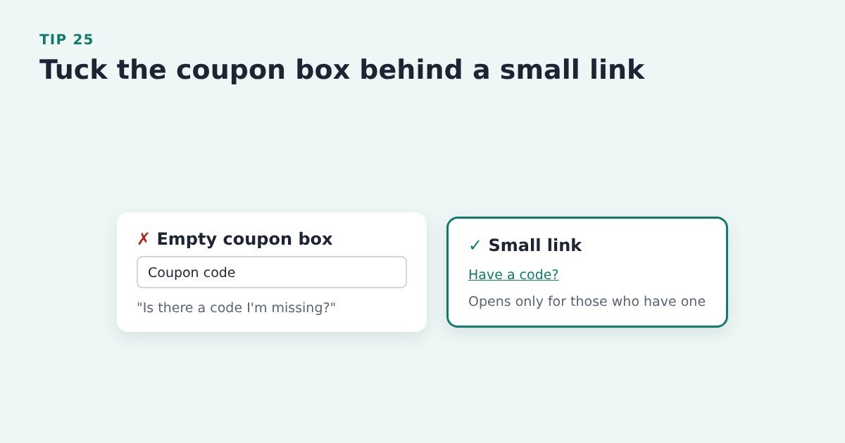
    Tip 25: Tuck the coupon box behind a small link

    Comparison: an empty coupon code box versus a small Have a code link that only opens when clicked

    An empty coupon box sends buyers without a code off to search for one, and some never come back. 8% of people do that. That is a lot of lost sales.

    Do it with ThriveCart: check whether your checkout shows a coupon box. If you don’t run coupons, make sure it isn’t showing. If you do, send any codes as a link instead.

    Better yet, put the coupon option below the “Pay” button and hide it behind a link to open the coupon box. People with a coupon will find it. People without a coupon will ignore it.

    Source: Baymard Institute, avoid Apply buttons in checkout

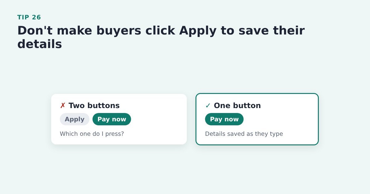
    Tip 26: Don’t make buyers click Apply to save their details

    Comparison: a checkout with both Apply and Pay now buttons versus one with a single Pay now button

    An extra “Apply” button next to “Pay now” makes people stop and wonder which to press. Keep one main button.

    Do it with ThriveCart: go through your checkout looking for any extra apply clicks (coupons are the usual one) and remove them where you can.

    Evidence: Baymard: 22% of benchmarked sites still require users to select an Apply button to save checkout inputs. Baymard Institute, avoid Apply buttons in checkout

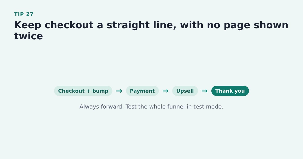
    Tip 27: Keep checkout a straight line

    Flow: checkout with order bump, payment, upsell, thank-you page, always moving forward

    Showing the buyer the same page twice feels like going round in circles. Plan each step once so they always move forward.

    Do it with ThriveCart: click through your whole ThriveCart funnel in test mode, including bumps, upsells and the success page, and check no step repeats.

    Source: Baymard Institute, the checkout UX guide


    Make your checkout the easy part

    If a launch is coming up, or last month’s sales were quieter than the traffic deserved, the checkout is one of the cheapest places to look. Most of the tips above take minutes in ThriveCart and cost nothing.

    The biggest single cut is not making buyers type their name and email at all. A pre-cart opt-in on your Buy button collects them first, so you can follow-up with the 70% who will abandon the cart.

    And Cart Conversion Boost is the free WordPress plugin that carries them into the ThriveCart checkout, so the cart opens already filled in. It works with opt-in forms from tools like Thrive Leads, Kit, Flodesk, MailerLite, Mailchimp, ActiveCampaign, AWeber, GetResponse, BirdSend, Contact Form 7 and ConvertBox (see the full list). The full 5-step process is free to read.


    Sources: Baymard Institute, cart abandonment rate statistics; Baymard Institute, form design best practices; Baymard Institute, current state of checkout UX; Baymard Institute, how to reduce cart abandonment; Baymard Institute, checkout form fields; Baymard Institute, inline form validation; Baymard Institute, the checkout UX guide; Baymard Institute, phone number UX; Baymard Institute, card number field must auto-format spaces; Baymard Institute, format expiry date fields like the card; Baymard Institute, save account creation for the confirmation step; Baymard Institute, avoid Apply buttons in checkout.

  • ThriveCart Abandoned Cart Emails: 16 Tips That Work

    ThriveCart Abandoned Cart Emails: 16 Tips That Work

    Last updated 27 October 2026

    Around 70% of people who reach a checkout leave without buying (Baymard, 2026). Some got distracted, some weren’t sure, and some meant to come back later. A short abandoned cart email sequence is how you bring the ones you can reach back to your ThriveCart checkout.

    Below are 16 tips for setting that sequence up, each with how to do it if you sell with ThriveCart. They’re pulled from research by Klaviyo, Omnisend, Mailchimp and Baymard, as well as our own findings.

    And we add to this page as we find more.

    In this guide

    1. First: who can you actually email?
    2. When to send
    3. How to structure the sequence
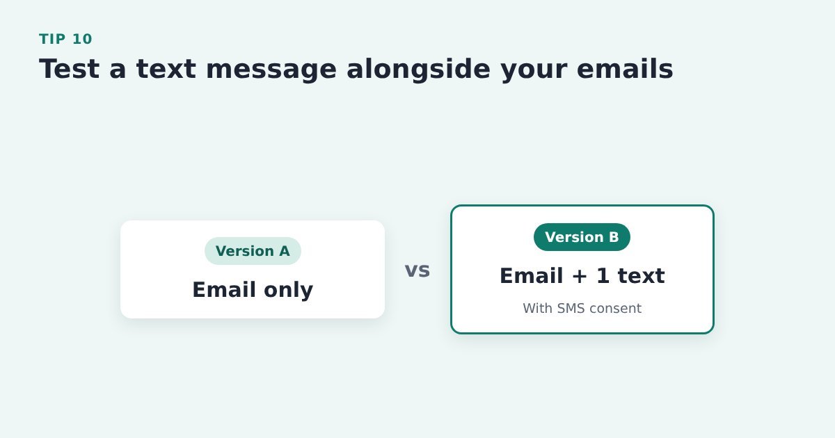
    4. Adding a text message
    5. Keep improving it

    First: who can you actually email?

    ThriveCart doesn’t send abandoned cart emails itself. It passes the abandoner’s name and email to the email tool you’ve connected (Kit, MailerLite, ActiveCampaign and so on), and your email tool sends the sequence.

    There’s a catch. ThriveCart can only pass on people it has recorded, and it records someone as a possible abandoned cart once they’ve typed their name and email into the checkout fields. Anyone who looks at the checkout and leaves before typing never gets recorded, so for most sellers the majority of abandoners can’t be reached.

    Two kinds of ThriveCart seller. If your Buy button goes straight to ThriveCart, your sequence only reaches the abandoners who typed their email details into the ThriveCart checkout page AND clicked out of each box. If you capture name and email before the cart (for example, a short opt-in popup on the Buy button), you already have the email of everyone who clicked Buy, so you can follow up with all of them.

    Every tip below works either way. The second setup just gives the sequence far more people to work with.

    When to send

    Tip 1: Send the first reminder 2 to 4 hours after they leave

    Timeline: a buyer leaves the checkout at 10:00, the first abandoned cart email goes out between 12:00 and 14:00, and they come back while the decision is still warm

    The decision is still fresh, and plenty of people only got pulled away for a moment.

    Do it with ThriveCart: in your email tool, put a 2 to 4 hour wait before the first email in the automation that ThriveCart’s abandoner tag (or list) starts.

    Source: Klaviyo, 2026 abandoned cart benchmarks

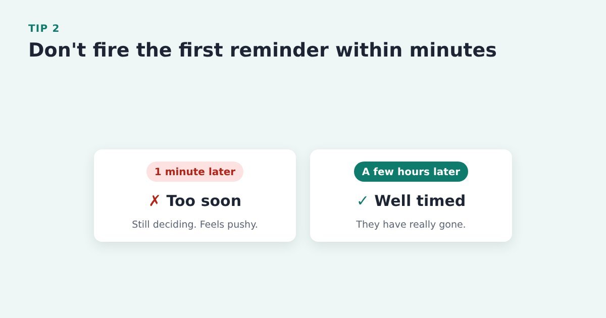
    Tip 2: Don’t fire it within minutes

    Comparison: a reminder 1 minute after leaving is too soon and feels pushy; a reminder a few hours later is well timed

    An instant reminder can land while they’re still deciding, and it can feel pushy.

    Do it with ThriveCart: check your automation doesn’t send the moment the abandoner tag arrives. Add a wait step, then test different delays.

    Source: Omnisend, abandoned cart email tips

    Tip 3: Only send between 10am and 9pm

    A 24-hour bar with the sending window from 10am to 9pm highlighted; emails triggered overnight wait until 10am

    An email that arrives at 2am gets buried under the morning’s inbox.

    Do it with ThriveCart: add a sending window of 10am to 9pm to the abandon automation, so anything triggered overnight or early in the morning waits until 10am.

    Source: Omnisend, abandoned cart email tips

    How to structure the sequence

    Tip 4: Set up a sequence for everyone who starts checkout and doesn’t finish

    Flow: someone starts checkout, doesn't buy, and goes into an abandoned cart sequence of three emails

    Abandoned cart flows earn more per recipient than any other automated email flow.

    Do it with ThriveCart: connect your email tool to the ThriveCart product and set the cart abandonment action to add a tag or list that starts the sequence. To reach abandoners ThriveCart doesn’t record, capture name and email before the cart.

    Evidence: Klaviyo’s 2026 data from over 110,000 brands puts abandoned cart flows at $6.77 revenue per recipient on average, the highest of any flow. Klaviyo, 2026 abandoned cart benchmarks

    Tip 5: Stop the sequence the moment someone buys

    Sequence: email 1 is sent, the buyer purchases and is tagged, emails 2 and 3 are skipped and they exit the sequence

    Nothing undoes a sale’s good feeling faster than a “you forgot to buy” email after paying.

    Do it with ThriveCart: set the product’s purchase action to tag buyers in your email tool, and make the abandon automation exit as soon as that tag is added.

    Source: Omnisend, abandoned cart email tips

    Tip 6: End with an email that asks why they didn’t buy

    An email with the subject "Quick question" asking what stopped them buying, leading to replies that tell you what to fix

    Once your reminders have run, a short question often gets honest replies, and those replies tell you what to fix.

    Do it with ThriveCart: make the last email in the automation a plain question, sent 4 to 5 days after they left (or around 48 to 72 hours for lower-priced products), from an address that reaches back to you.

    Source: Klaviyo, 2026 abandoned cart benchmarks, Drip.

    Tip 7: Give past customers a shorter, lighter reminder

    Two paths: a past customer gets one gentle email, a new visitor gets the full three-email sequence

    Someone who has bought from you before needs a nudge, not the full sequence.

    Do it with ThriveCart: use the purchase tags you’ve set ThriveCart to add to split the automation: one gentle email for existing customers, the full sequence for everyone else.

    Source: Klaviyo, browse abandonment email tips

    Tip 8: Run a separate sequence for memberships and subscriptions

    Comparison: a one-off course sequence sells the result, a membership sequence sells the ongoing monthly value

    A membership is sold on ongoing value, so one-off product copy won’t fit.

    Do it with ThriveCart: give each membership or subscription product its own abandon tag and write that sequence around what members get month after month.

    Source: Klaviyo, how to reduce cart abandonment

    Tip 9: Hold back anyone with an open support question

    Flow: someone abandons their cart but has an open support ticket, so the sequence is paused until it is answered

    A sales reminder on top of an unanswered problem looks careless.

    Do it with ThriveCart: add a filter to the abandon automation that skips contacts tagged with an open support ticket until it’s answered.

    Source: Klaviyo, 12 abandoned cart email best practices

    Adding a text message

    ThriveCart doesn’t send texts, so this only applies if your email tool also does SMS and you’ve collected consent to text people.

    Tip 10: Test a text message alongside your emails

    Test: version A is email only, version B is email plus one text message for contacts with SMS consent

    Texts get seen quickly and can recover buyers who skim past email.

    Do it with ThriveCart: add one text step to the abandon automation for contacts with SMS consent, and compare results against email only.

    NOTE: Asking for the phone number may be adding friction to the sales process. Test it.

    Evidence: Klaviyo’s 2026 data shows abandoned cart texts averaging $4.48 revenue per recipient and a 10.3% click rate. Klaviyo, 2026 abandoned cart benchmarks

    Tip 11: Send one text, not a series

    A phone showing one short text: "Hi Sam, your order is still waiting. Finish it here" with a link

    Keep it short, use their first name and include a single link back to checkout.

    Do it with ThriveCart: link the text to the product’s ThriveCart checkout, including prefilling their name and email in the link. And use their first name in the message.

    Source: Klaviyo, adding SMS to your abandoned cart flow

    Tip 12: Skip the matching email when someone gets the text

    Sequence: a text replaces email 1, which is skipped, then the contact rejoins at email 2

    Two reminders about the same thing at once feels like nagging.

    Do it with ThriveCart: let the text replace the first email for those contacts, then rejoin the email sequence from email 2.

    Source: Klaviyo, adding SMS to your abandoned cart flow

    Tip 13: Start on the channel each person responds to most

    Two paths: people who click emails get an email first, people who click texts get a text first

    Some people click emails, some click texts. Lead with the one they use.

    Do it with ThriveCart: if your email tool tracks engagement by channel, branch the abandon automation so the first reminder goes where that contact usually clicks.

    Source: Klaviyo, 12 abandoned cart email best practices

    Keep improving it

    Tip 14: Find the email where people stop opening

    Illustrative bar chart of opens for four emails, with the weakest, email 3, highlighted as the one to fix first

    Treat the sequence as something you keep improving, not something you set and forget.

    Do it with ThriveCart: check opens and clicks for each email in the automation, then test the timing, offer or channel of the weakest one first.

    Source: Klaviyo, 2026 abandoned cart benchmarks

    Tip 15: Watch the unsubscribe rate

    Illustrative line chart of unsubscribes across four emails with a spike at email 3, meaning it is too frequent or too pushy

    A spike on one email means it’s too frequent or too pushy.

    Do it with ThriveCart: look at unsubscribes alongside opens, clicks and recovered ThriveCart sales for each email, and soften or space out the one that spikes.

    Source: Mailchimp, abandoned cart email strategies

    Tip 16: Fix the checkout as well as the emails

    A checkout form with phone number and company name crossed out: cut the fields you don't need

    Recovery emails win back distracted buyers, but they won’t fix a clunky checkout.

    Do it with ThriveCart: while the sequence runs, go through your ThriveCart checkout for fields you don’t need, costs that appear late and anything that errors on a phone.

    Source: Baymard Institute, how to reduce cart abandonment


    Give your sequence more people to work with

    The tips above make your abandoned cart emails better. A pre-cart opt-in makes sure there’s someone to send them to: the Buy button opens a short popup asking for name and email, then sends the buyer on to ThriveCart.

    Cart Conversion Boost is the free WordPress plugin that carries those details into the ThriveCart checkout, so it opens already filled in and buyers never type them twice. The full 5-step process is free to read.


    Sources: Baymard Institute, cart abandonment rate; Klaviyo, 2026 abandoned cart benchmarks; Klaviyo, 12 abandoned cart email best practices; Klaviyo, how to reduce cart abandonment; Klaviyo, browse abandonment email tips; Klaviyo help, adding SMS; Omnisend, abandoned cart email tips; Mailchimp, abandoned cart email strategies; Baymard Institute, how to reduce cart abandonment.